Interpreting a kernel density, box plots & radar charts
R ile Duygu Analizi

Ted Kwartler
Data Dude
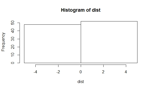
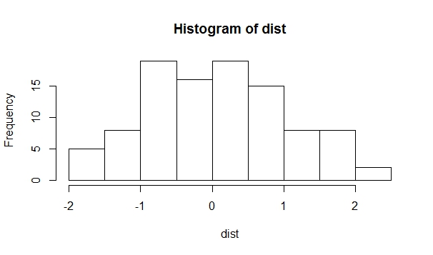
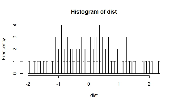
Kernel density plots vs histogram
hist(dist, breaks = 1)
hist(dist, breaks = 10)
hist(dist, breaks = 100)
Kernel density plots vs histogram
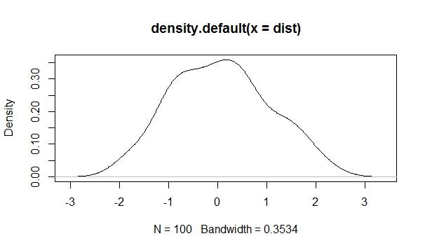
dist <- rnorm(100,
              mean = 0,
              sd = 1)
hist(dist, breaks = 10)
d_curve <- density(dist)
plot(d_curve)
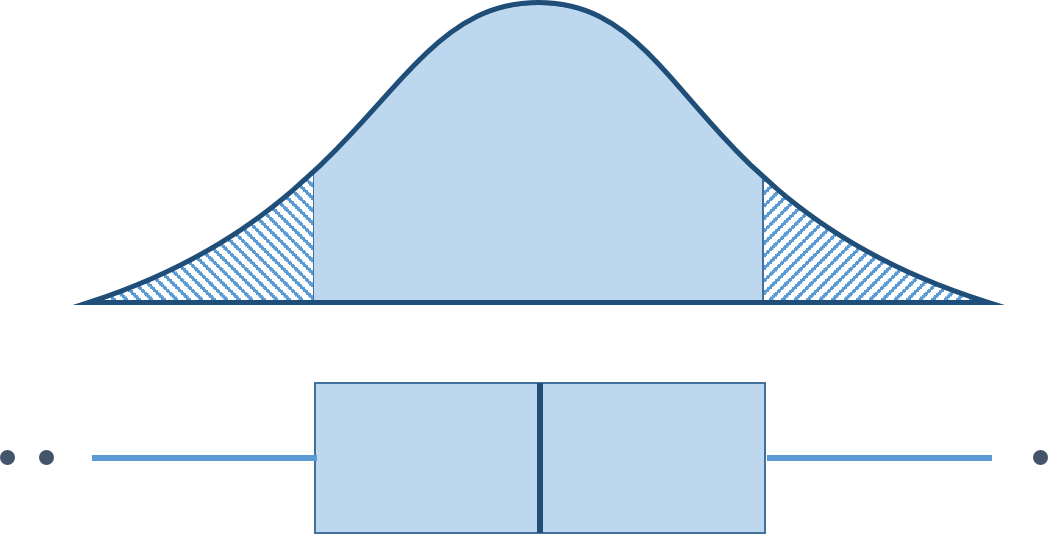
Box plot
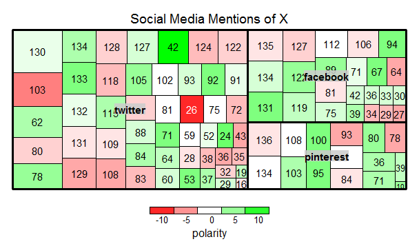
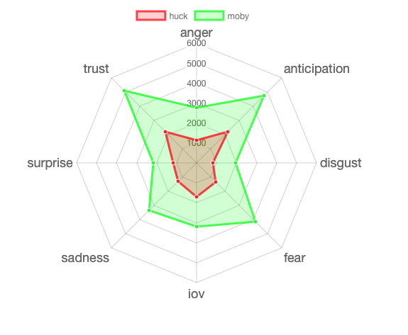
Radar Wheel of Emotion

Treemaps