Je plots aanpassen
Introductie tot datavisualisatie met Matplotlib

Ariel Rokem
Data Scientist
Dataweergave aanpassen
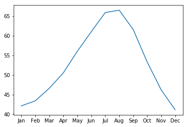
ax.plot(seattle_weather["MONTH"],
        seattle_weather["MLY-PRCP-NORMAL"])
plt.show()
Markers toevoegen
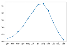
ax.plot(seattle_weather["MONTH"],
        seattle_weather["MLY-PRCP-NORMAL"],
        marker="o")
plt.show()

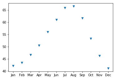
Markers kiezen
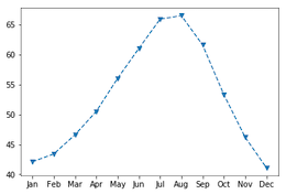
ax.plot(seattle_weather["MONTH"],
        seattle_weather["MLY-PRCP-NORMAL"],
        marker="v")
plt.show()
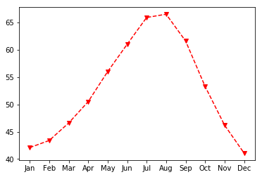
Lijntype instellen
fig, ax = plt.subplots()
ax.plot(seattle_weather["MONTH"],
        seattle_weather["MLY-TAVG-NORMAL"],
        marker="v", linestyle="--")
plt.show()

Lijnen weglaten met lijntype
fig, ax = plt.subplots()
ax.plot(seattle_weather["MONTH"],
        seattle_weather["MLY-TAVG-NORMAL"],
        marker="v", linestyle="None")
plt.show()
Kleur kiezen
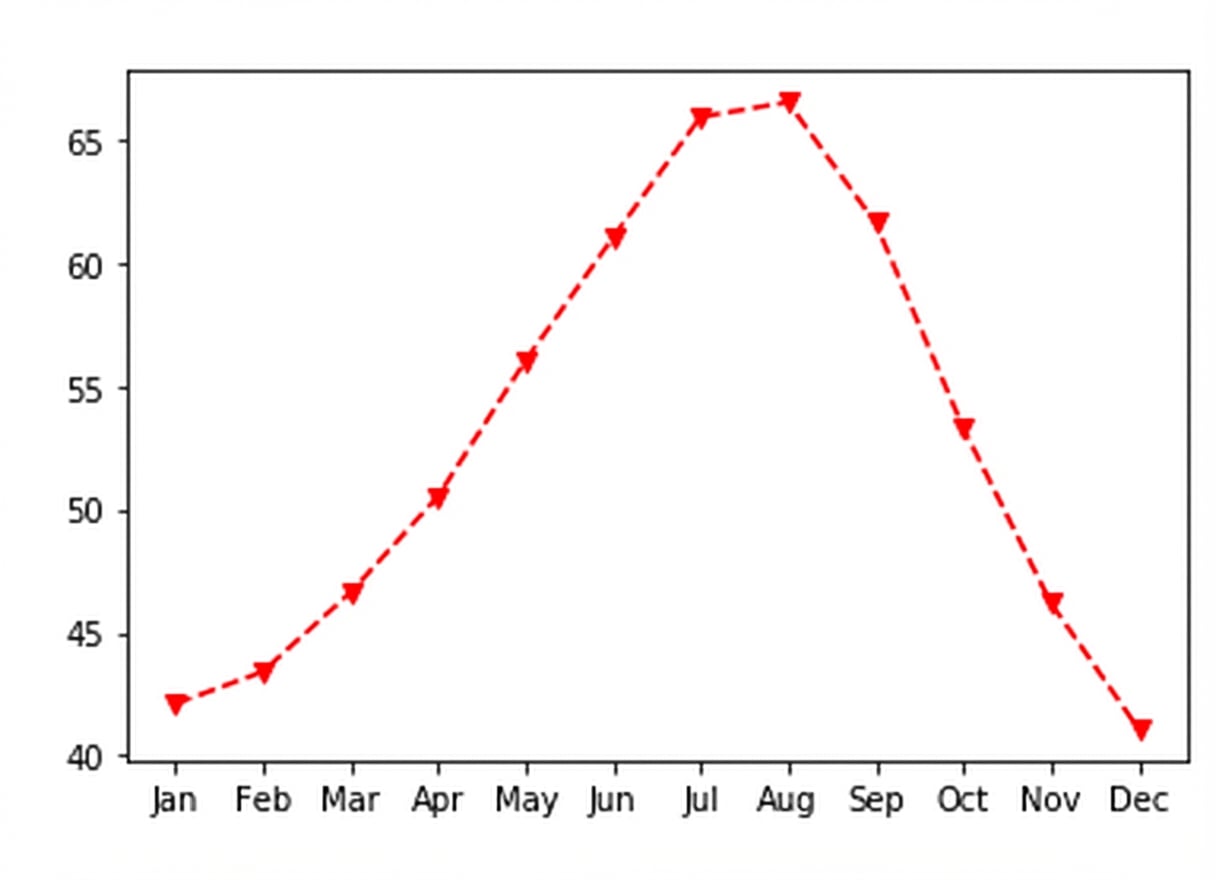
fig, ax = plt.subplots()
ax.plot(seattle_weather["MONTH"],
        seattle_weather["MLY-TAVG-NORMAL"],
        marker="v", linestyle="--", color="r")
plt.show()
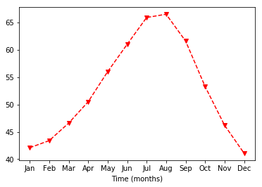
Aslabels aanpassen
ax.set_xlabel("Tijd (maanden)")
plt.show()
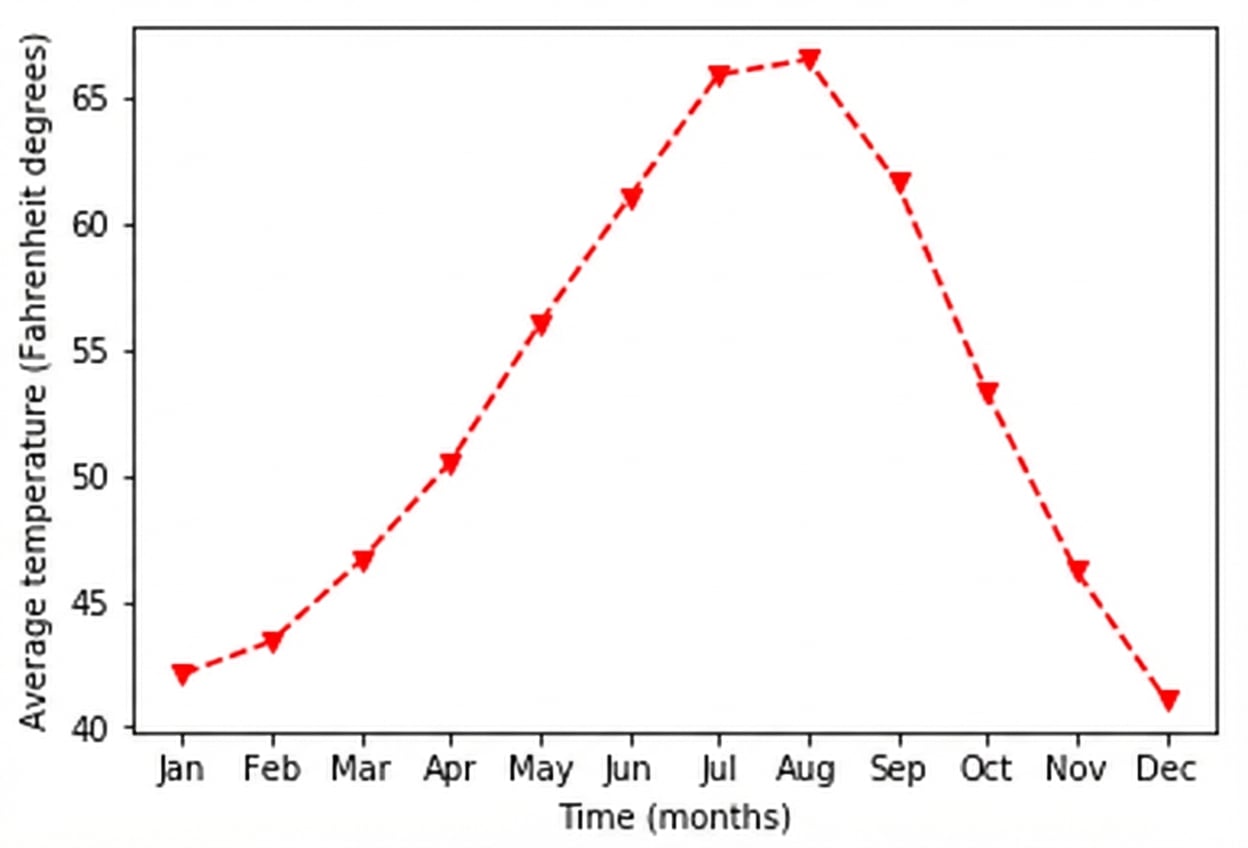
Y-aslabel instellen
ax.set_xlabel("Tijd (maanden)")
ax.set_ylabel("Gemiddelde temperatuur (graden Fahrenheit)")
plt.show()
Een titel toevoegen
ax.set_title("Weer in Seattle")
plt.show()