Puntplots
Introductie tot datavisualisatie met Seaborn

Content Team
DataCamp
Wat zijn puntplots?
1 Waskom, M. L. (2021). seaborn: statistical data visualization. https://seaborn.pydata.org/
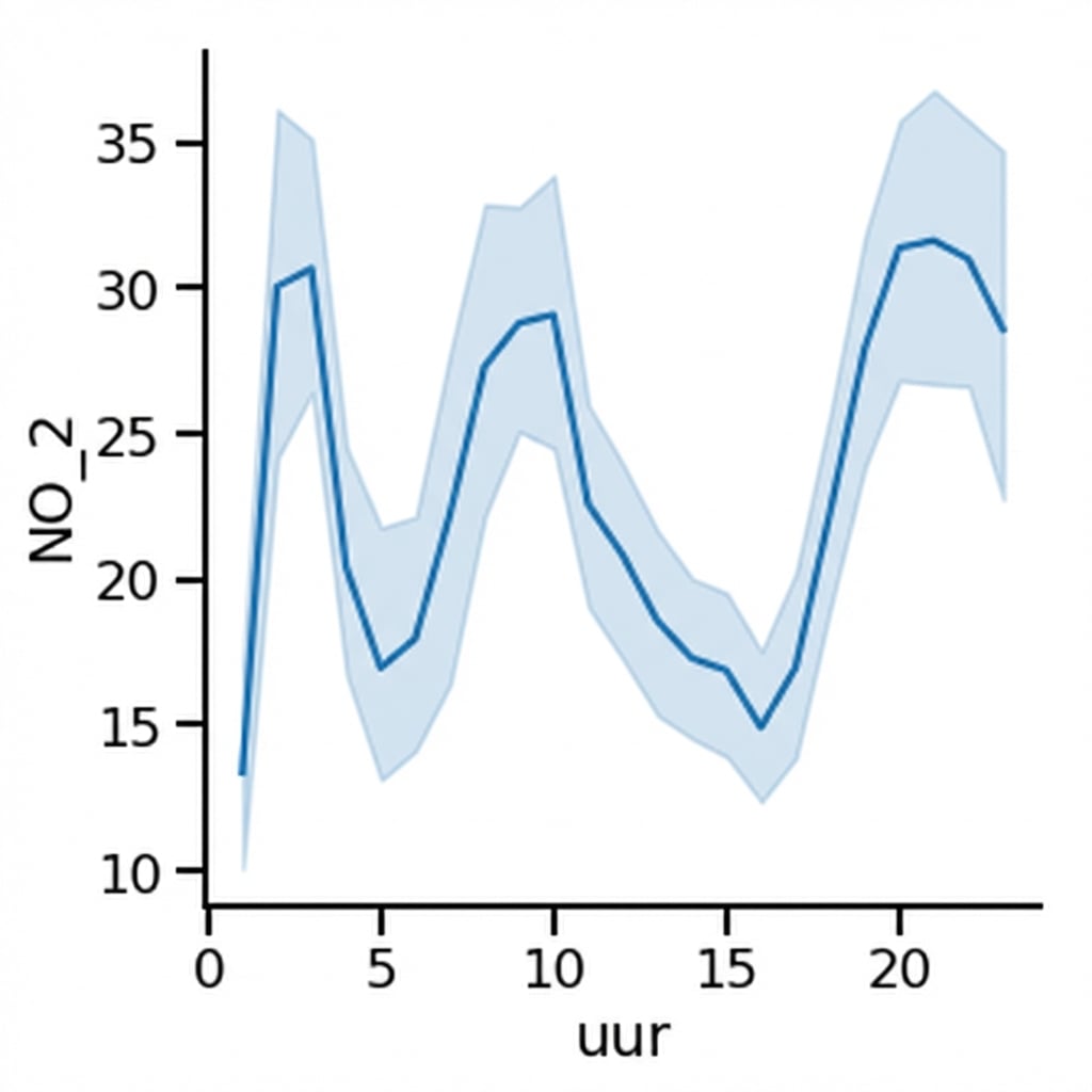
Lijndiagram: gemiddeld stikstofdioxide door de tijd
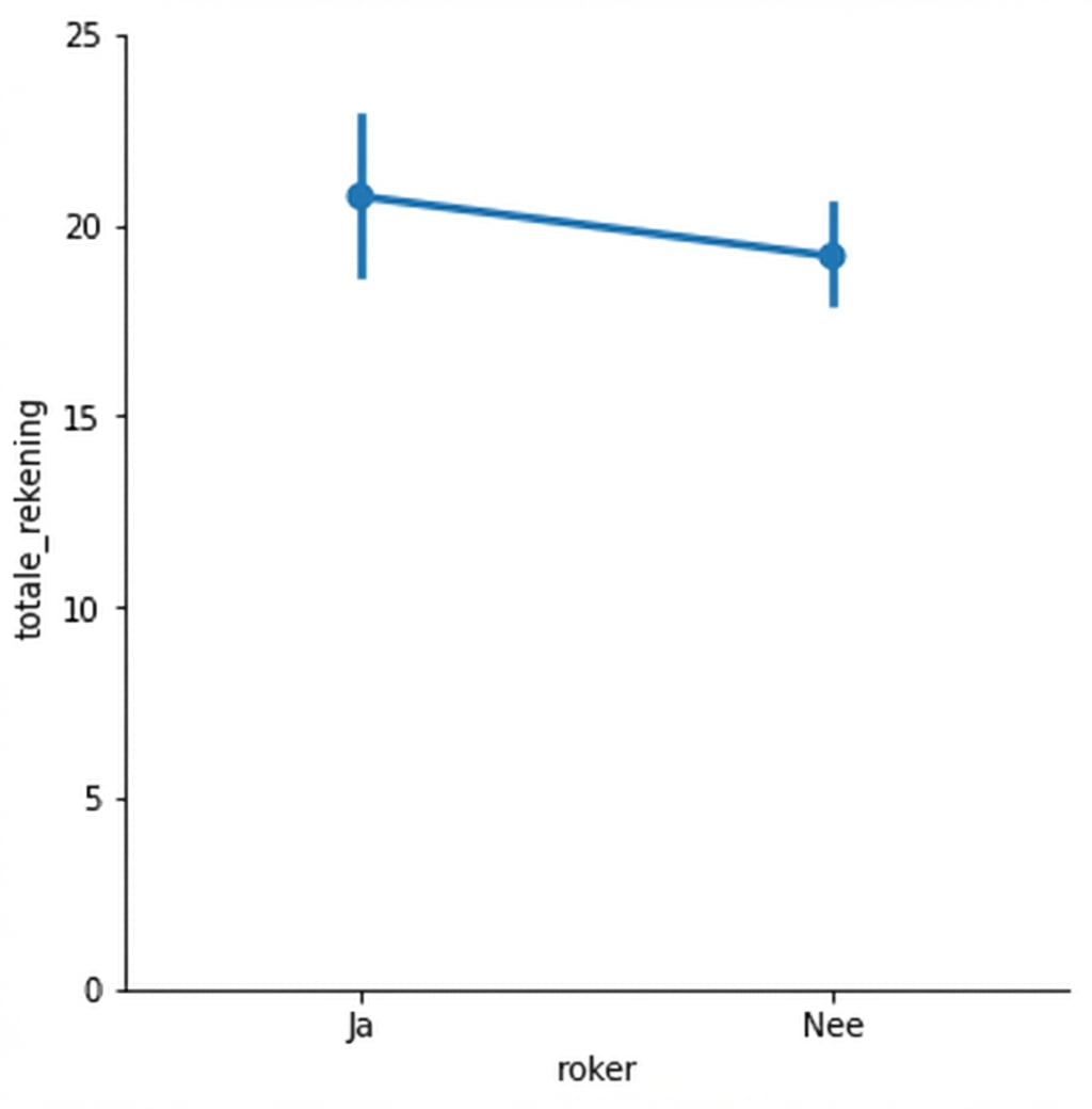
Puntplot: gemiddelde restaurantrekening, rokers vs. niet-rokers
1 Waskom, M. L. (2021). seaborn: statistical data visualization. https://seaborn.pydata.org/
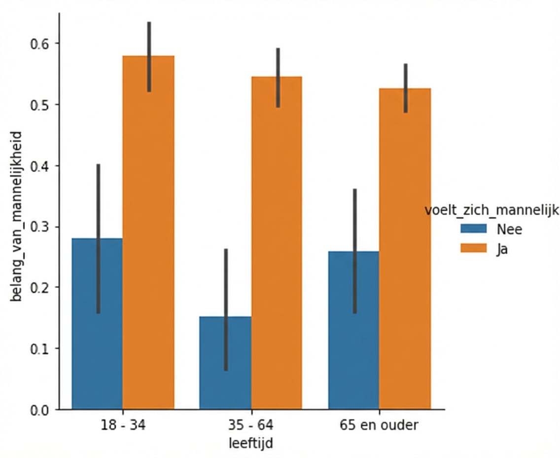
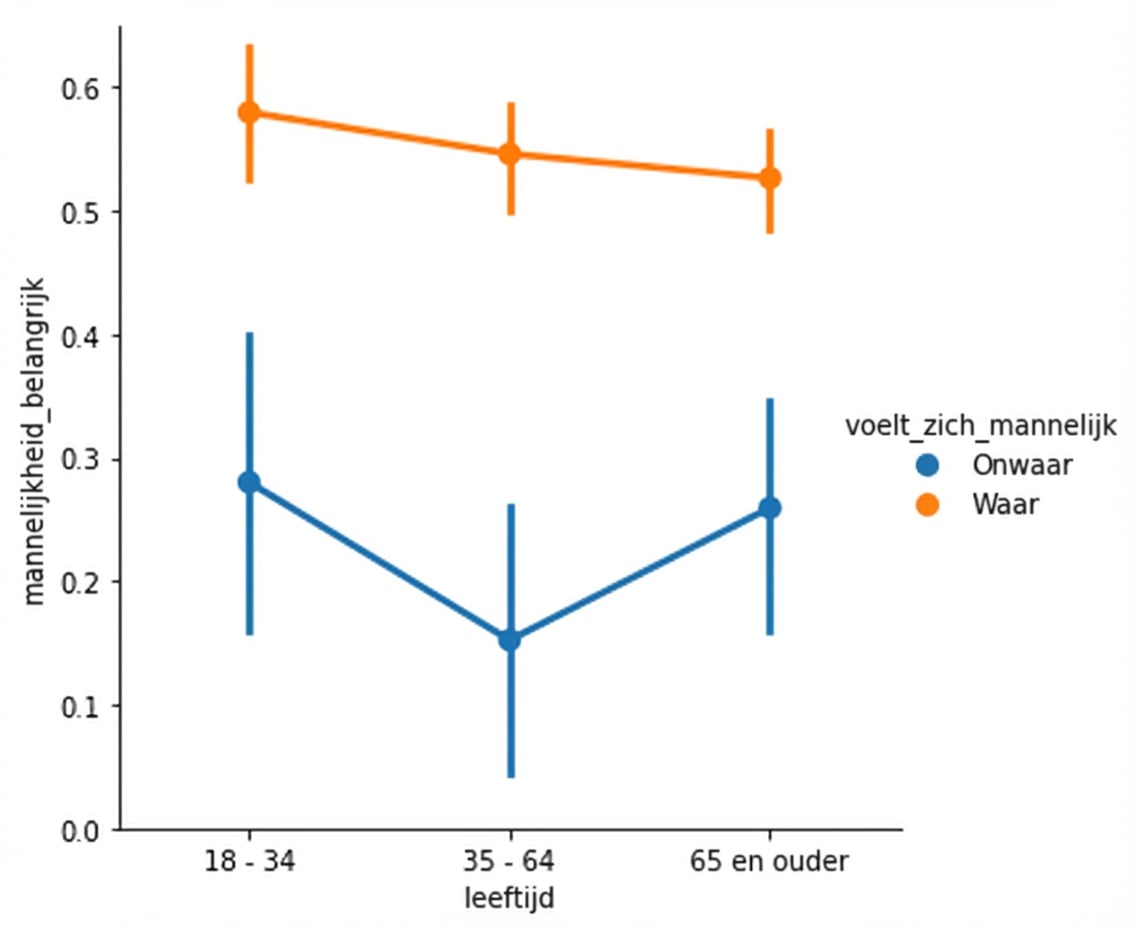
Puntplots vs. staafdiagrammen
Een puntplot maken
Punten loskoppelen

De mediaan tonen
1 Waskom, M. L. (2021). seaborn: statistical data visualization. https://seaborn.pydata.org/
De mediaan tonen

1 Waskom, M. L. (2021). seaborn: statistical data visualization. https://seaborn.pydata.org/
Betrouwbaarheidsintervallen aanpassen

1 Waskom, M. L. (2021). seaborn: statistical data visualization. https://seaborn.pydata.org/
Betrouwbaarheidsintervallen uitschakelen

1 Waskom, M. L. (2021). seaborn: statistical data visualization. https://seaborn.pydata.org/

