Spreidplots aanpassen
Introductie tot datavisualisatie met Seaborn

Content Team
DataCamp
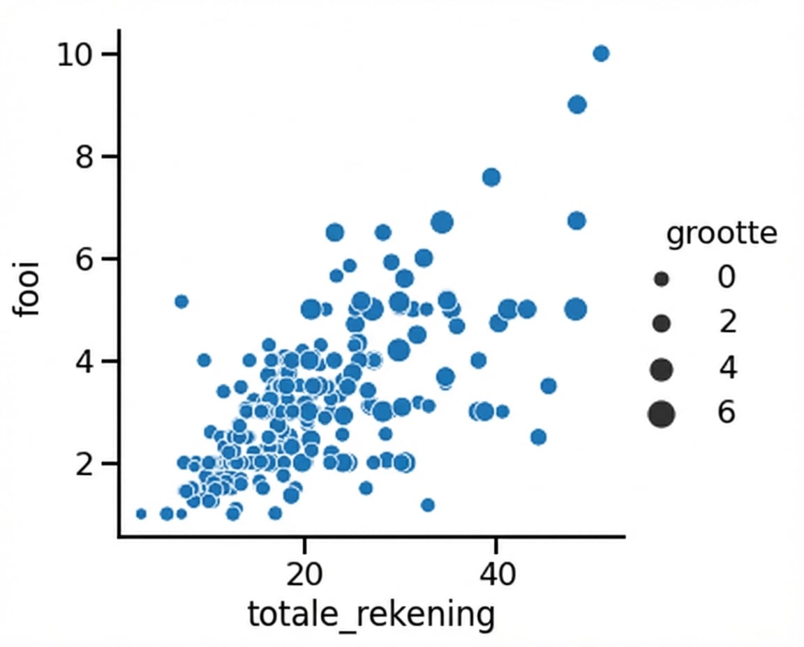
Subgroepen met puntgrootte
1 Waskom, M. L. (2021). seaborn: statistical data visualization. https://seaborn.pydata.org/
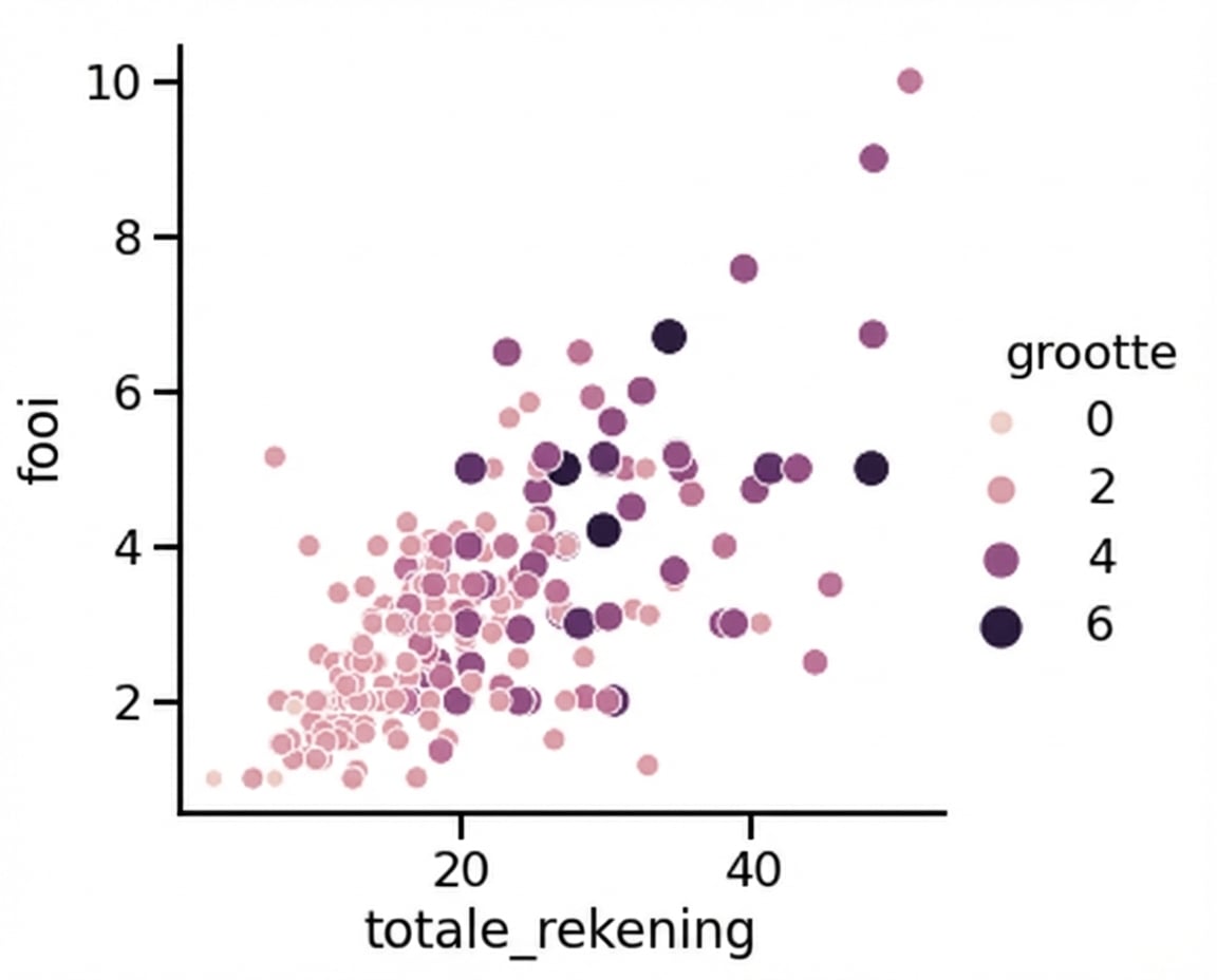
Puntgrootte en hue
1 Waskom, M. L. (2021). seaborn: statistical data visualization. https://seaborn.pydata.org/
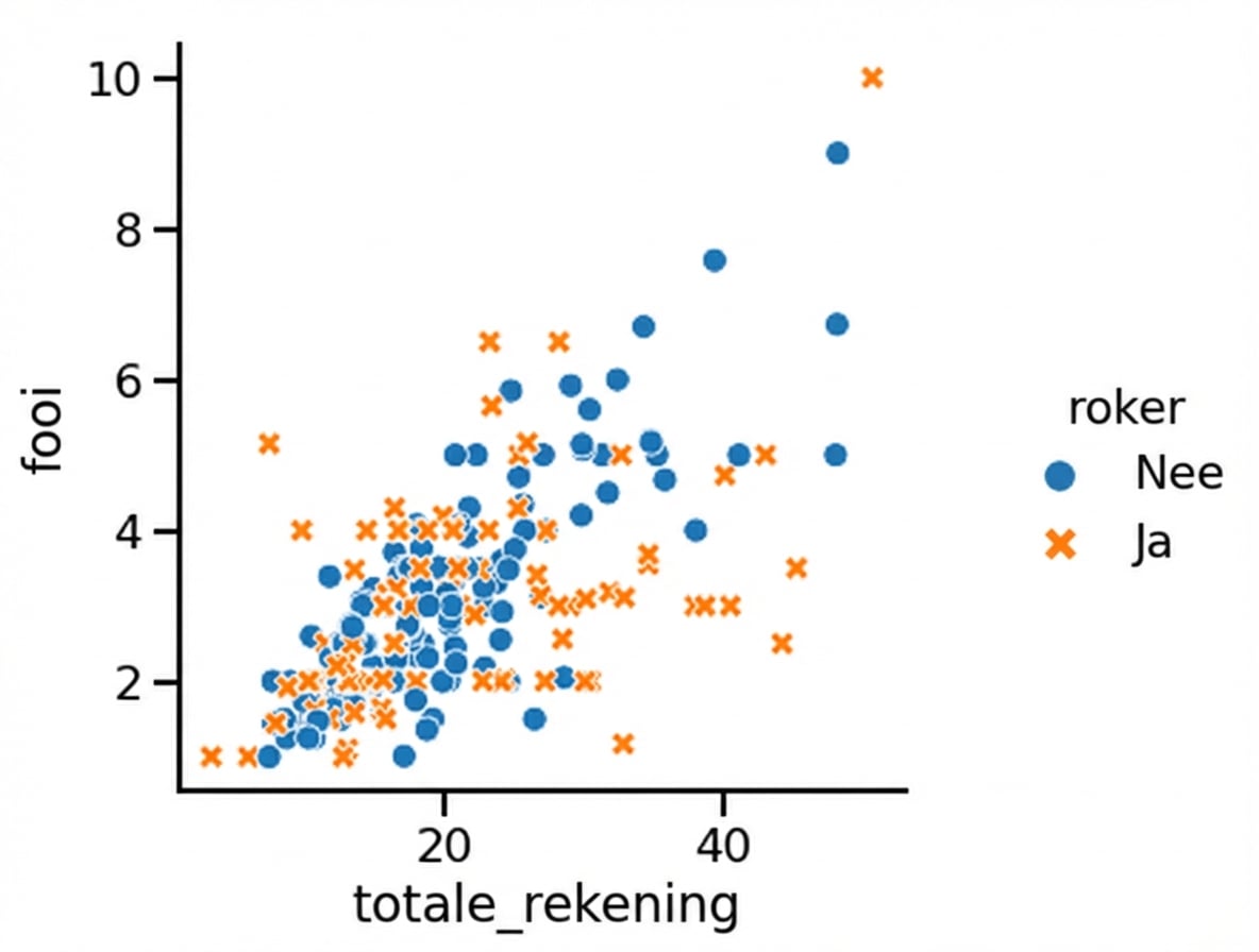
Subgroepen met puntstijl
1 Waskom, M. L. (2021). seaborn: statistical data visualization. https://seaborn.pydata.org/
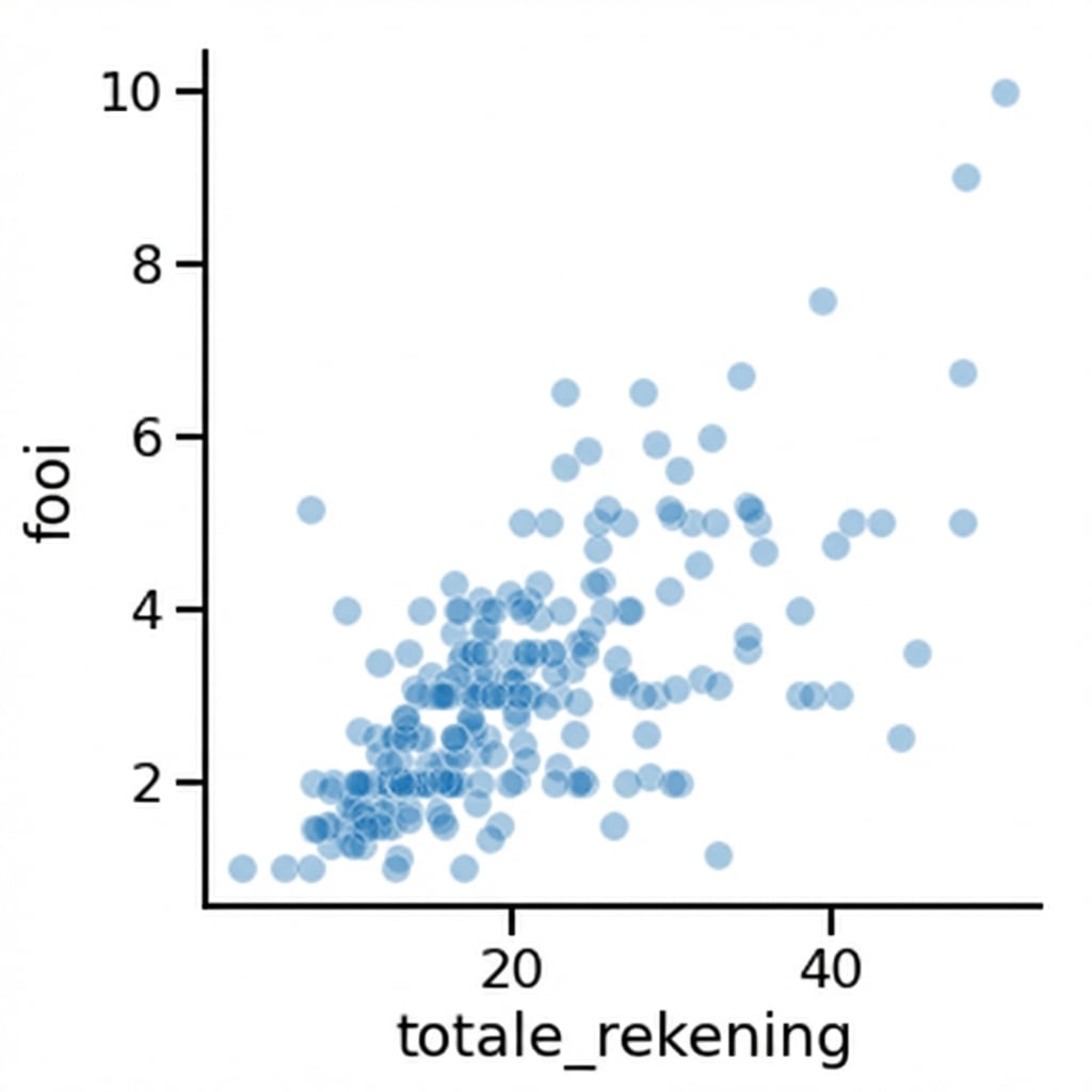
Punttransparantie aanpassen
1 Waskom, M. L. (2021). seaborn: statistical data visualization. https://seaborn.pydata.org/

