Plotstijl en kleur wijzigen

Introductie tot datavisualisatie met Seaborn

Content Team

DataCamp

Waarom aanpassen?

Redenen om stijl te wijzigen:

  • Persoonlijke voorkeur
  • Leesbaarheid verbeteren
  • Interpretatie sturen
Introductie tot datavisualisatie met Seaborn

Figuurstijl wijzigen

  • Figuurstijl omvat achtergrond en assen
  • Voorinstellingen: "white", "dark", "whitegrid", "darkgrid", "ticks"
  • sns.set_style()
Introductie tot datavisualisatie met Seaborn

Standaard figuurstijl ("white")

sns.catplot(x="age", 
            y="masculinity_important",
            data=masculinity_data,
            hue="feel_masculine",
            kind="point")

plt.show()

Puntplot van mannelijkheidsenquête

Introductie tot datavisualisatie met Seaborn

Figuurstijl: "whitegrid"

sns.set_style("whitegrid")

sns.catplot(x="age", 
            y="masculinity_important",
            data=masculinity_data,
            hue="feel_masculine",
            kind="point")

plt.show()

Puntplot met wit raster

Introductie tot datavisualisatie met Seaborn

Andere stijlen

sns.set_style("ticks")

sns.catplot(x="age", 
            y="masculinity_important",
            data=masculinity_data,
            hue="feel_masculine",
            kind="point")

plt.show()

Puntplot met streepjes

Introductie tot datavisualisatie met Seaborn

Andere stijlen

sns.set_style("dark")

sns.catplot(x="age", 
            y="masculinity_important",
            data=masculinity_data,
            hue="feel_masculine",
            kind="point")

plt.show()

Puntplot met donkere achtergrond

Introductie tot datavisualisatie met Seaborn

Andere stijlen

sns.set_style("darkgrid")

sns.catplot(x="age", 
            y="masculinity_important",
            data=masculinity_data,
            hue="feel_masculine",
            kind="point")

plt.show()

Puntplot met donker raster

Introductie tot datavisualisatie met Seaborn

Palet wijzigen

  • Figuurpalet bepaalt de kleur van de hoofdelementen
  • sns.set_palette()
  • Gebruik voorinstellingen of maak een eigen palet
Introductie tot datavisualisatie met Seaborn

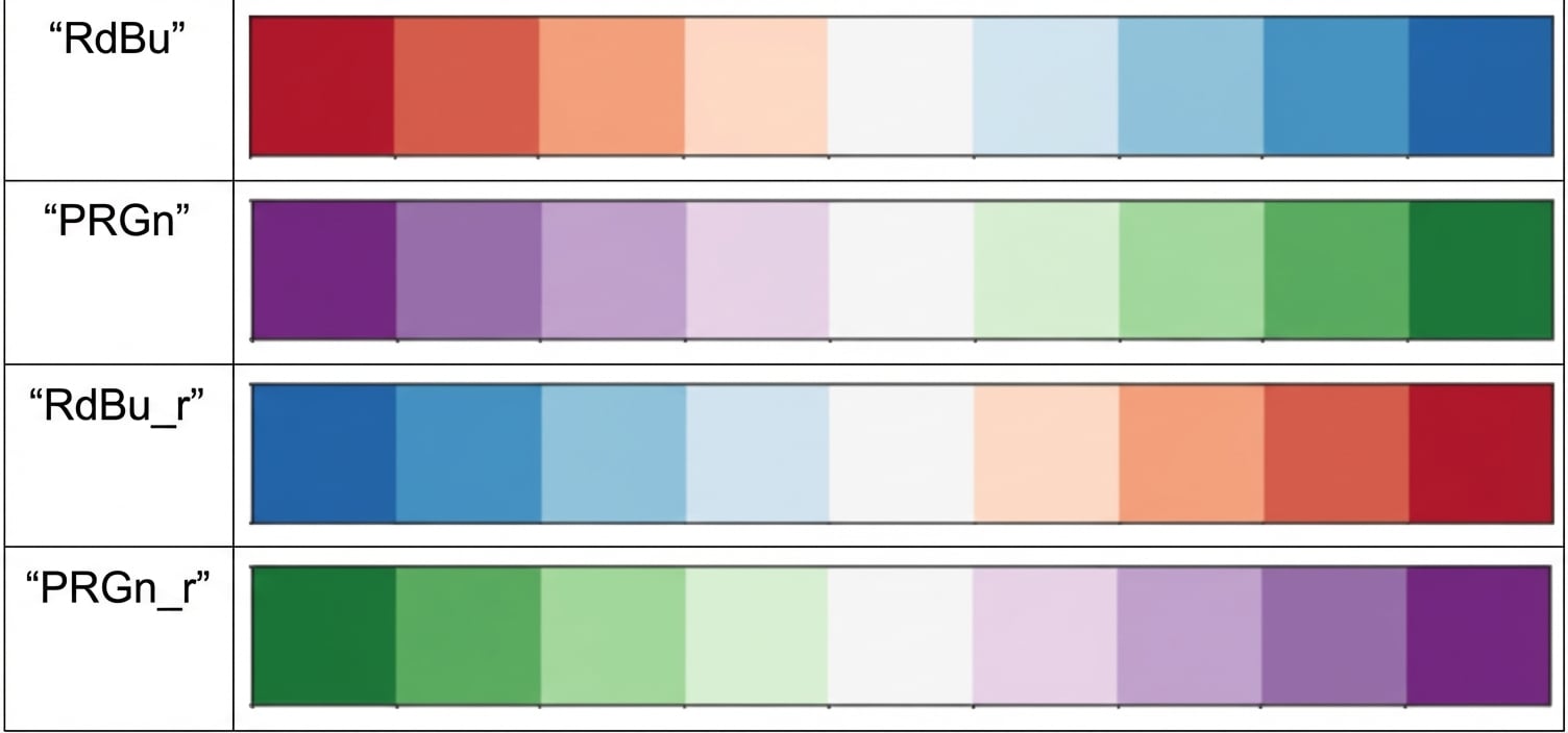
Divergerende paletten

Vier voorbeeld van divergerende paletten

Introductie tot datavisualisatie met Seaborn

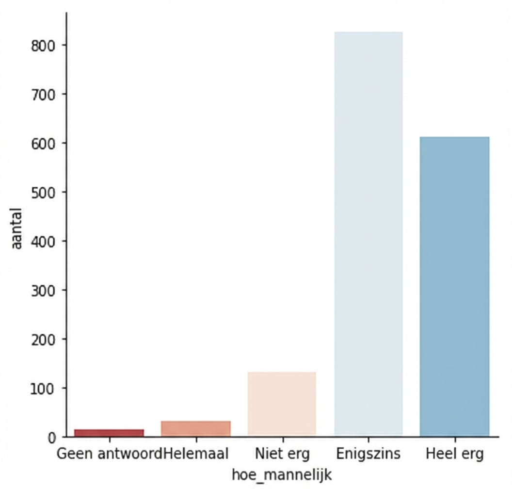
Voorbeeld (standaardpalet)

category_order = ["No answer", 
                  "Not at all",
                  "Not very", 
                  "Somewhat", 
                  "Very"]

sns.catplot(x="how_masculine",
            data=masculinity_data,
            kind="count",
            order=category_order)

plt.show()

Countplot van enquêteresultaten

Introductie tot datavisualisatie met Seaborn

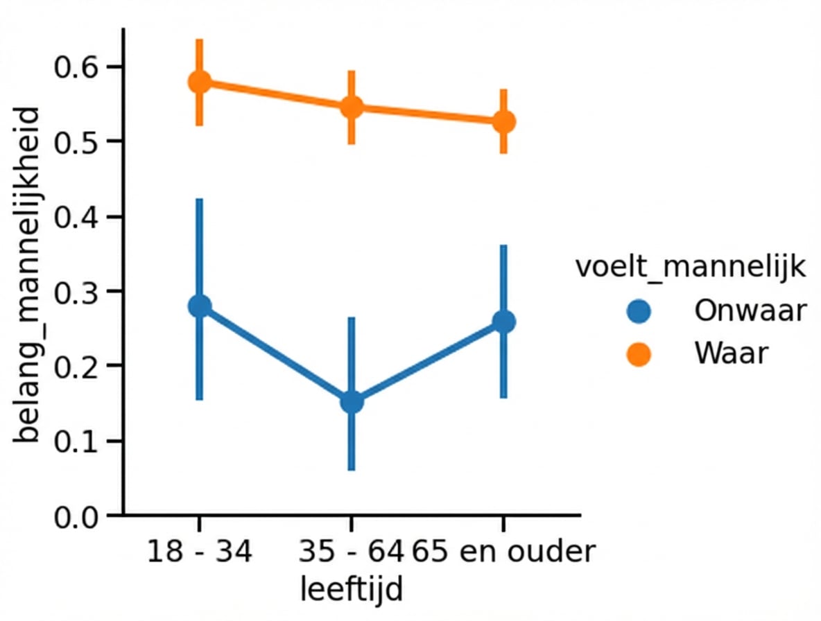
Voorbeeld (divergerend palet)

sns.set_palette("RdBu")

category_order = ["No answer", 
                  "Not at all",
                  "Not very", 
                  "Somewhat", 
                  "Very"]

sns.catplot(x="how_masculine",
            data=masculinity_data,
            kind="count",
            order=category_order)

plt.show()

Countplot met divergerend palet

Introductie tot datavisualisatie met Seaborn

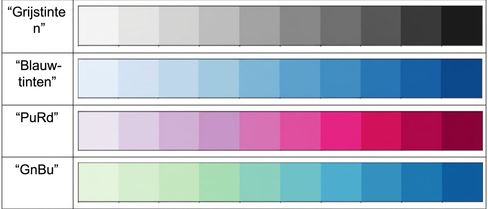
Sequentiële paletten

Vier voorbeeld van sequentiële paletten

Introductie tot datavisualisatie met Seaborn

Voorbeeld sequentieel palet

Spreidplot van pk vs. mpg met sequentieel palet

1 Waskom, M. L. (2021). seaborn: statistical data visualization. https://seaborn.pydata.org/
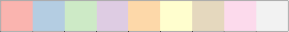
Introductie tot datavisualisatie met Seaborn

Aangepaste paletten

custom_palette = ["red", "green", "orange", "blue",
                  "yellow", "purple"]

sns.set_palette(custom_palette)

Aangepast palet met kleurnamen

Introductie tot datavisualisatie met Seaborn

Aangepaste paletten

custom_palette = ['#FBB4AE', '#B3CDE3', '#CCEBC5', 
                  '#DECBE4', '#FED9A6', '#FFFFCC', 
                  '#E5D8BD', '#FDDAEC', '#F2F2F2']

sns.set_palette(custom_palette)

Aangepast palet met hex-codes

Introductie tot datavisualisatie met Seaborn

Schaal aanpassen

  • Figuurcontext schaalt elementen en labels
  • sns.set_context()
  • Klein naar groot: "paper", "notebook", "talk", "poster"
Introductie tot datavisualisatie met Seaborn

Standaardcontext: "paper"

sns.catplot(x="age", 
            y="masculinity_important",
            data=masculinity_data,
            hue="feel_masculine",
            kind="point")

plt.show()

Puntplot met notebook-context

Introductie tot datavisualisatie met Seaborn

Grotere context: "talk"

sns.set_context("talk")

sns.catplot(x="age", 
            y="masculinity_important",
            data=masculinity_data,
            hue="feel_masculine",
            kind="point")

plt.show()

Puntplot met grotere context

Introductie tot datavisualisatie met Seaborn

Laten we oefenen!

Introductie tot datavisualisatie met Seaborn

Preparing Video For Download...