Introductie tot Seaborn

Introductie tot datavisualisatie met Seaborn

Content Team

DataCamp

Wat is Seaborn?

  • Python-bibliotheek voor datavisualisatie
  • Maak snel de meestgebruikte plottypes

Boxplots van totale rekening per weekdag, uitgesplitst naar man vs. vrouw

1 Waskom, M. L. (2021). seaborn: statistical data visualization. https://seaborn.pydata.org/
Introductie tot datavisualisatie met Seaborn

Waarom is Seaborn nuttig?

Afbeelding van een data-analyseworkflow

Introductie tot datavisualisatie met Seaborn

Voordelen van Seaborn

  • Makkelijk te gebruiken
  • Werkt goed met pandas-datastructuren
  • Gebouwd op matplotlib
Introductie tot datavisualisatie met Seaborn

Aan de slag

import seaborn as sns

import matplotlib.pyplot as plt

Samuel Norman Seaborn (sns)

  • Televisieserie “The West Wing”
Introductie tot datavisualisatie met Seaborn

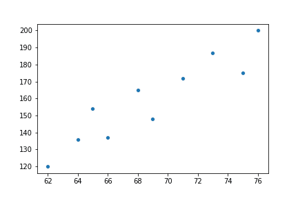
Voorbeeld 1: Spreidingsdiagram

import seaborn as sns
import matplotlib.pyplot as plt

height = [62, 64, 69, 75, 66, 68, 65, 71, 76, 73] weight = [120, 136, 148, 175, 137, 165, 154, 172, 200, 187]
sns.scatterplot(x=height, y=weight)
plt.show()

Spreidingsdiagram van lengte vs. gewicht

Introductie tot datavisualisatie met Seaborn

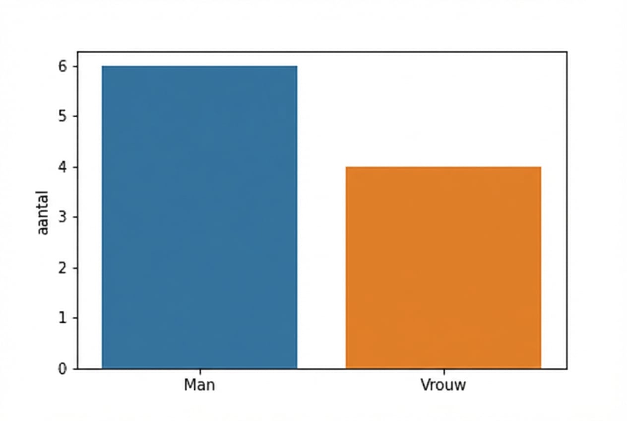
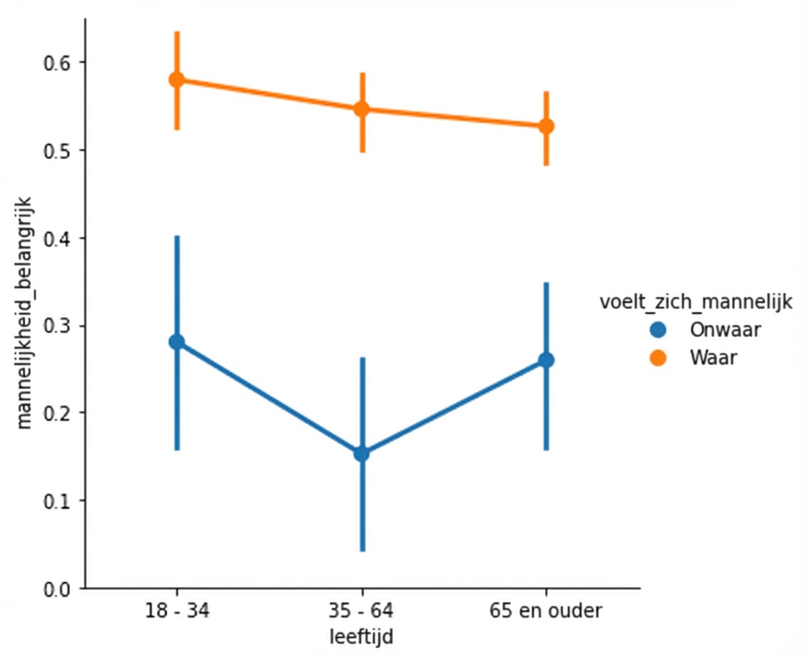
Voorbeeld 2: Countplot maken

import seaborn as sns
import matplotlib.pyplot as plt

gender = ["Female", "Female", "Female", "Female", "Male", "Male", "Male", "Male", "Male", "Male"]
sns.countplot(x=gender)
plt.show()

Staafdiagram van aantallen per geslacht

Introductie tot datavisualisatie met Seaborn

Spreidingsdiagram met zwarte en rode kleuren

Lijndiagram met markers en volle lijnen

Pointplot van masculiniteit met hue

Spreidingsdiagram van pk vs. mpg met sequentiële palet

1 Waskom, M. L. (2021). seaborn: statistical data visualization. https://seaborn.pydata.org/
Introductie tot datavisualisatie met Seaborn

Laten we oefenen!

Introductie tot datavisualisatie met Seaborn

Preparing Video For Download...