Je staaf- en puntdiagrammen finetunen
Best practices voor visualisaties in R

Nick Strayer
Instructor
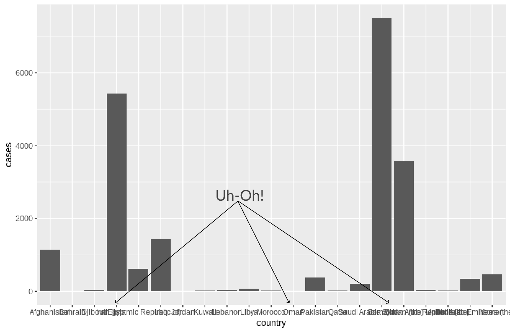
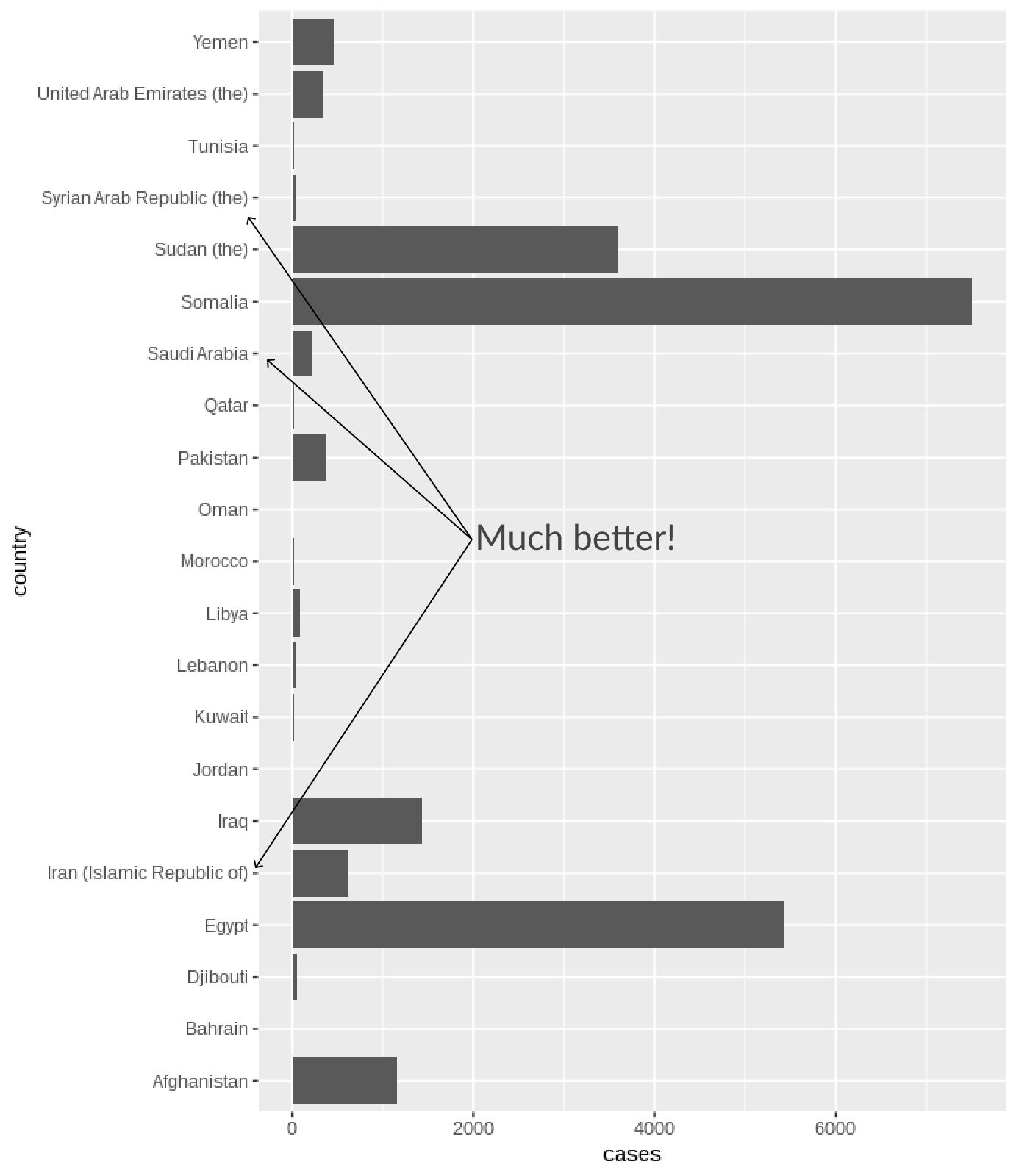
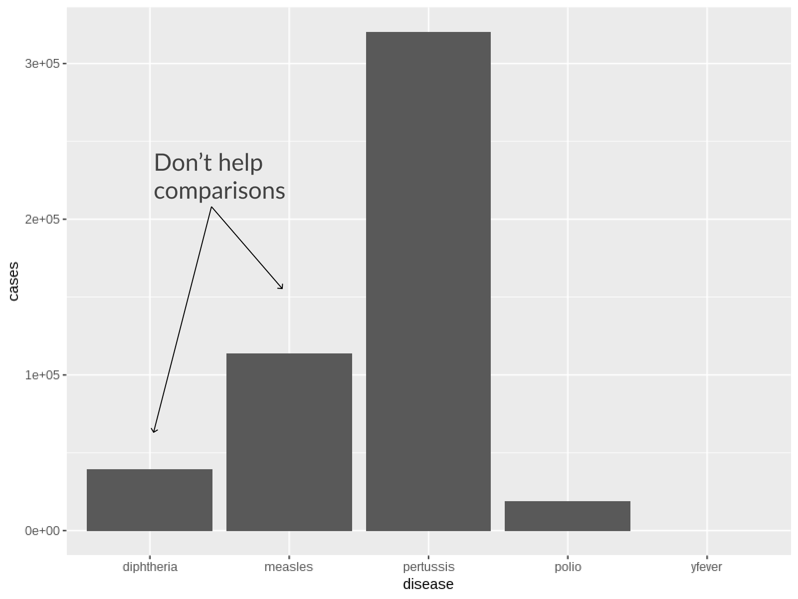
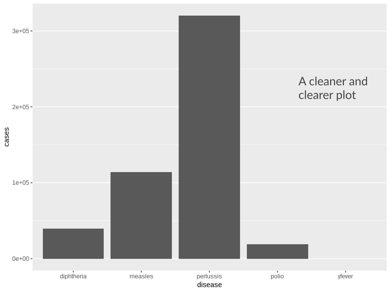
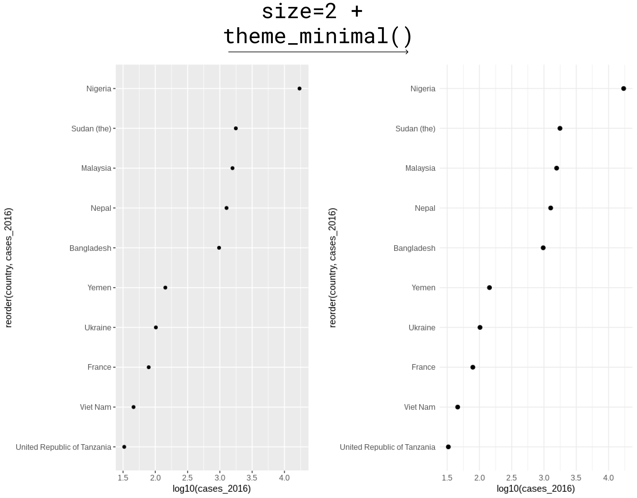
Te veel raster
- Geen parallelle rasters nodig bij staven
- In puntdiagrammen volstaat raster op puntposities
Best practices voor visualisaties in R
Nick Strayer
Instructor

