Assen bewerken
Introductie tot datavisualisatie met Plotly in Python

Alex Scriven
Data Scientist
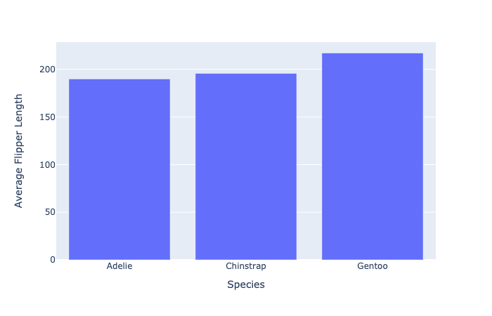
Standaard as-titels

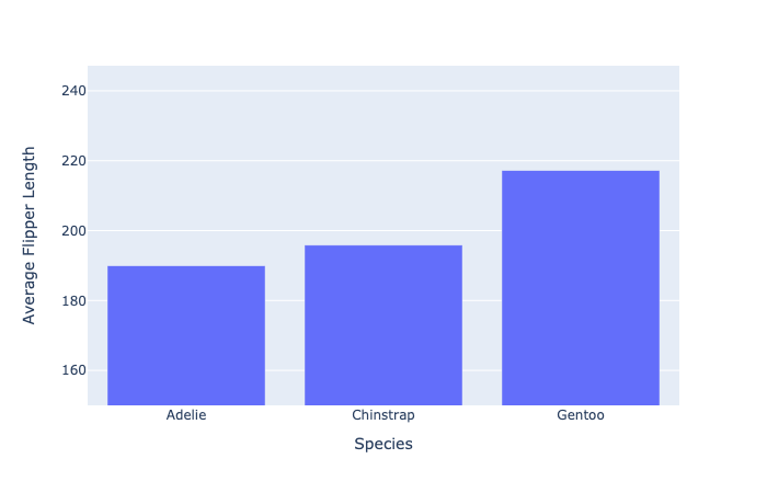
Onze plot opschonen
Assenbereiken bewerken
- Stel de y-as in van 150 tot de maximumwaarde (met kleine marge)
fig.update_layout(dict(
    yaxis=dict(range=[150, penguin_flippers["av_flip_length"].max() + 30]
    )))
Onze nieuwe asbereiken
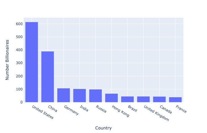
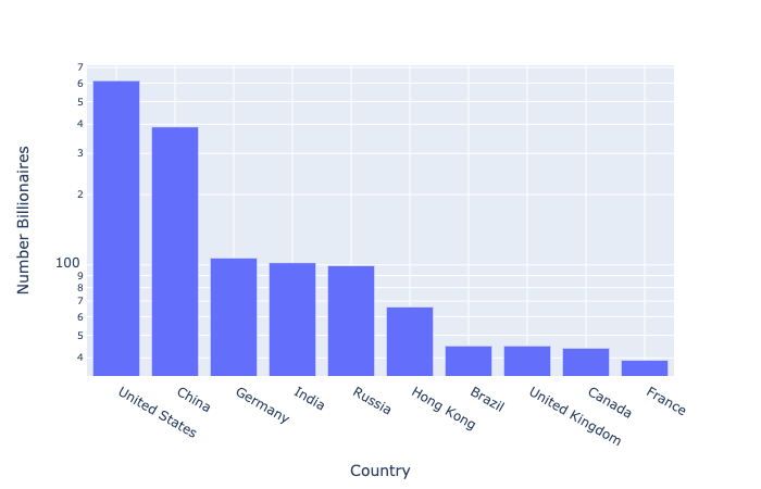
Schaalproblemen in data
Wat als sommige datapunten veel groter zijn dan andere?
- Top 10 landen naar aantal miljardairs
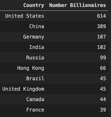
Ons schaalprobleem
De log-schaal
- Gebruikt bij grote waardeverschillen
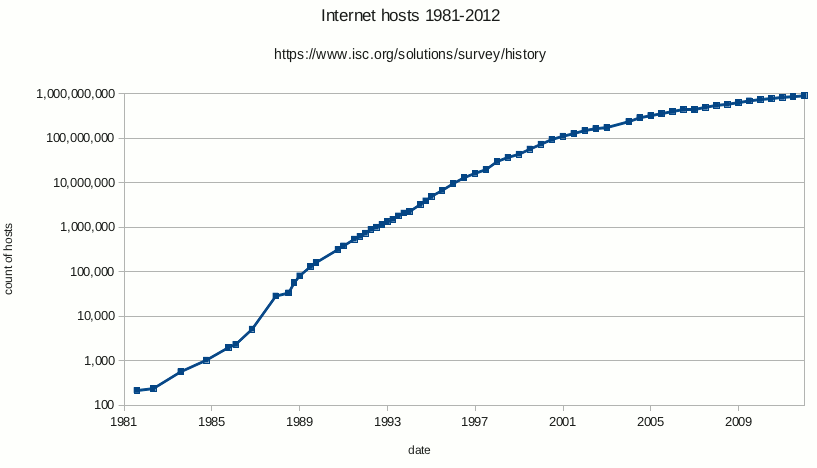
- Elke tick is tien keer de vorige (10, 100, 1000, enz.)
Log toepassen op onze data
$$
Log-schaal: let op
💡 Houd altijd je publiek in gedachten bij het kiezen van een visualisatie