Kleur aanpassen
Introductie tot datavisualisatie met Plotly in Python

Alex Scriven
Data Scientist
Waarom kleur aanpassen?
Een beetje kleurtheorie
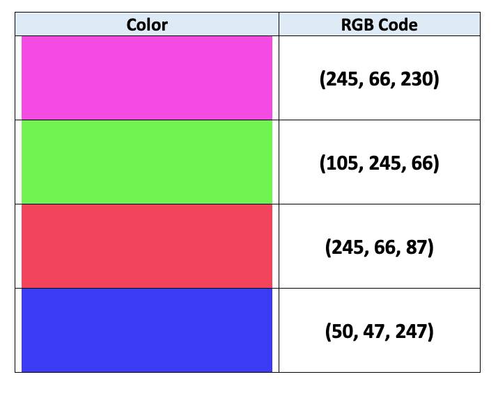
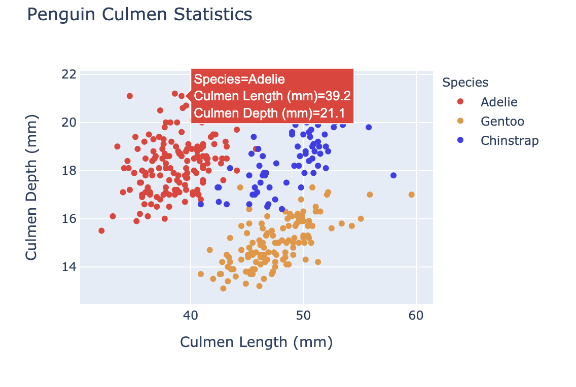
Onze kleuren onthuld
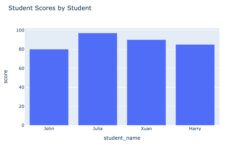
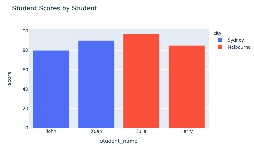
De plot vóór:
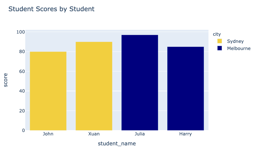
Onze plot na:
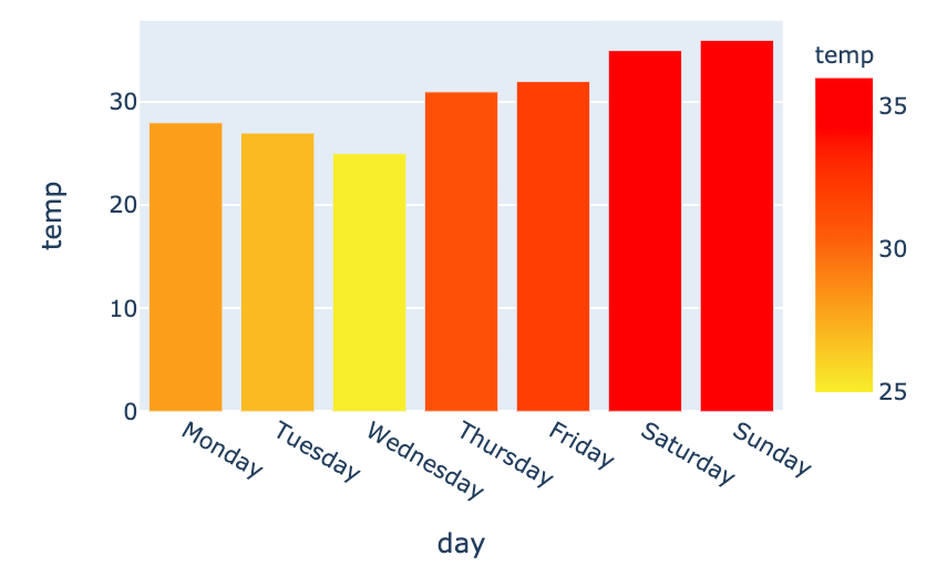
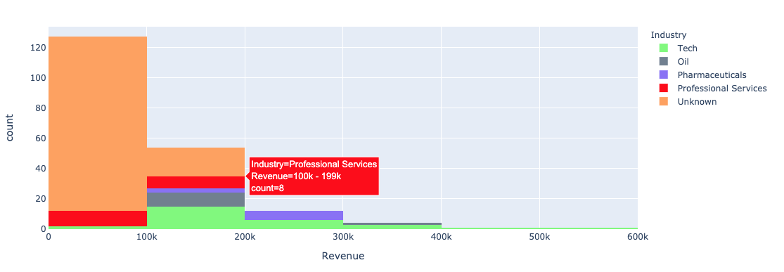
Kleur bij univariate plots
Onze specifieke kleuren
Kleurenschalen in plotly.express
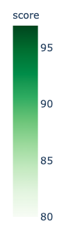
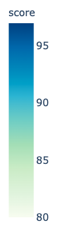
Ingebouwde kleurenschalen gebruiken
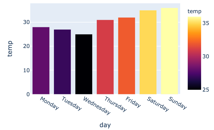
Eigen kleurverloop maken