Plotly en de Plotly-figure
Introductie tot datavisualisatie met Plotly in Python

Alex Scriven
Data Scientist
Wat is Plotly?
- Een JavaScript-visualisatiebibliotheek
- Geen zorgen: je hoeft geen JavaScript te kennen!
- Plotly heeft een Python-wrapper
Onze figure onthuld
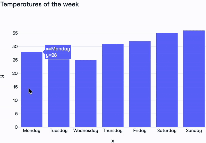
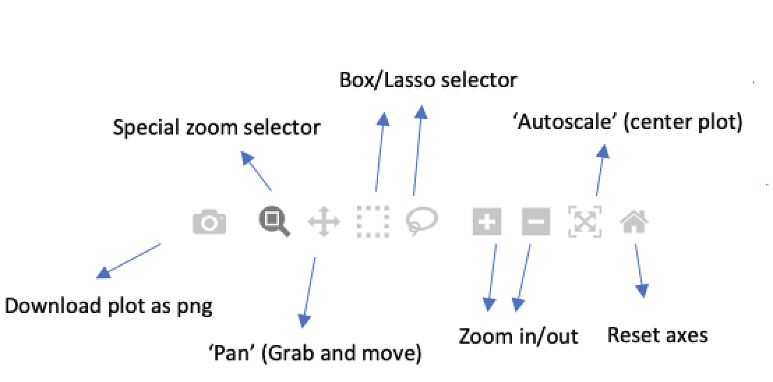
Directe interactiviteit van Plotly
$$
- Hover over punten
- Extra interactieve knoppen