Bivariate visualisaties
Introductie tot datavisualisatie met Plotly in Python

Alex Scriven
Data Scientist
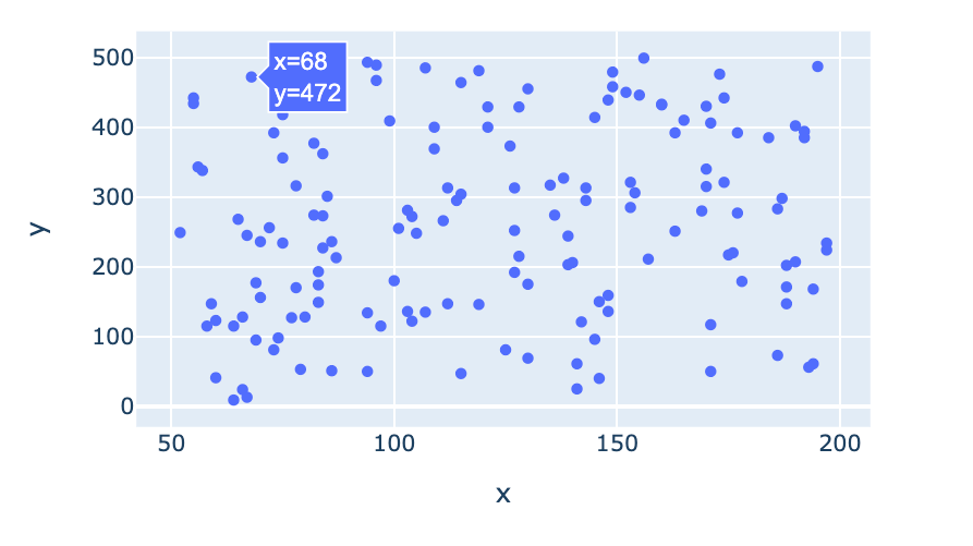
Scatterplot
- Een y-as voor één variabele
- Een x-as voor een andere variabele
- Elk snijpunt is een punt, bijv. (68, 472)
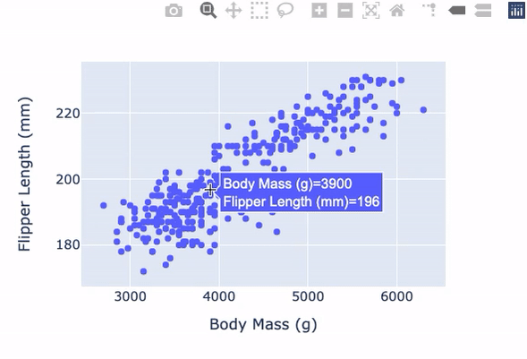
Scatterplot met plotly.express
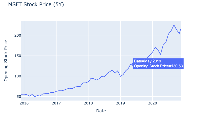
Lijngrafieken in plotly.express
$$
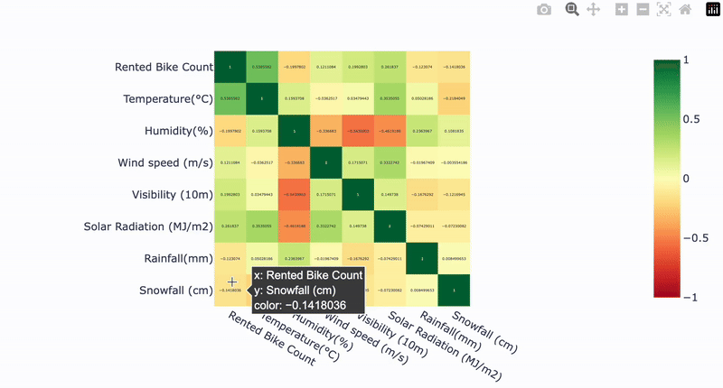
Correlatieplot voorbereiden
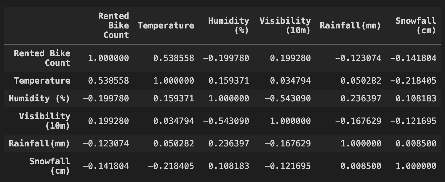
Onze correlatieplot