Subplots
Introductie tot datavisualisatie met Plotly in Python

Alex Scriven
Data Scientist
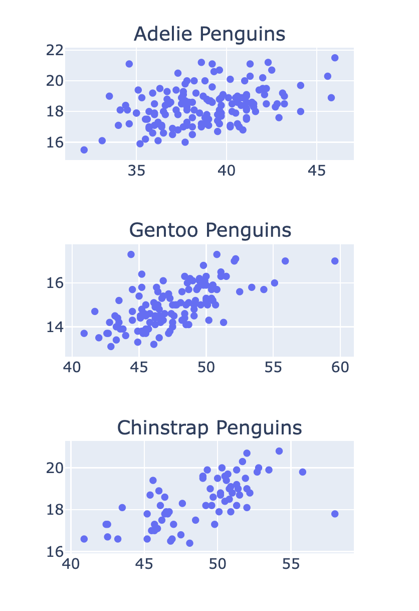
Wat zijn subplots?
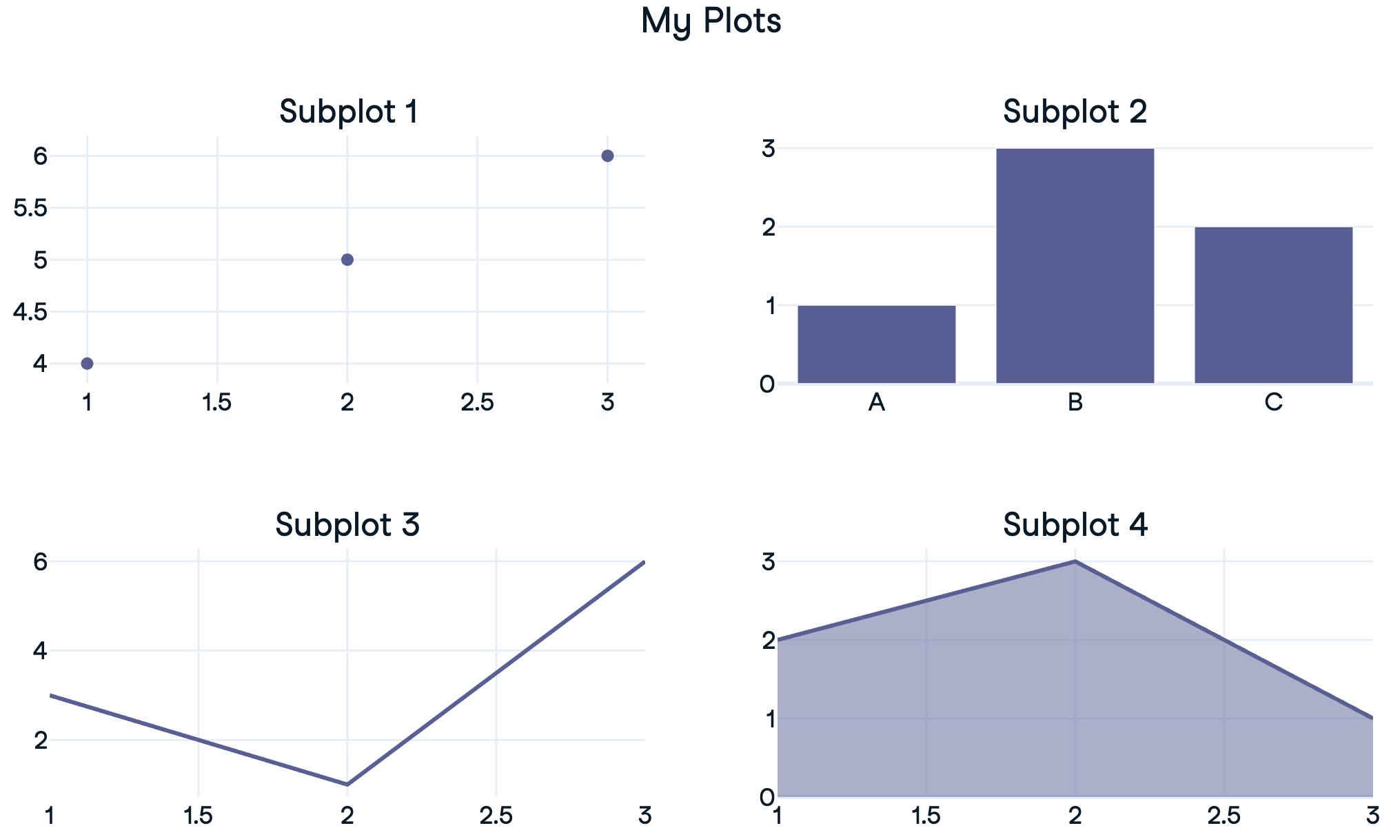
Een 1x2-subplot maken
Subplots aanpassen
Subplot-titels
Meer opties in de documentatie
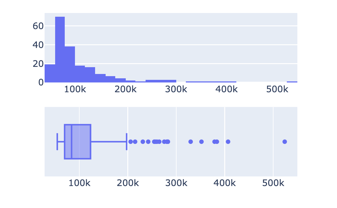
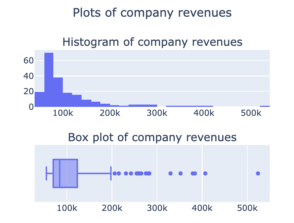
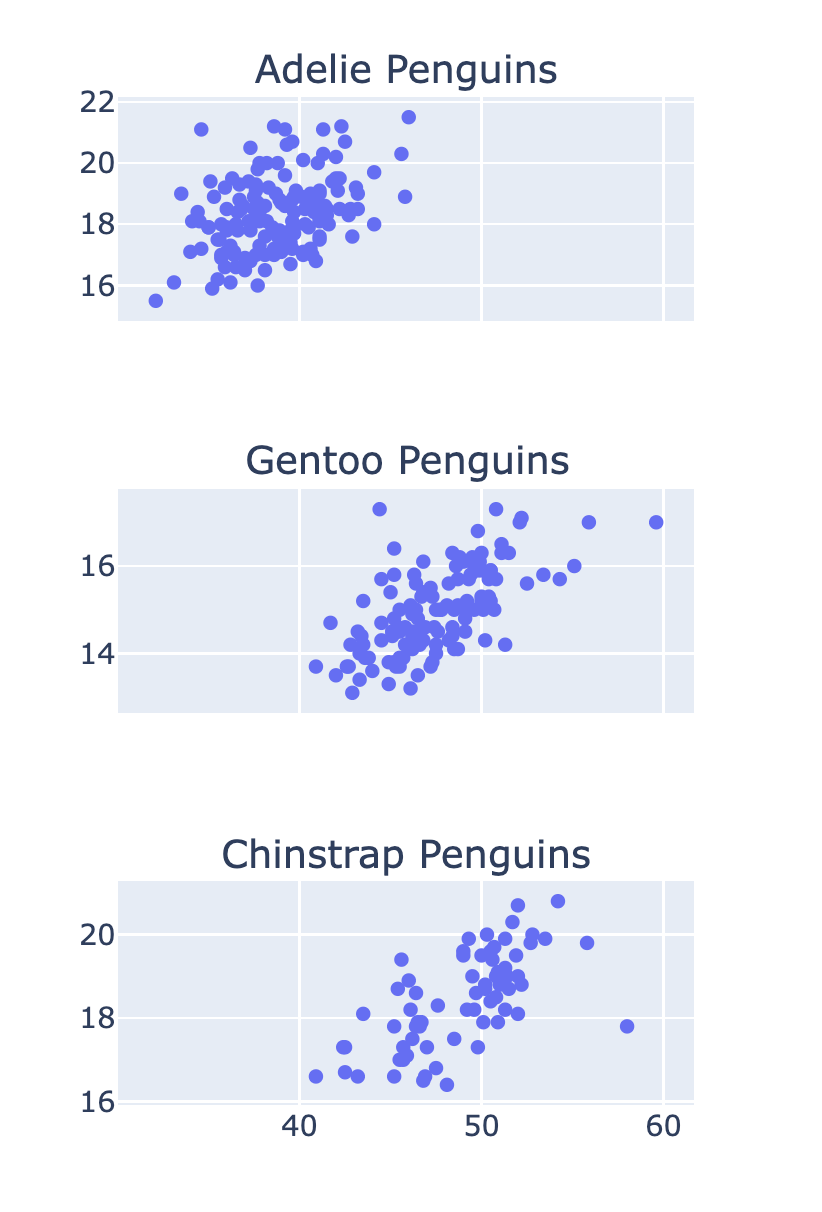
Gestapelde subplots
Subplots met gedeelde assen
Introductie tot datavisualisatie met Plotly in Python
Alex Scriven
Data Scientist
Meer opties in de documentatie

