Making better plots
Categorische gegevens in de Tidyverse

Emily Robinson
Data Scientist
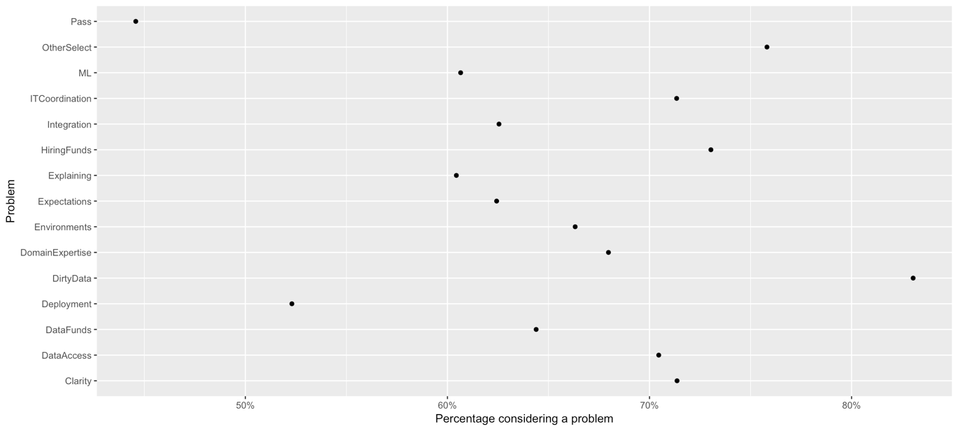
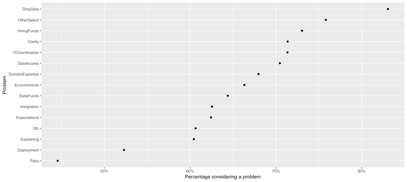
Reordering factors
ggplot(WorkChallenges, aes(x = fct_reorder(question, perc_problem),
                           y = perc_problem)) +
  geom_point() +
  coord_flip()
Reordering bar chart
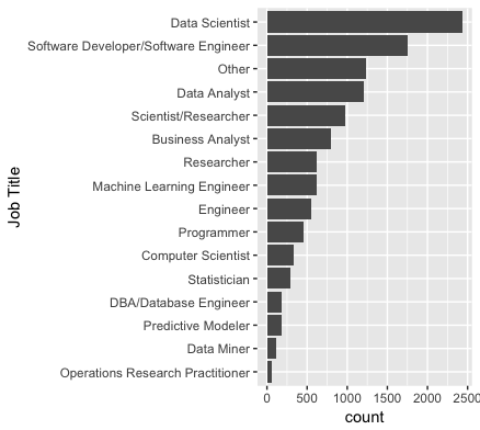
ggplot(multiple_choice_responses, aes(x = fct_infreq(CurrentJobTitleSelect)) +
   geom_bar() +
   coord_flip()

Reversing factor levels
ggplot(multiple_choice_responses, aes(x = fct_rev(fct_infreq(CurrentJobTitleSelect)))) +
    geom_bar() +
    coord_flip()