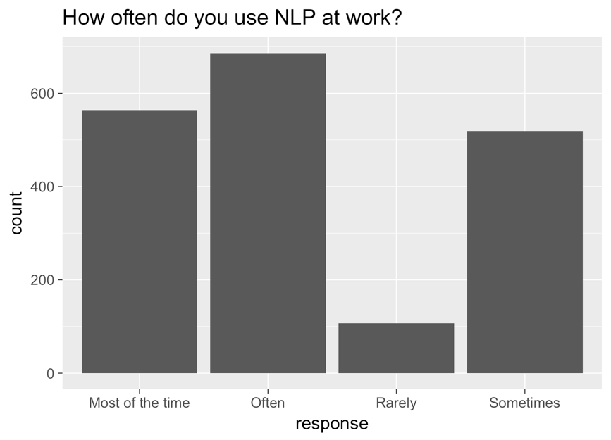
Reordering factors
Categorische gegevens in de Tidyverse

Emily Robinson
Data Scientist
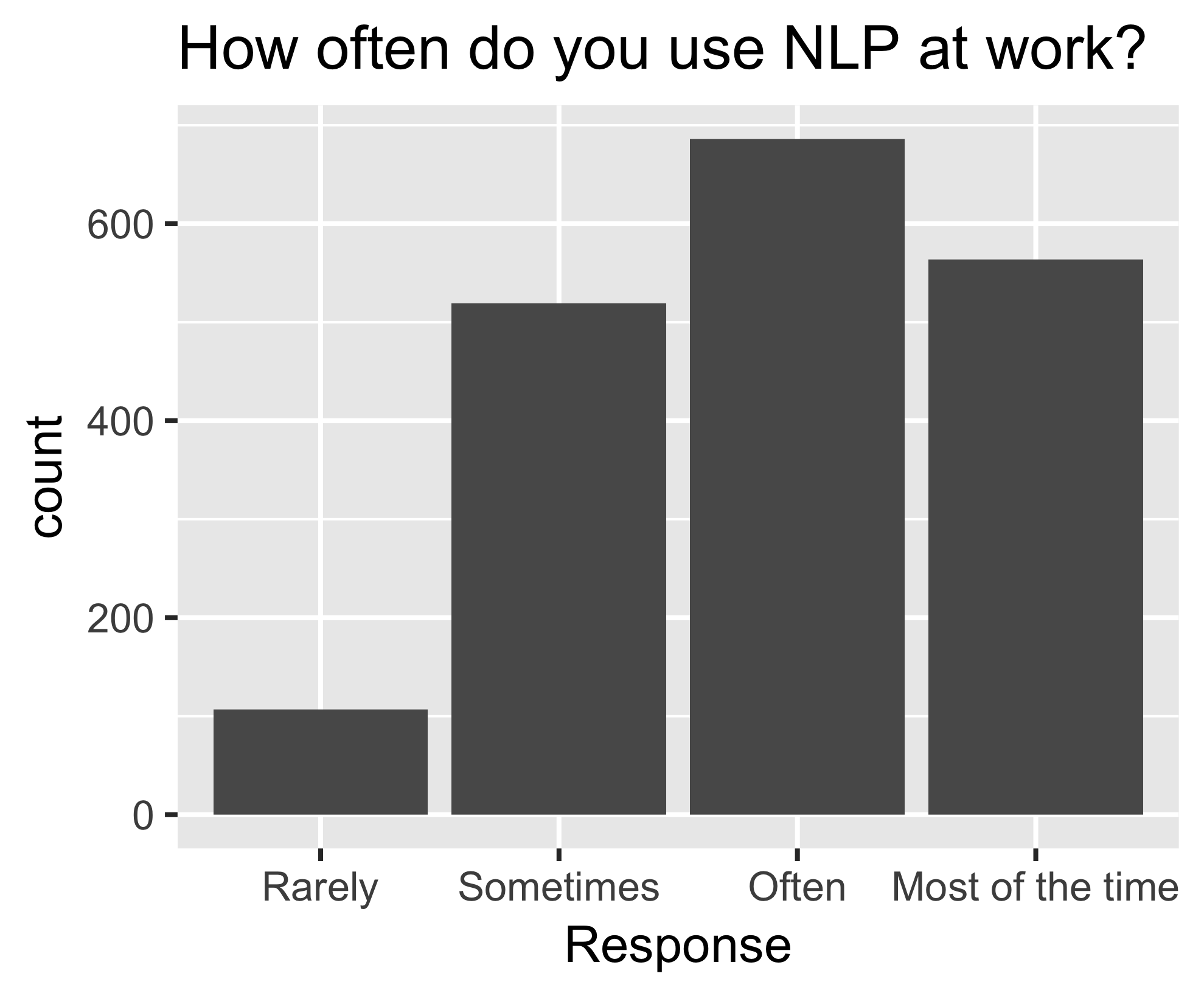
Corrected graph
ggplot(aes(nlp_frequency,
            x = fct_relevel(response,
            "Rarely", "Sometimes", "Often", "Most of the time"))) +
        geom_bar()