Je datavisualisaties verbeteren in Python
Nick Strayer
Instructor
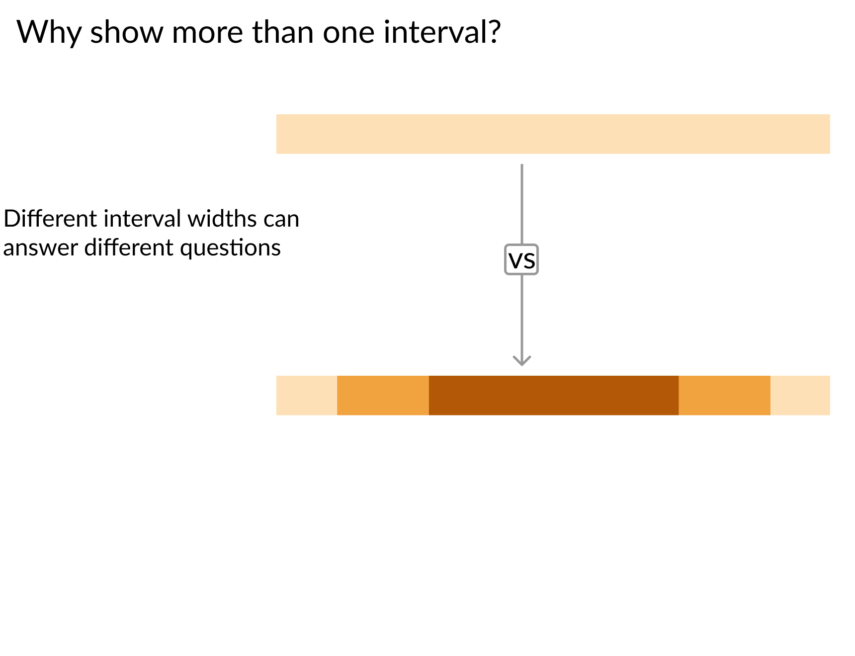
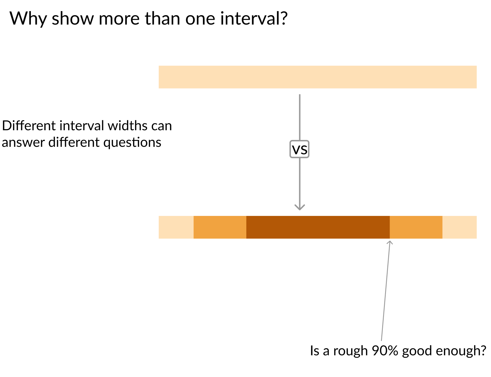
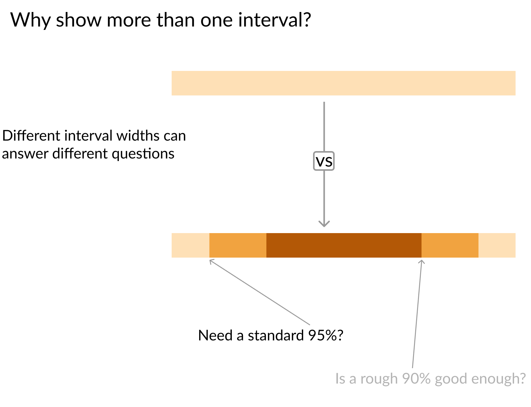
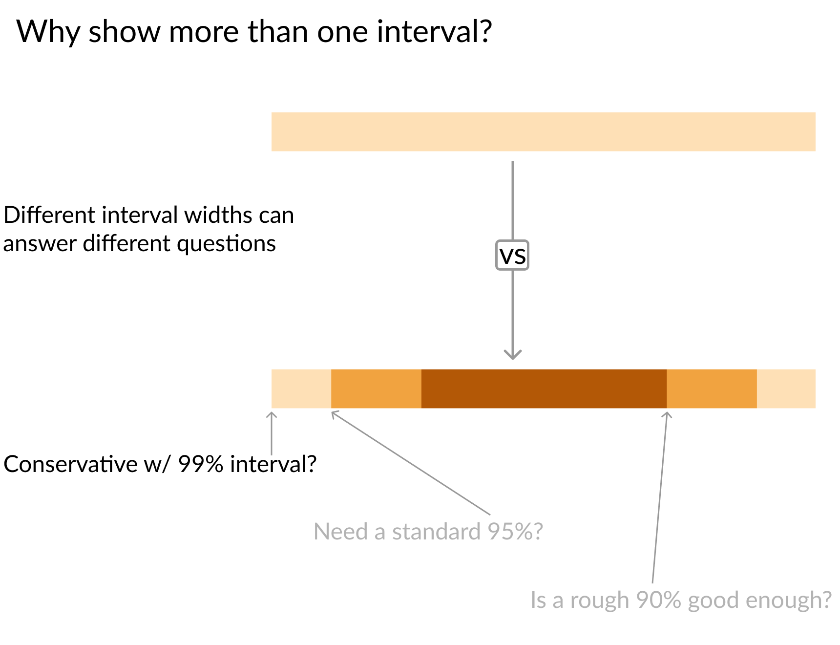
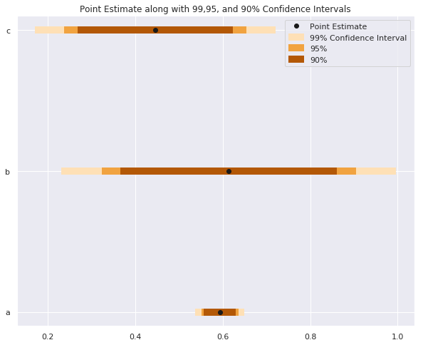
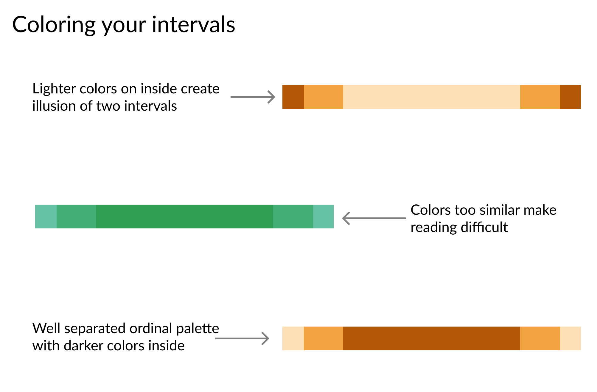
# Intervalgrootte instellen
sizes    = ['99%', '95%', '90%']
Z_scores = [2.58,   1.96,  1.67]
colors   = ['#fee0b6','#f1a340', '#b35806']


for size, z, color in zip(sizes, Z_scores, colors):

    plt.hlines(y = data.y,
               # Bereken onder- en bovengrens
               xmin = data['est'] - z*data['std_err'],
               xmax = data['est'] + z*data['std_err'],
               # Kleur op basis van intervalgrootte
               color = color,

               # Dikkere lijn voor zichtbaarheid
               linewidth = 7,

               # Label voor duidelijke legenda
               label = size)

plt.plot('est', 'y', 'ko', data = data, label = 'Puntschatting')
plt.legend()
# Intervalgrootte instellen sizes = ['99%', '95%', '90%'] Z_scores = [2.58, 1.96, 1.67] colors = ['#fee0b6','#f1a340', '#b35806']
for size, z, color in zip(sizes, Z_scores, colors): plt.hlines(y = data.y, # Bereken onder- en bovengrens xmin = data['est'] - z*data['std_err'], xmax = data['est'] + z*data['std_err'], # Kleur op basis van intervalgrootte color = color,
# Dikkere lijn voor zichtbaarheid linewidth = 7,
# Label voor duidelijke legenda label = size)
plt.plot('est', 'y', 'ko', data = data, label = 'Puntschatting') plt.legend()
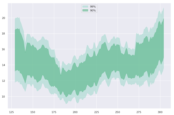
widths   = [    '99%',     '90%']
z_scores = [     2.58,      1.67]
colors   = ['#99d8c9', '#41ae76']

for percent, Z, color in zip(widths, z_scores, colors):
    # Kleur instellen om banden te onderscheiden
    plt.fill_between(
        x=data.day,
        y1=data['mean'] - Z*data['std_err'],
        y2=data['mean'] + Z*data['std_err']
        color=color,

        # Lagere dekking zodat raster zichtbaar blijft
        alpha=0.5,

        # Geef elke band een label voor de legenda
        label=percent)
widths = [ '99%', '90%'] z_scores = [ 2.58, 1.67] colors = ['#99d8c9', '#41ae76'] for percent, Z, color in zip(widths, z_scores, colors): # Kleur instellen om banden te onderscheiden plt.fill_between( x=data.day, y1=data['mean'] - Z*data['std_err'], y2=data['mean'] + Z*data['std_err'] color=color,
# Lagere dekking zodat raster zichtbaar blijft alpha=0.5,
# Geef elke band een label voor de legenda label=percent)
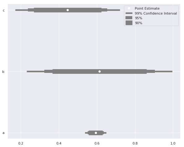
sizes = ['99% betrouwbaarheidsinterval', '95%', '90%']

# Verschillende lijndiktes voor intervallen
widths   = [   5,     10,    15]
Z_scores = [2.58,   1.96,  1.67]

for size, z, width in zip(sizes, Z_scores, widths):
    plt.hlines(
        y = data.y, label = size,
        xmin = data['est'] - z*data['std_err'],
        xmax = data['est'] + z*data['std_err'],
        color = 'grey'

        # Pas lijndikte aan per interval
        linewidth = width)

plt.plot('est', 'y', 'wo', data = data, label = 'Puntschatting')
plt.legend()
sizes = ['99% betrouwbaarheidsinterval', '95%', '90%'] # Verschillende lijndiktes voor intervallen widths = [ 5, 10, 15] Z_scores = [2.58, 1.96, 1.67] for size, z, width in zip(sizes, Z_scores, widths): plt.hlines( y = data.y, label = size, xmin = data['est'] - z*data['std_err'], xmax = data['est'] + z*data['std_err'], color = 'grey'
# Pas lijndikte aan per interval linewidth = width)
plt.plot('est', 'y', 'wo', data = data, label = 'Puntschatting') plt.legend()