Demografische data in kaart brengen met ggplot2

US Census-gegevens analyseren in R

Kyle Walker

Instructor
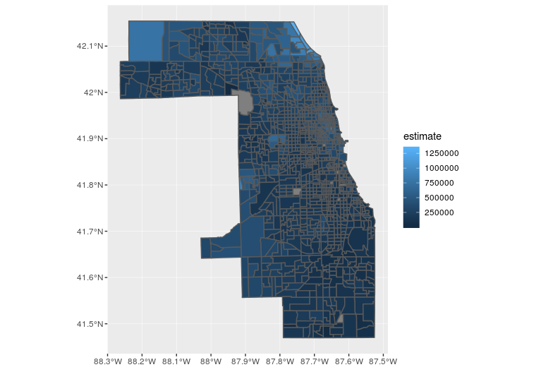
Een eenvoudige choropleth-kaart met geom_sf()

library(ggplot2)

ggplot(cook_value, aes(fill = estimate)) + 
  geom_sf()
US Census-gegevens analyseren in R

eerste Cook County-ggplot

US Census-gegevens analyseren in R

Kaartkleuren aanpassen

ggplot(cook_value, aes(fill = estimate, color = estimate)) + 
  geom_sf() + 
  scale_fill_viridis_c() +  
  scale_color_viridis_c()
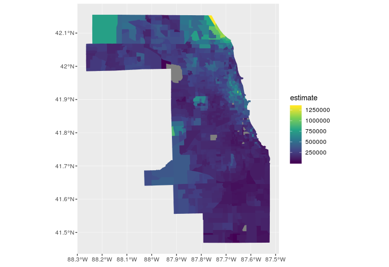
Cook County-plot met viridis

US Census-gegevens analyseren in R

De kaartuitvoer aanpassen

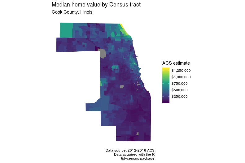
ggplot(cook_value, aes(fill = estimate, color = estimate)) + 
  geom_sf() + 
  scale_fill_viridis_c(labels = scales::dollar) +  
  scale_color_viridis_c(guide = FALSE) + 
  theme_minimal() + 
  coord_sf(crs = 26916, datum = NA) + 
  labs(title = "Median home value by Census tract", 
       subtitle = "Cook County, Illinois", 
       caption = "Data source: 2012-2016 ACS.\nData acquired with the R 
                  tidycensus package.", 
       fill = "ACS estimate")
US Census-gegevens analyseren in R

Opgemaakte Cook County-ggplot

US Census-gegevens analyseren in R

Laten we oefenen!

US Census-gegevens analyseren in R

Preparing Video For Download...