Efficiënte visualisaties met lay-outs
Introductie tot datavisualisatie met Julia

Gustavo Vieira Suñe
Data Analyst
Lay-outs
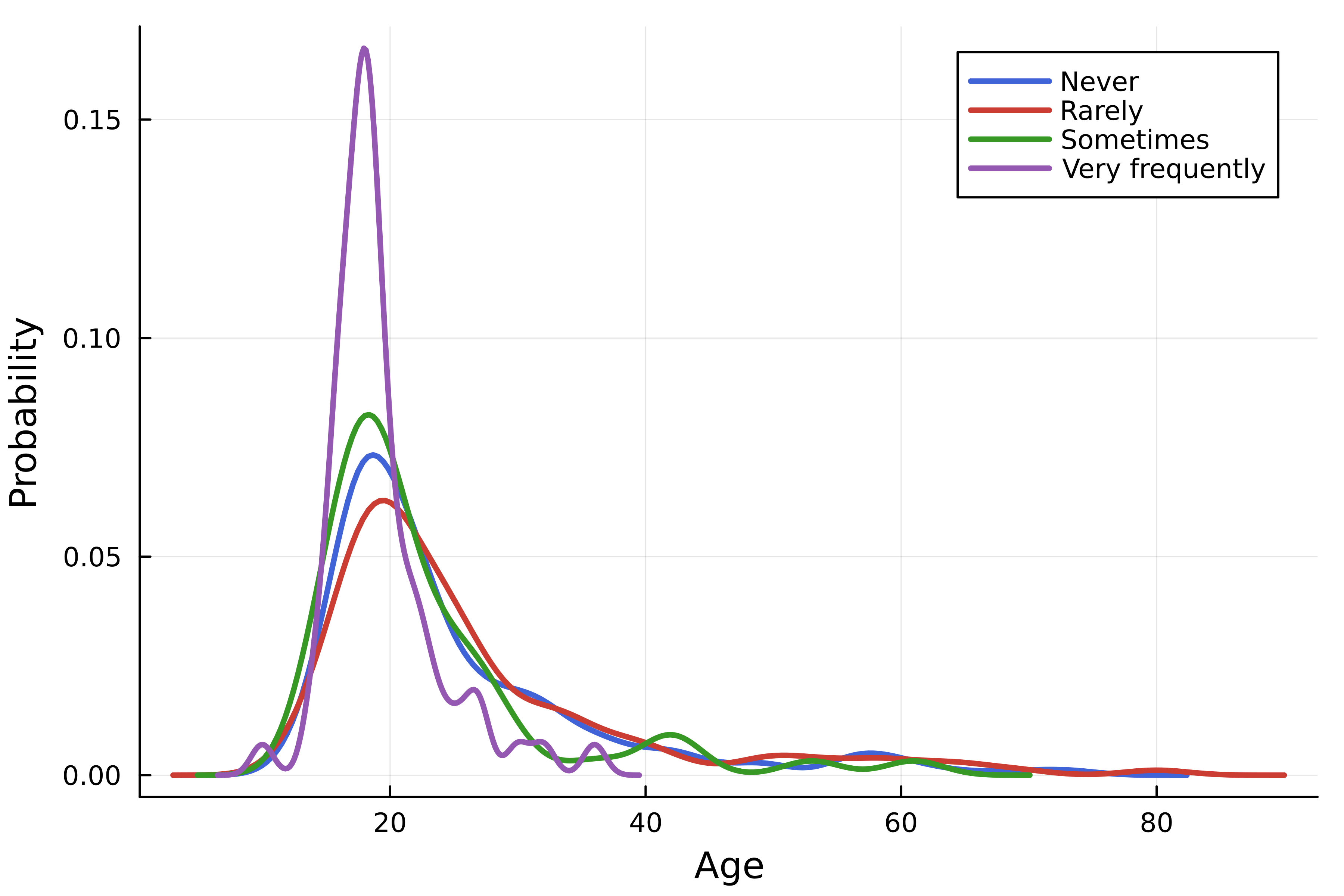
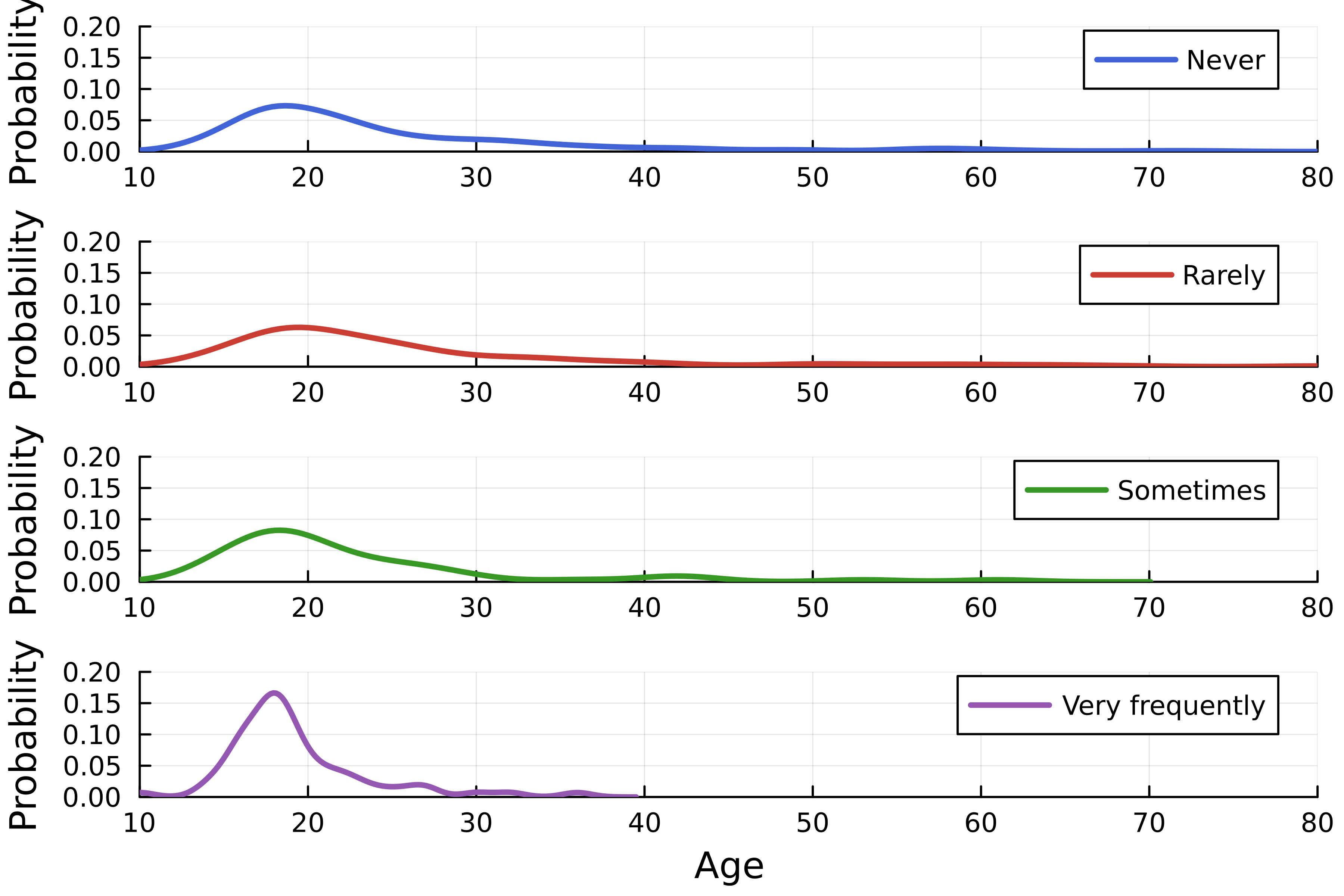
- Meerdere curves in één figuur
- Plotraster (
layout)
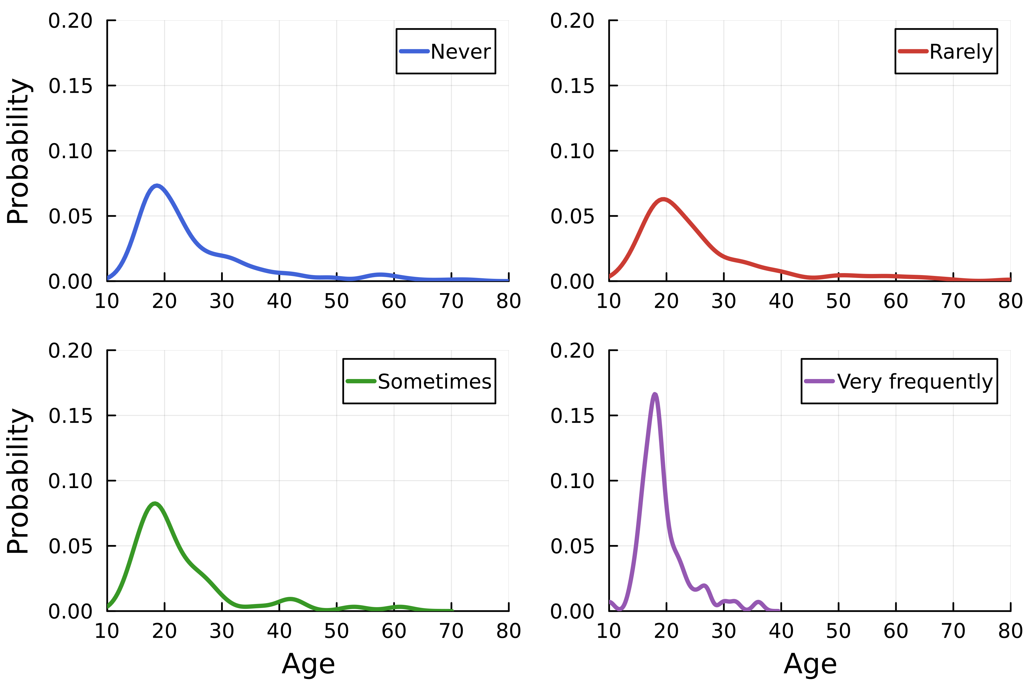
Het raster
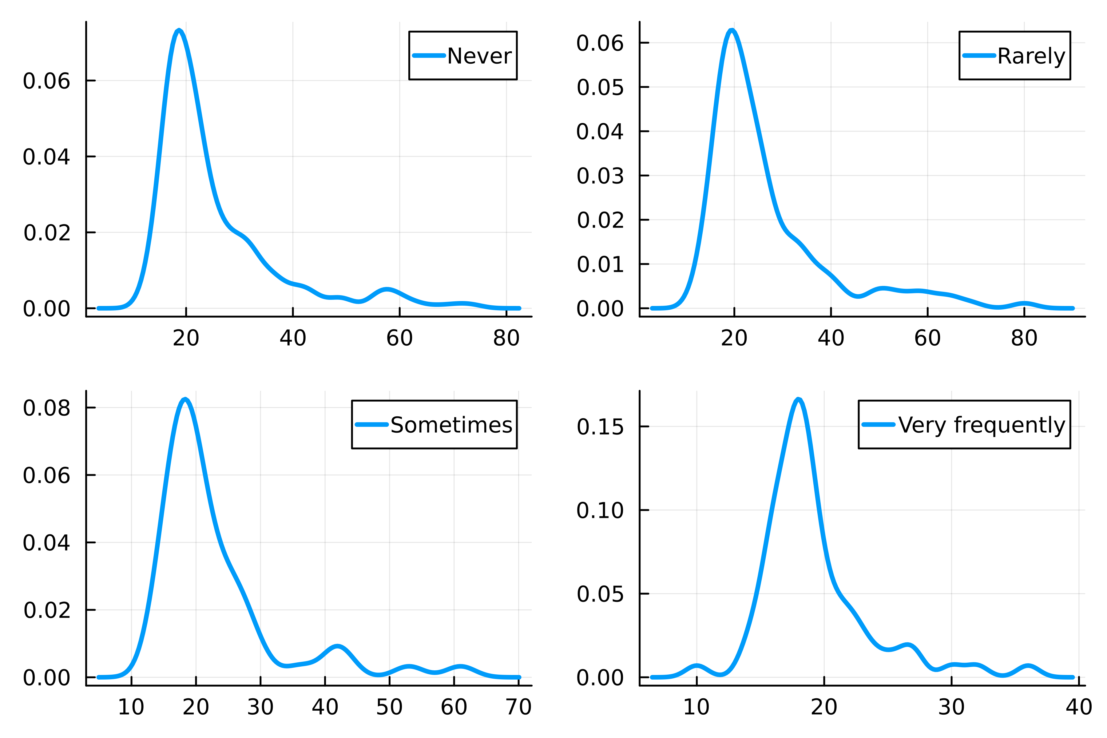
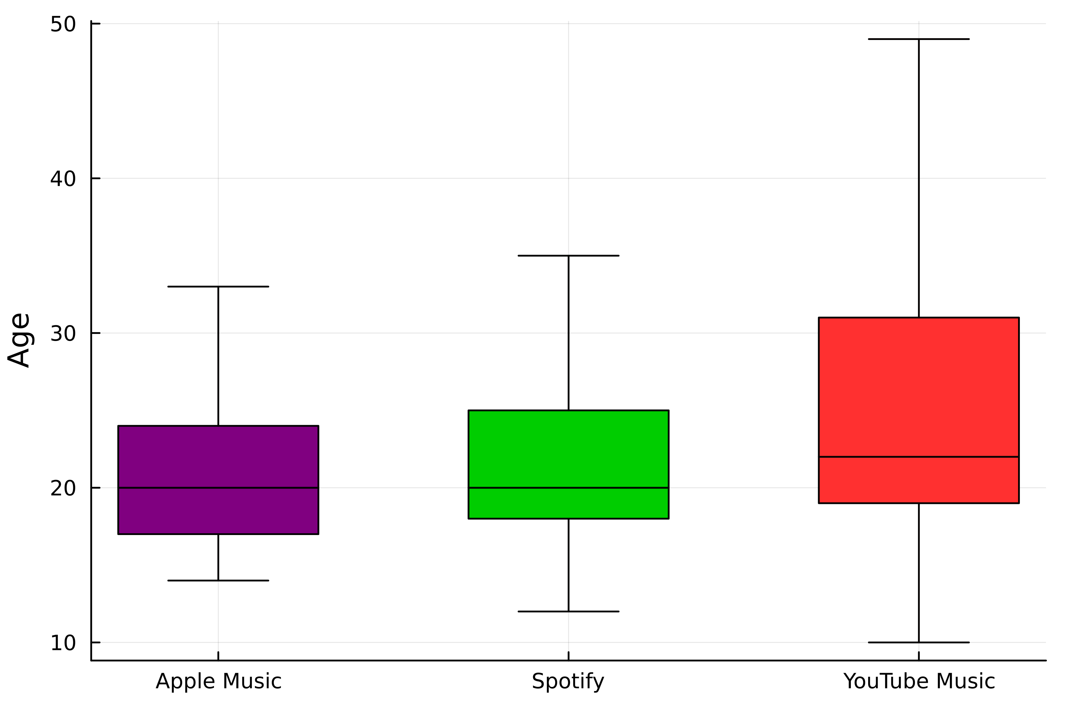
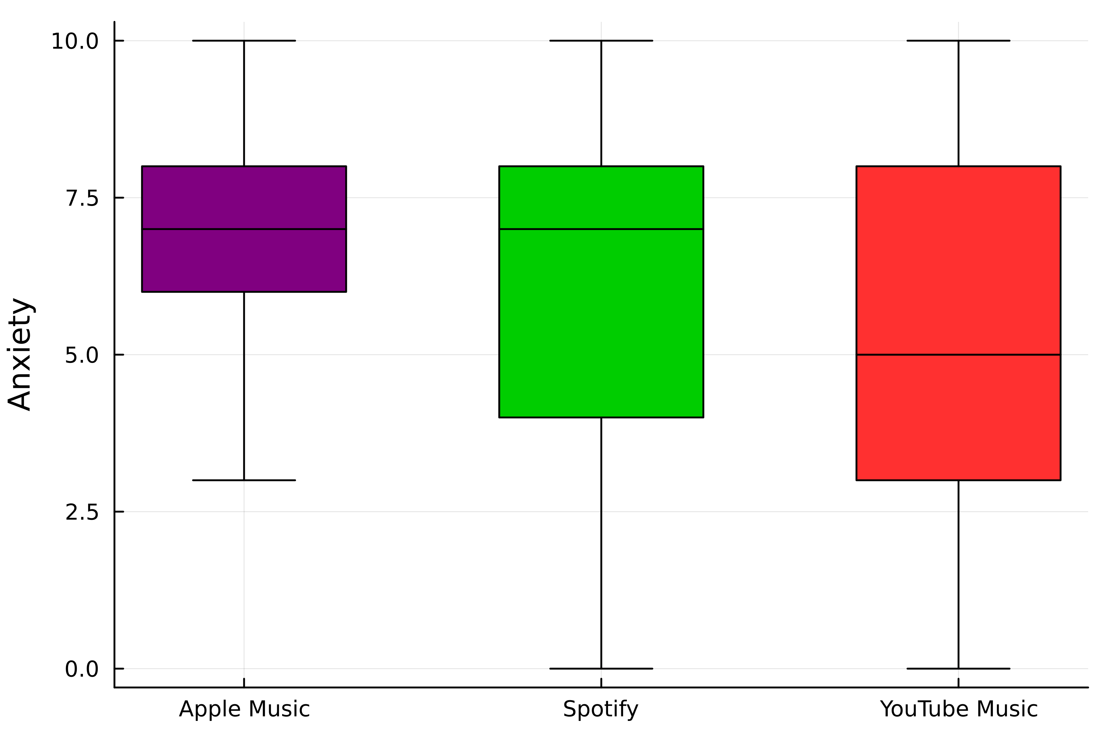
Rasterelementen aanpassen
Het raster regelen
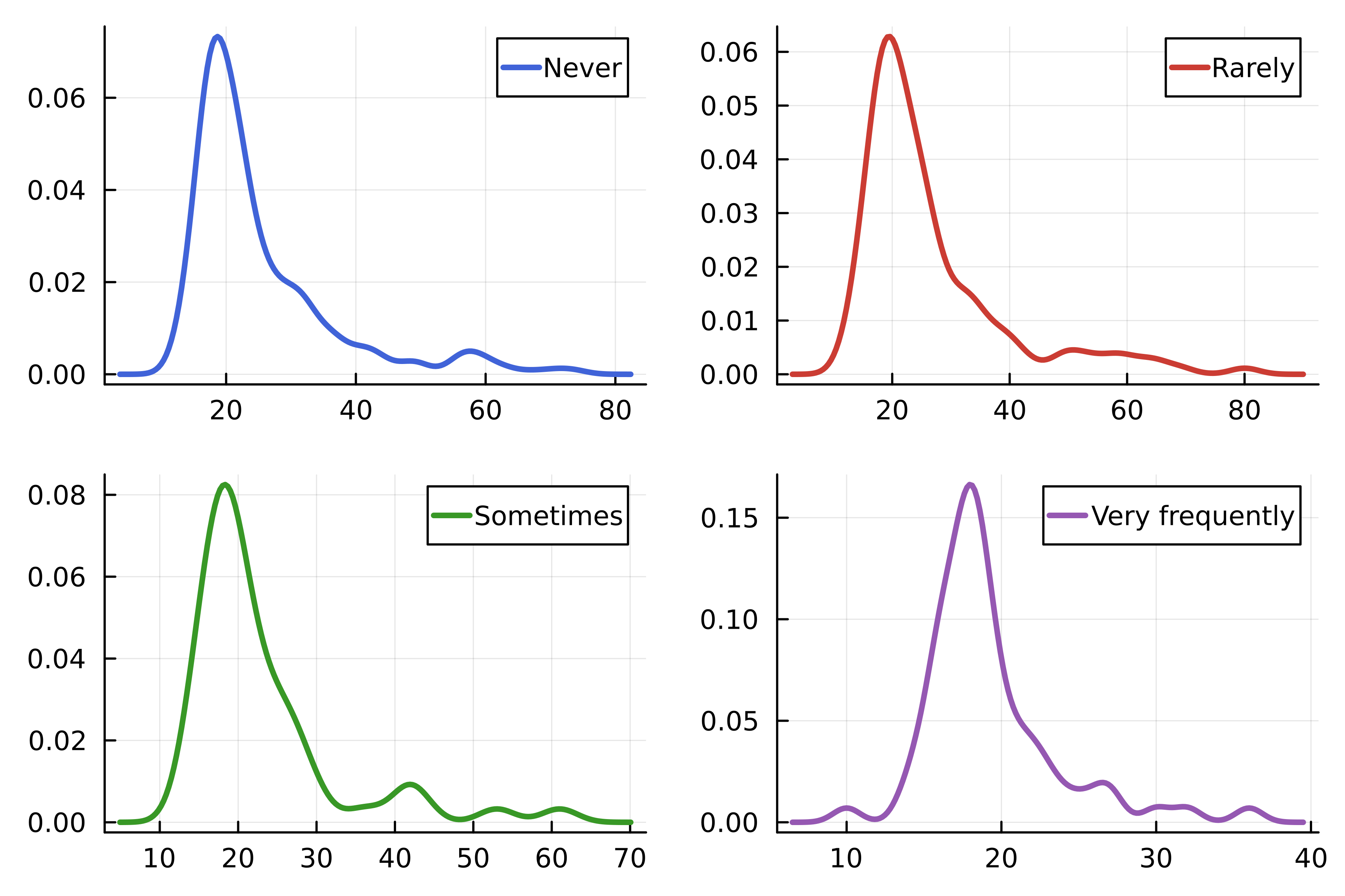
Geavanceerde lay-outs
Stapsgewijs
Stapsgewijs
Stapsgewijs
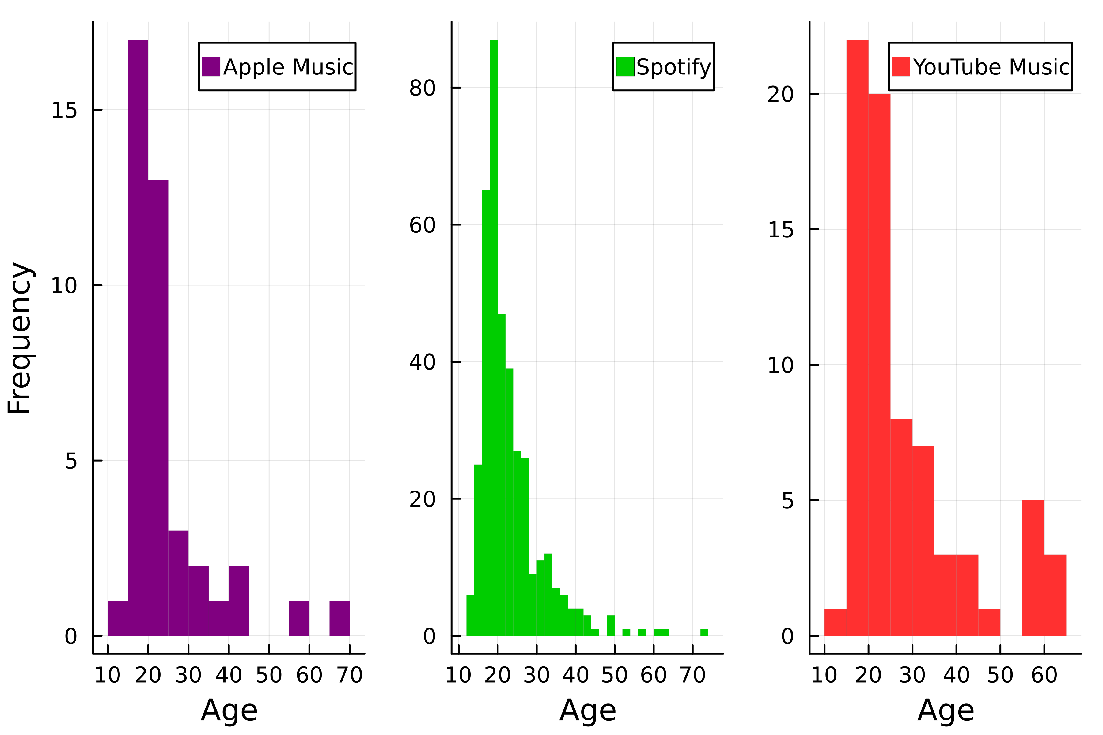
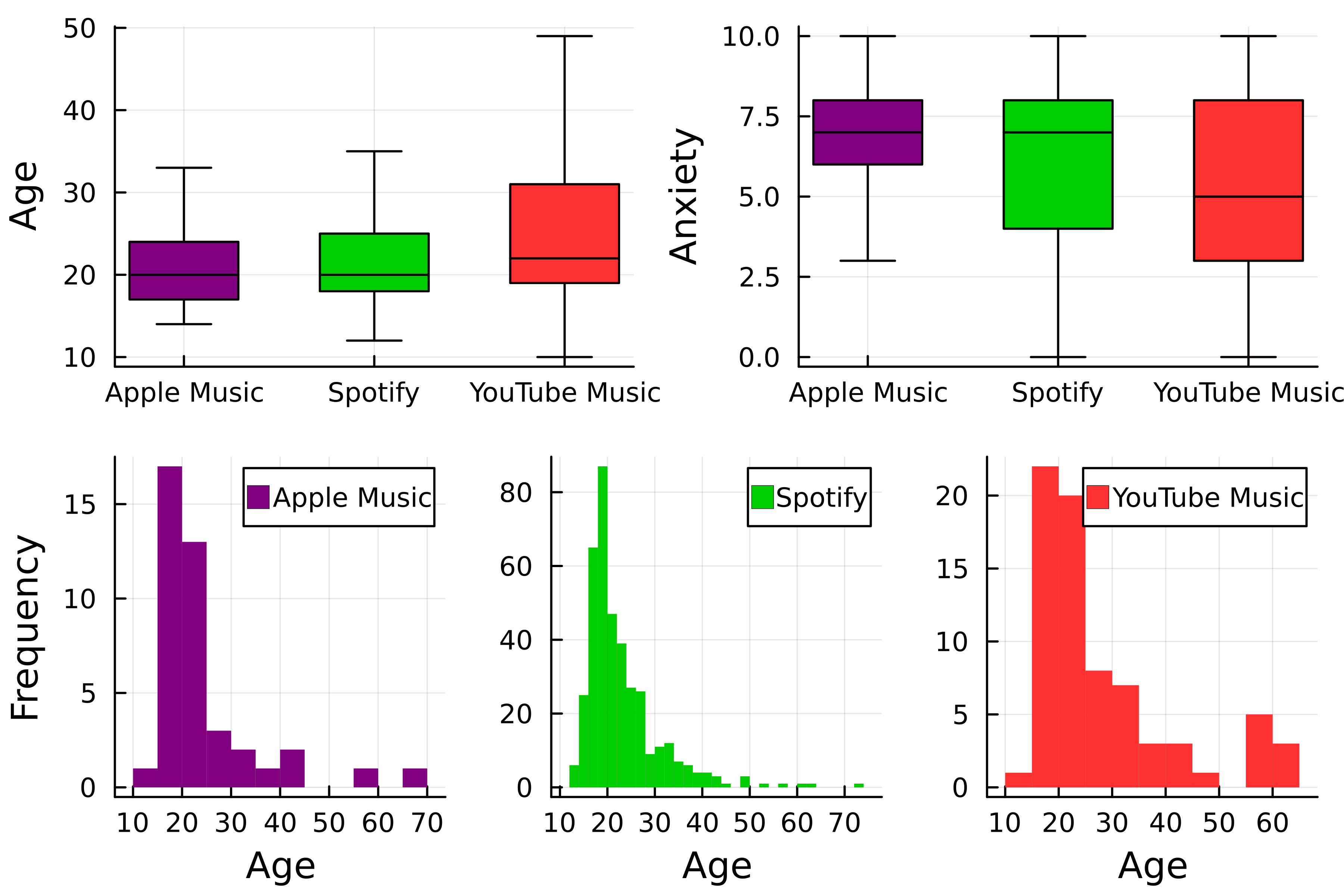
Plots samenvoegen
# Kies layout
layout = @layout [a b; c]
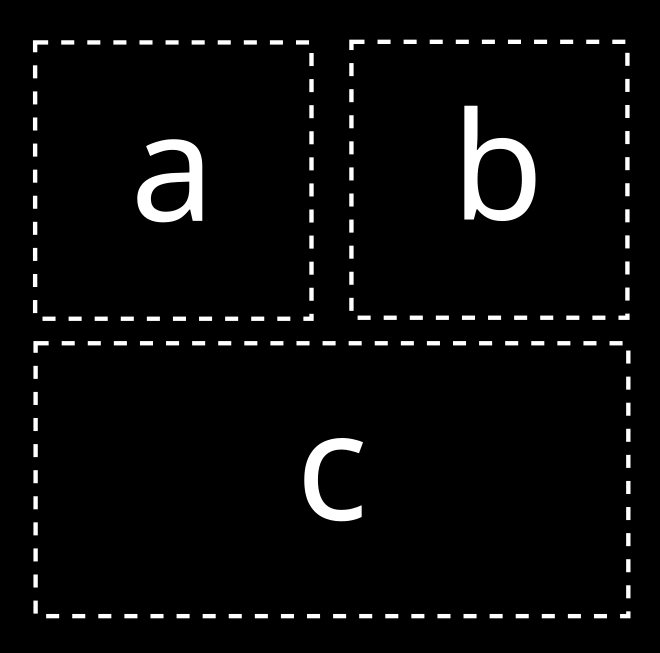
# Combineer de plots
plot(p1, p2, p3, layout=layout)

