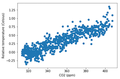
Perbandingan kuantitatif: scatter plot

Pengantar Visualisasi Data dengan Matplotlib

Ariel Rokem

Data Scientist

Pengenalan scatter plot

fig, ax = plt.subplots()

ax.scatter(climate_change["co2"], climate_change["relative_temp"])
ax.set_xlabel("CO2 (ppm)") ax.set_ylabel("Suhu relatif (Celsius)") plt.show()

Pengantar Visualisasi Data dengan Matplotlib

Kustomisasi scatter plot

eighties = climate_change["1980-01-01":"1989-12-31"]
nineties = climate_change["1990-01-01":"1999-12-31"]

fig, ax = plt.subplots()
ax.scatter(eighties["co2"], eighties["relative_temp"], color="red", label="eighties")
ax.scatter(nineties["co2"], nineties["relative_temp"], color="blue", label="nineties")
ax.legend() ax.set_xlabel("CO2 (ppm)") ax.set_ylabel("Suhu relatif (Celsius)") plt.show()
Pengantar Visualisasi Data dengan Matplotlib

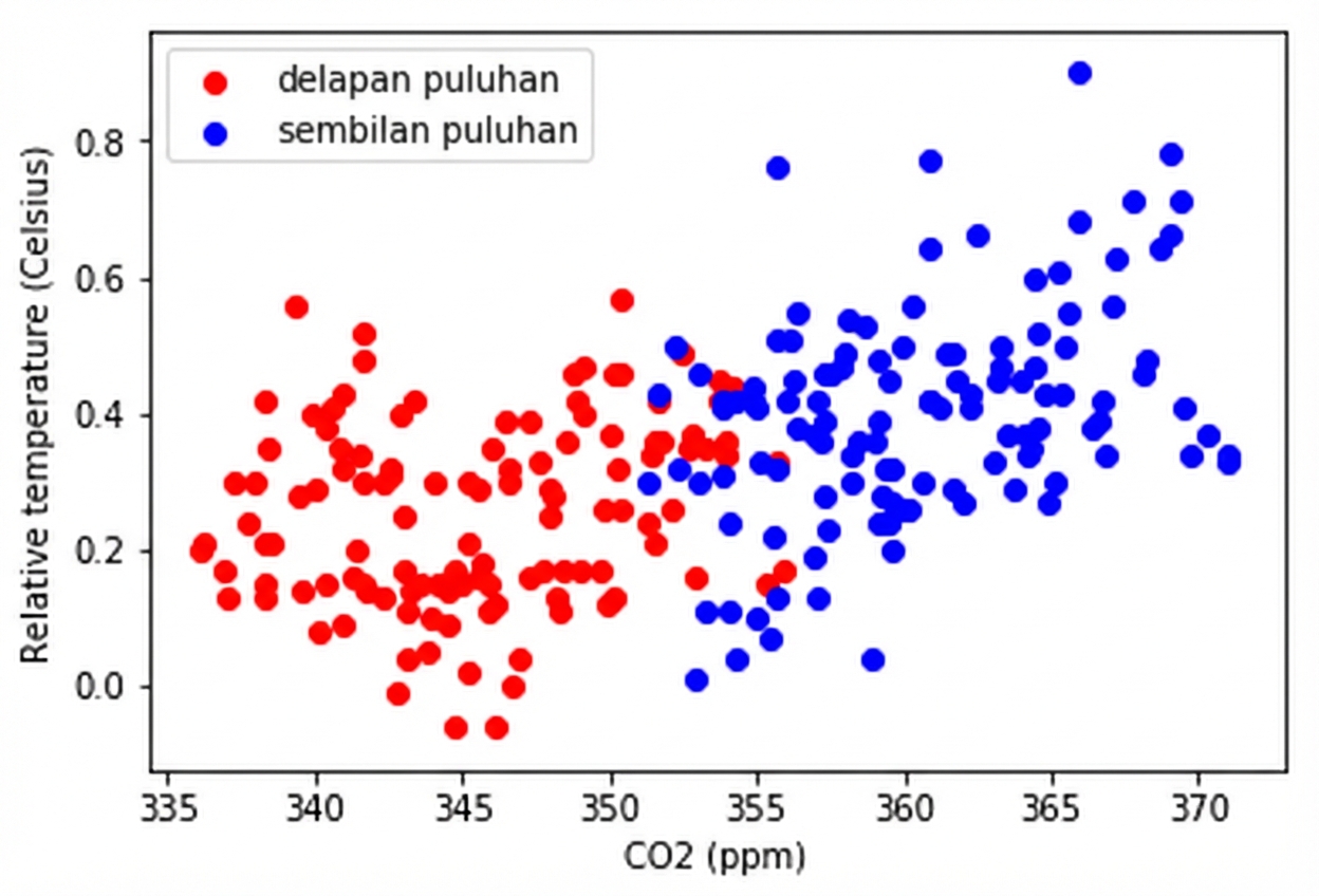
Mengkoding perbandingan dengan warna

Pengantar Visualisasi Data dengan Matplotlib

Mengkoding variabel ketiga dengan warna

fig, ax = plt.subplots()

ax.scatter(climate_change["co2"], climate_change["relative_temp"], c=climate_change.index)
ax.set_xlabel("CO2 (ppm)") ax.set_ylabel("Suhu relatif (Celsius)") plt.show()
Pengantar Visualisasi Data dengan Matplotlib

Mengkoding waktu dengan warna

Pengantar Visualisasi Data dengan Matplotlib

Ayo berlatih membuat scatter plot!

Pengantar Visualisasi Data dengan Matplotlib

Preparing Video For Download...