Menambah variabel ketiga dengan hue
Pengantar Visualisasi Data dengan Seaborn

Content Team
DataCamp
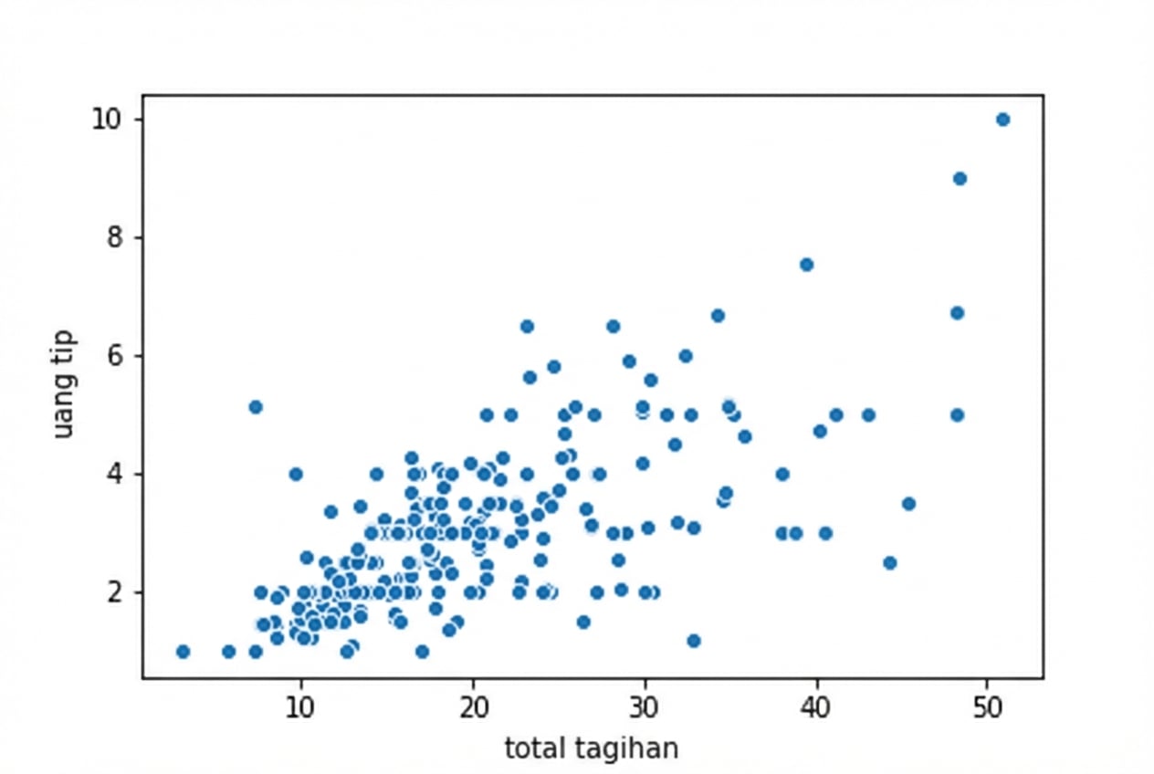
Scatter plot dasar
1 Waskom, M. L. (2021). seaborn: statistical data visualization. https://seaborn.pydata.org/
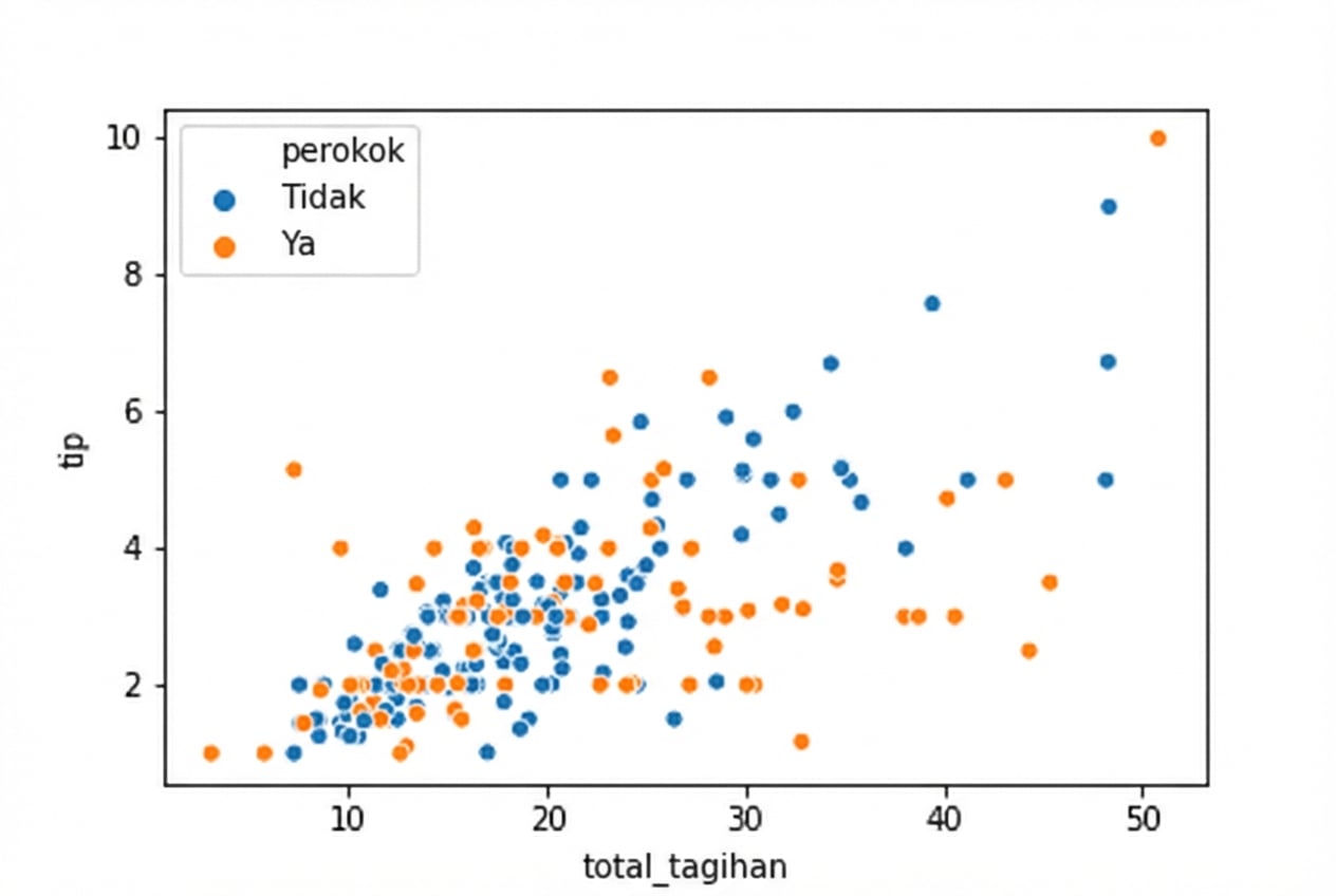
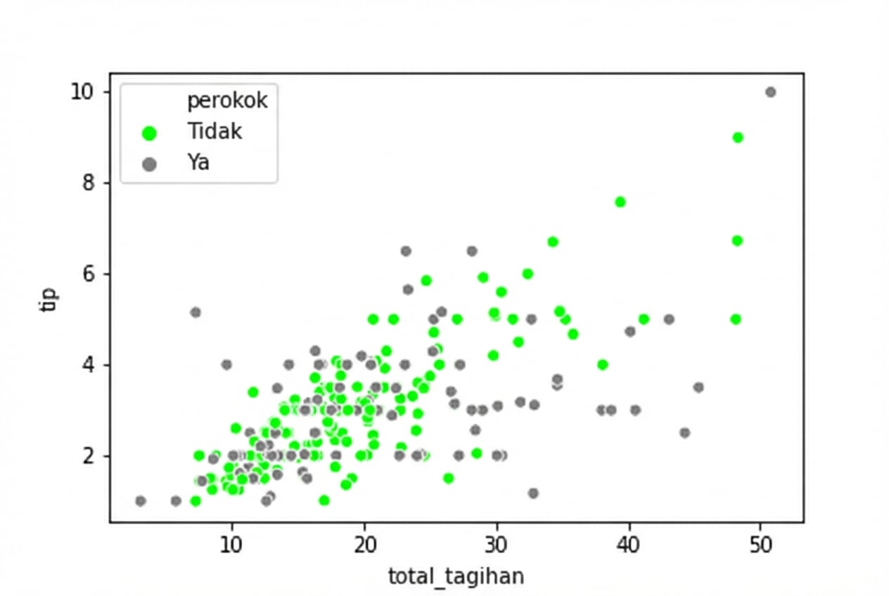
Scatter plot dengan hue
1 Waskom, M. L. (2021). seaborn: statistical data visualization. https://seaborn.pydata.org/
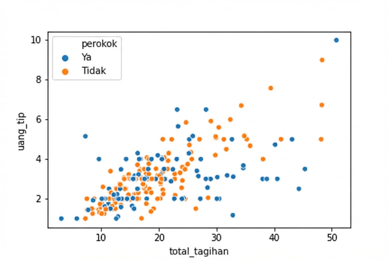
Mengatur urutan hue
1 Waskom, M. L. (2021). seaborn: statistical data visualization. https://seaborn.pydata.org/
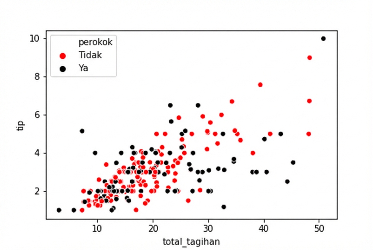
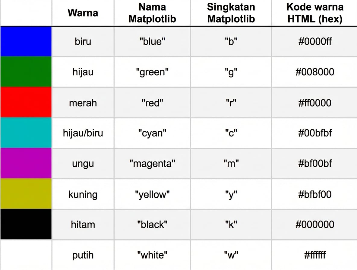
Menentukan warna hue
1 Waskom, M. L. (2021). seaborn: statistical data visualization. https://seaborn.pydata.org/
Menggunakan kode warna heksadesimal HTML dengan hue
1 Waskom, M. L. (2021). seaborn: statistical data visualization. https://seaborn.pydata.org/
Menggunakan hue pada count plot
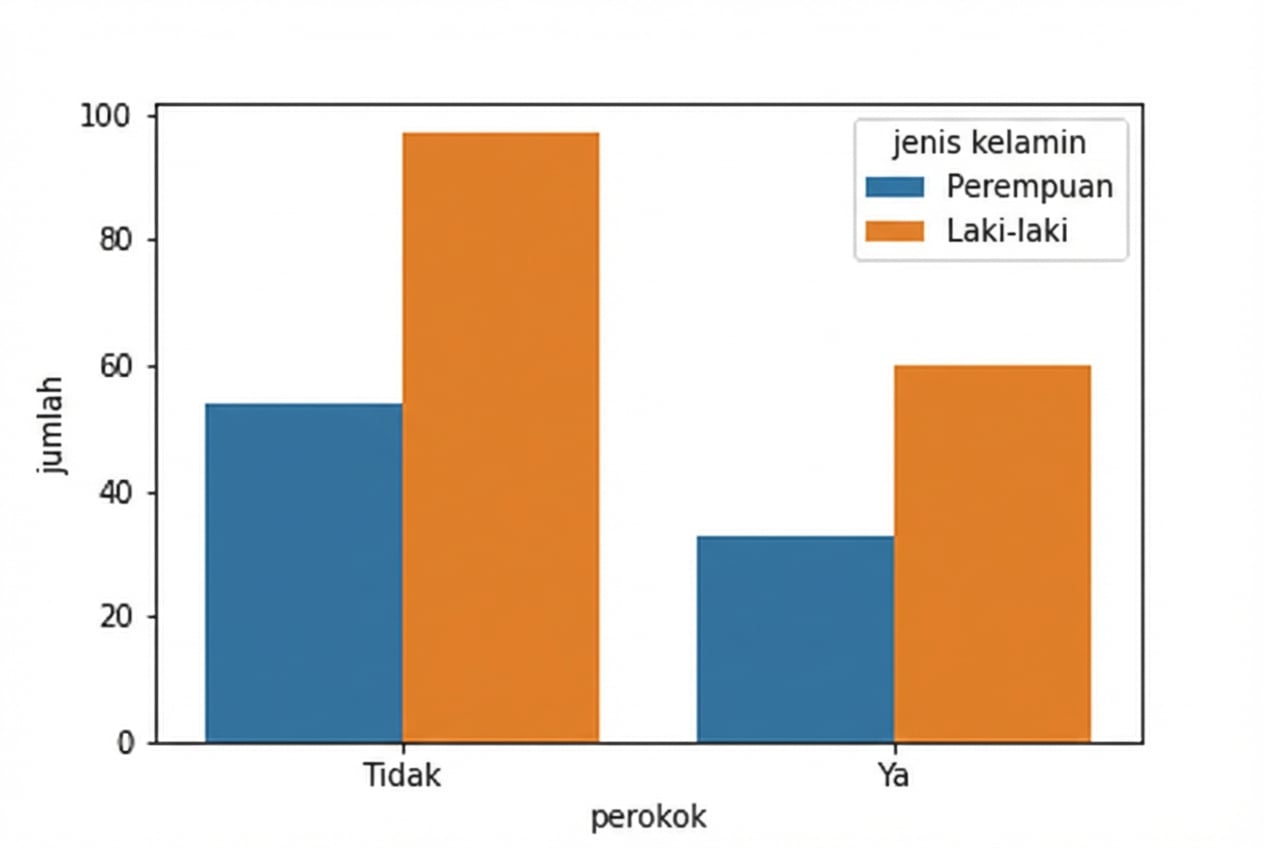
1 Waskom, M. L. (2021). seaborn: statistical data visualization. https://seaborn.pydata.org/

