Pengantar Visualisasi Data dengan Plotly di Python
Alex Scriven
Data Scientist
Cara kustomisasi plot:
color)update_layout()fig.update_layout({"title":{"text":"A New Title"}})
Kustomisasi warna membantu:

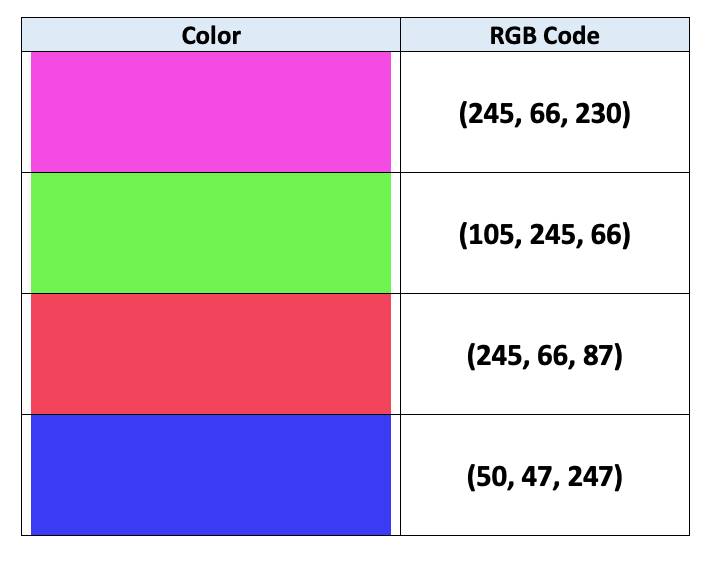
Komputer menggunakan pengkodean RGB untuk menentukan warna:
$$
$$
Lihat selengkapnya di artikel ini

color (kolom DataFrame)
fig = px.bar(data_frame=student_scores,
x="student_name",
y="score",
title="Student Scores by Student"
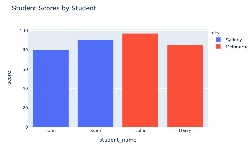
color="city")
fig.show()
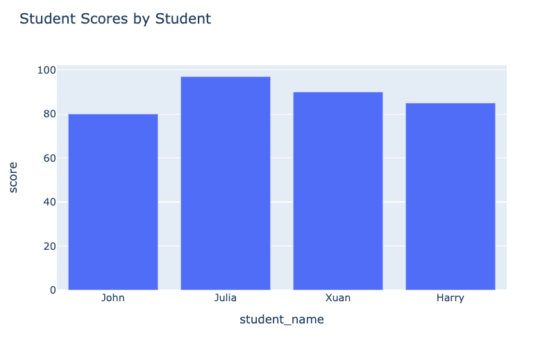
Plot sebelum:

Plot sesudah:

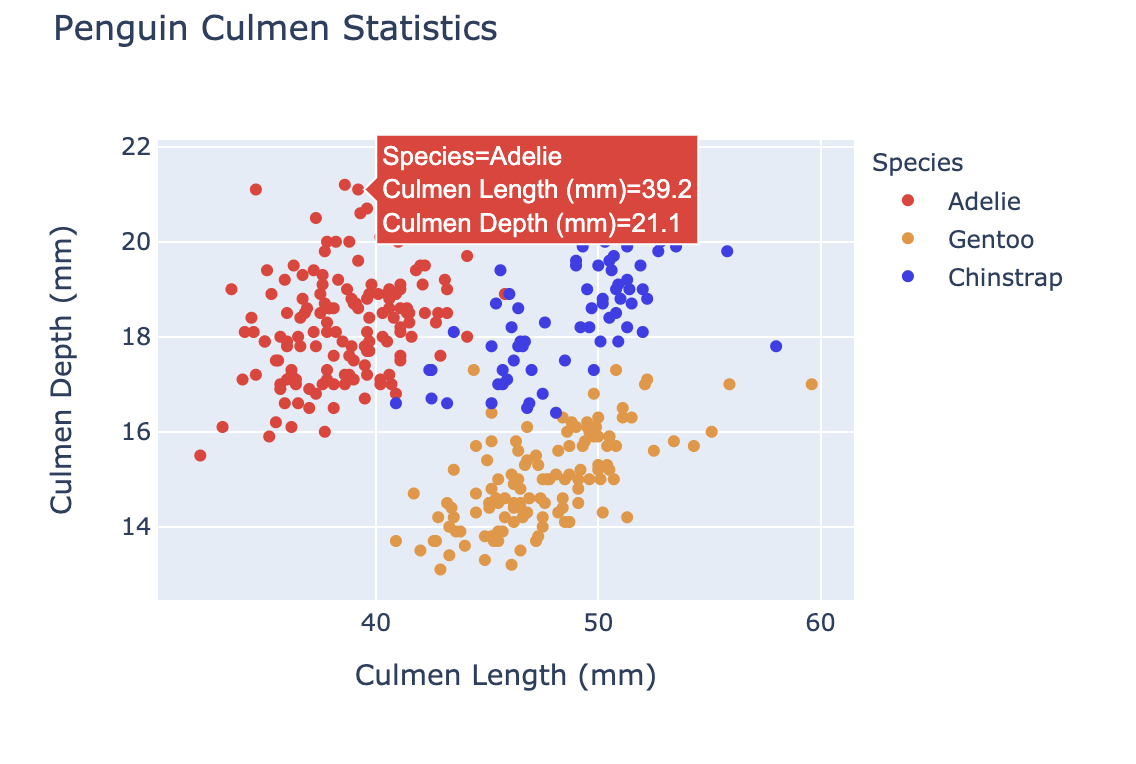
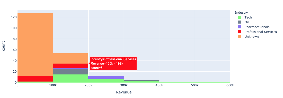
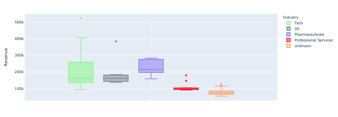
Menggunakan argumen color di plotly.express untuk plot univariat (bar, histogram):


color_discrete_map: Kamus yang memetakan nilai kategorikal ke warna"red", "green", dll.$$
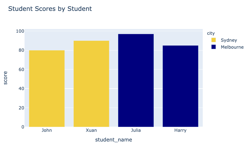
fig = px.bar( data_frame=student_scores, x="student_name", y="score", title="Student Scores by Student",color_discrete_map={ "Melbourne": "rgb(0,0,128)", "Sydney": "rgb(235, 207, 52)"},color="city")


$$
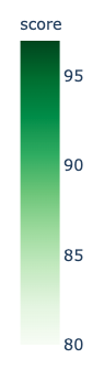
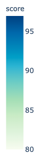
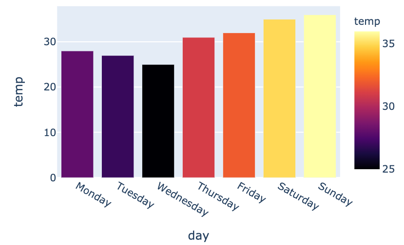
color_continuous_scale untuk skala warna.
fig = px.bar(data_frame=weekly_temps,
x="day", y="temp",
color="temp",
color_continuous_scale="inferno")
fig.show()
$$

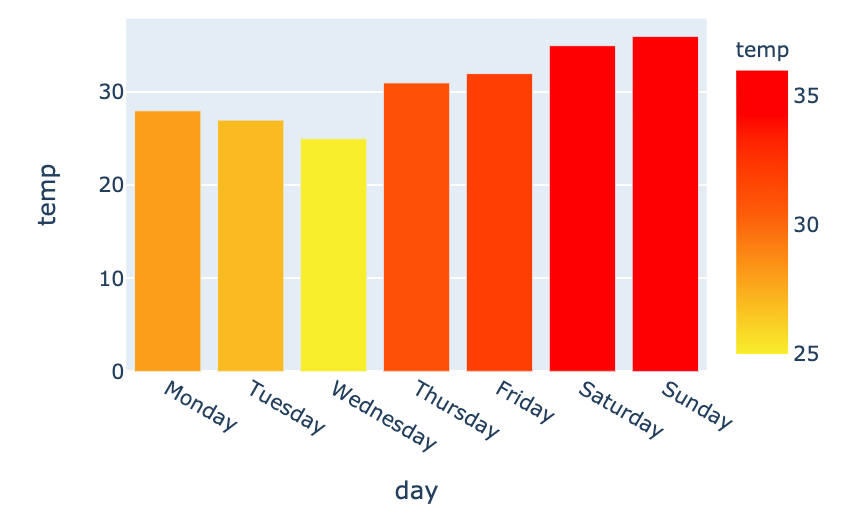
my_scale=[("rgb(242, 238, 10)"), ("rgb(242, 95, 10)"), ("rgb(255,0,0)")]fig = px.bar(data_frame=weekly_temps, x="day", y="temp",color_continuous_scale=my_scale, color="temp")

Pengantar Visualisasi Data dengan Plotly di Python