Memvisualisasikan variabel kuantitatif

Menganalisis Data Survei di R

Kelly McConville

Assistant Professor of Statistics

Tabel rerata

out <- svyby(formula = ~DaysPhysHlthBad, by = ~SmokeNow, 
             design = NHANES_design, 
             FUN = svymean, na.rm = TRUE, 
             keep.names = FALSE)
out
  SmokeNow DaysPhysHlthBad        se
1       No        3.908984 0.1996290
2      Yes        4.951750 0.2346189
Menganalisis Data Survei di R

Grafik batang

ggplot(data = out, mapping = aes(x = SmokeNow, y = DaysPhysHlthBad)) +
  geom_col() + 
  labs(y = "Monthly Average Number\n of Bad Health Days", 
       x = "Smoker?")
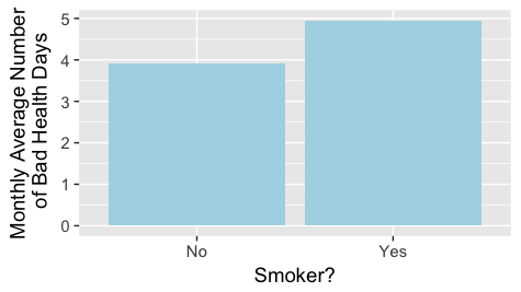
Grafik batang jumlah rata-rata hari kesehatan buruk untuk perokok dan bukan perokok

Menganalisis Data Survei di R

Grafik batang dengan batang galat

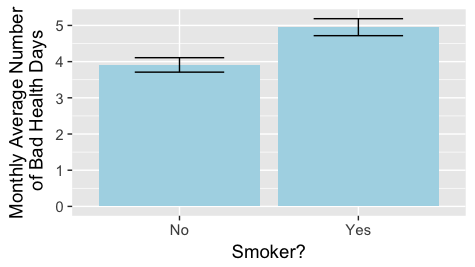
Grafik batang jumlah rata-rata hari kesehatan buruk untuk perokok dan bukan perokok dengan batang galat

Menganalisis Data Survei di R

Grafik batang dengan batang galat

out <- mutate(out, lower = DaysPhysHlthBad - se, 
              upper = DaysPhysHlthBad + se)
out
  SmokeNow DaysPhysHlthBad        se    lower    upper
1       No        3.908984 0.1996290 3.709355 4.108613
2      Yes        4.951750 0.2346189 4.717131 5.186369
Menganalisis Data Survei di R

Grafik batang dengan batang galat

ggplot(data = out, mapping = aes(x = SmokeNow, y = DaysPhysHlthBad, 
                                 ymin = lower, ymax = upper)) +
  geom_col(fill = "lightblue") + geom_errorbar(width = 0.5) + 
  labs(y = "Monthly Average Number\n of Bad Health Days", 
       x = "Smoker?")

Grafik batang jumlah rata-rata hari kesehatan buruk untuk perokok dan bukan perokok dengan batang galat

Menganalisis Data Survei di R

Histogram

ggplot(data = NHANESraw, mapping = aes(x = DaysPhysHlthBad, 
                                       weight = WTMEC4YR)) + 
  geom_histogram(binwidth = 1, color = "white") +
  labs(x = "Number of Bad Health Days in a Month")
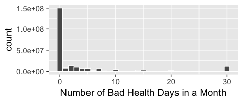
Histogram jumlah hari kesehatan buruk

Menganalisis Data Survei di R

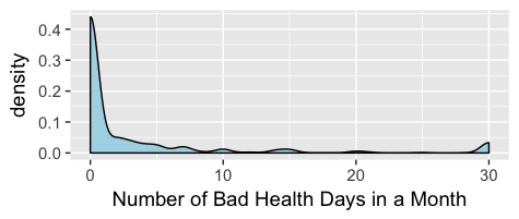
Plot kerapatan

NHANESraw %>%
filter(!is.na(DaysPhysHlthBad)) %>%
  mutate(WTMEC4YR_std = WTMEC4YR/sum(WTMEC4YR)) %>%
ggplot(mapping = aes(x = DaysPhysHlthBad, weight = WTMEC4YR_std)) + 
  geom_density(bw = 0.6,  fill = "lightblue") +
  labs(x = "Number of Bad Health Days in a Month")

Plot kerapatan jumlah hari kesehatan buruk
Menganalisis Data Survei di R

Plot kerapatan berfaset

NHANESraw %>%
    filter(!is.na(DaysPhysHlthBad), 
           !is.na(SmokeNow)) %>%
    group_by(SmokeNow) %>%
    mutate(WTMEC4YR_std = WTMEC4YR/sum(WTMEC4YR)) %>%
    ggplot(mapping = 
           aes(x = DaysPhysHlthBad, 
           weight = WTMEC4YR_std)) + 
  geom_density(bw = 0.6, fill = "lightblue") +
  labs(x = "Number of Bad Health Days in a Month") + 
  facet_wrap(~SmokeNow, labeller = "label_both")
Menganalisis Data Survei di R

Plot kerapatan berfaset

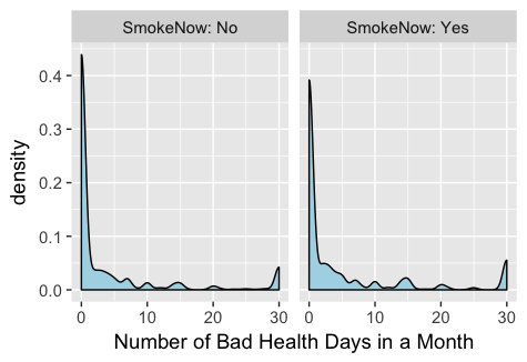
Plot kerapatan jumlah hari kesehatan buruk untuk perokok dan bukan perokok

Menganalisis Data Survei di R

Ayo berlatih!

Menganalisis Data Survei di R

Preparing Video For Download...