Visualisasi Data Interaktif Tingkat Menengah dengan plotly di R
Adam Loy
Statistician, Carleton College
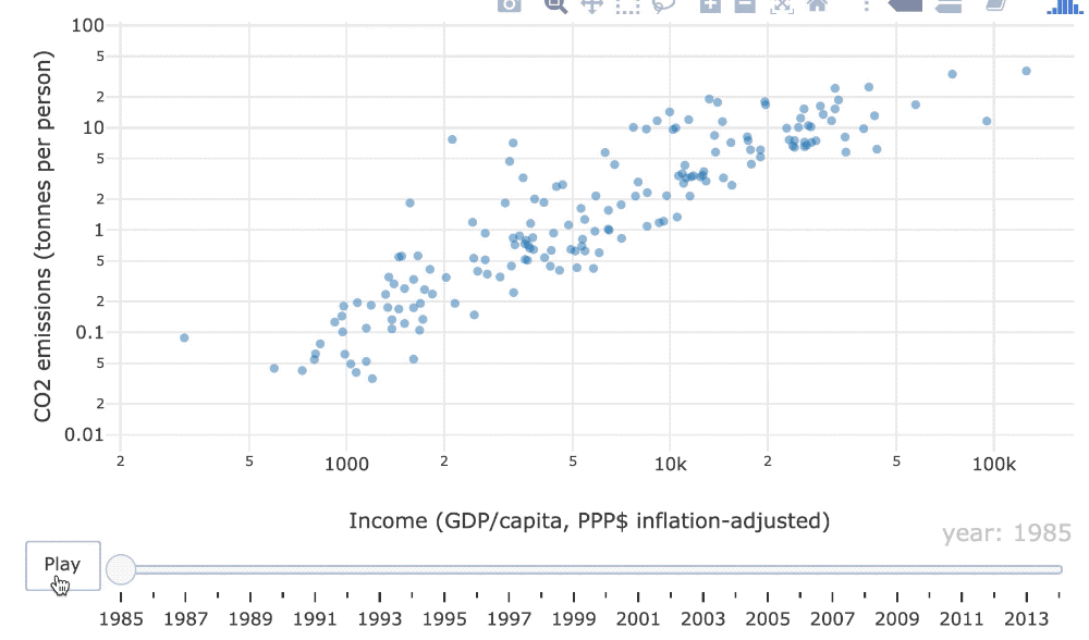
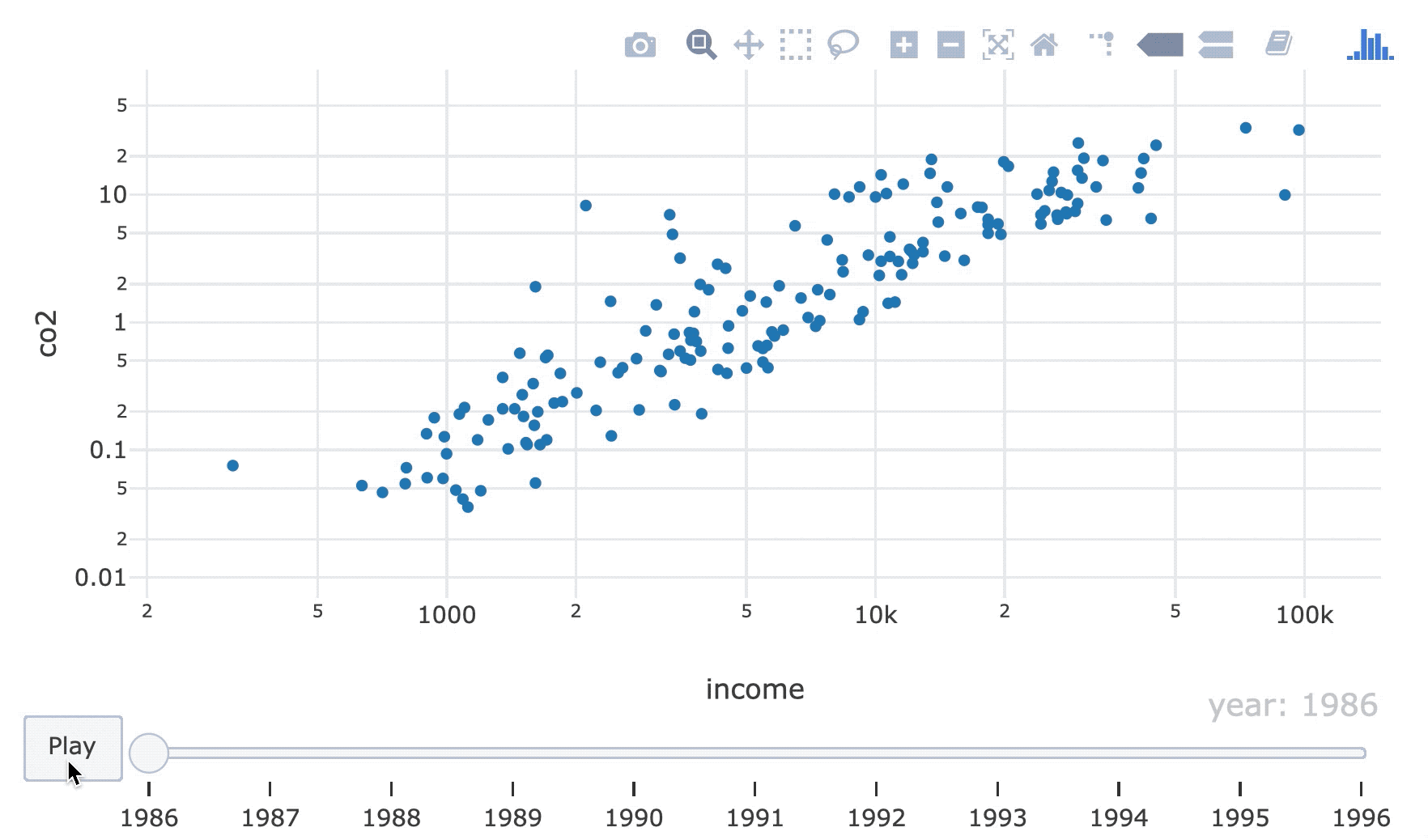
Pertanyaan: Apakah hubungan antara emisi karbon dioksida dan pendapatan berubah dari waktu ke waktu?
world_indicators
# A tibble: 11,387 x 11
country year income co2 military population urban life_expectancy four_regions
<chr> <dbl> <dbl> <dbl> <dbl> <dbl> <dbl> <dbl> <chr>
1 Afghan… 1960 1210 0.0461 NA 9000000 7.56e5 38.6 asia
2 Albania 1960 2790 1.24 NA 1640000 4.94e5 62.7 europe
3 Algeria 1960 6520 0.554 NA 11100000 3.39e6 52 africa
4 Andorra 1960 15200 NA NA 13400 7.84e3 NA europe
5 Angola 1960 3860 0.0975 NA 5640000 5.89e5 42.4 africa
# … with 1.138e+04 more rows, and 2 more variables: eight_regions <chr>, six_regions <chr>


Frame = plot pada satu titik waktu

world_indicators %>%
plot_ly(x = ~income, y = ~co2) %>%
add_markers(frame = ~year, showlegend = FALSE) %>%
layout(xaxis = list(type = "log"), yaxis = list(type = "log"))
Satu elemen grafis (mis. glif) mewakili satu titik data (mis. Belgia)
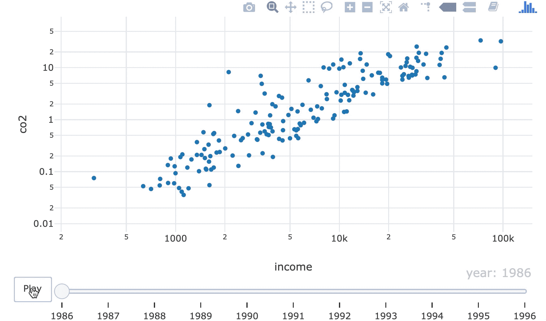
world_indicators %>%
plot_ly(x = ~income, y = ~co2) %>%
add_markers(frame = ~year, ids = ~country, showlegend = FALSE) %>%
layout(xaxis = list(type = "log"), yaxis = list(type = "log"))

Visualisasi Data Interaktif Tingkat Menengah dengan plotly di R