Strategi seleksi
Visualisasi Data Interaktif Tingkat Menengah dengan plotly di R

Adam Loy
Statistician, Carleton College
Dua strategi seleksi
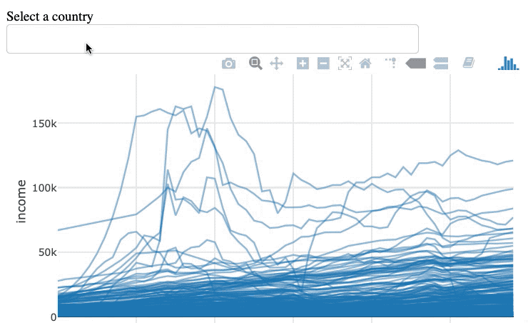
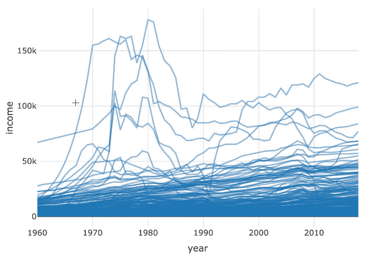
Contoh
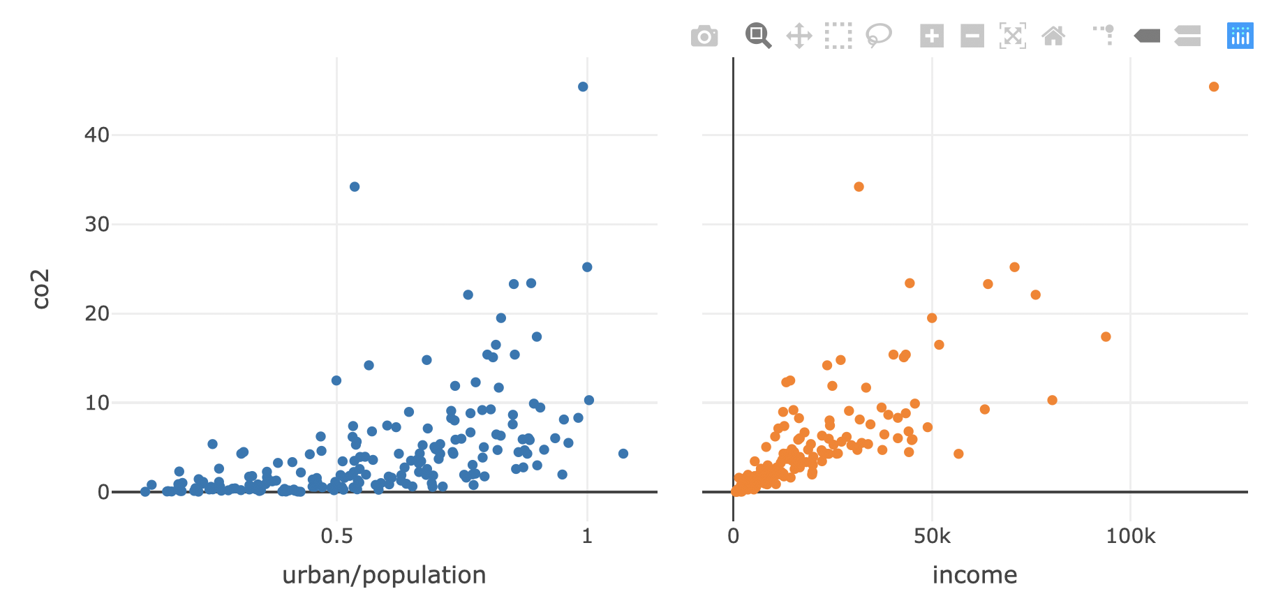
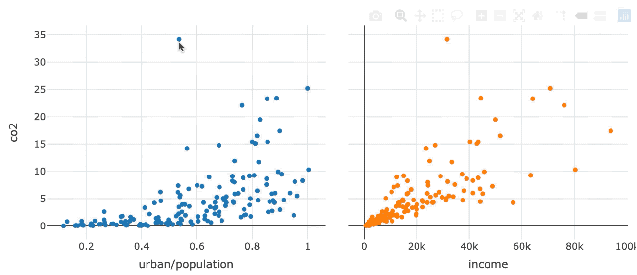
Seleksi persisten
Aktifkan seleksi persisten dengan highlight()
subplot(p1, p2, titleX = TRUE, shareY = TRUE) %>%
  hide_legend() %>%
  highlight(persistent = TRUE)
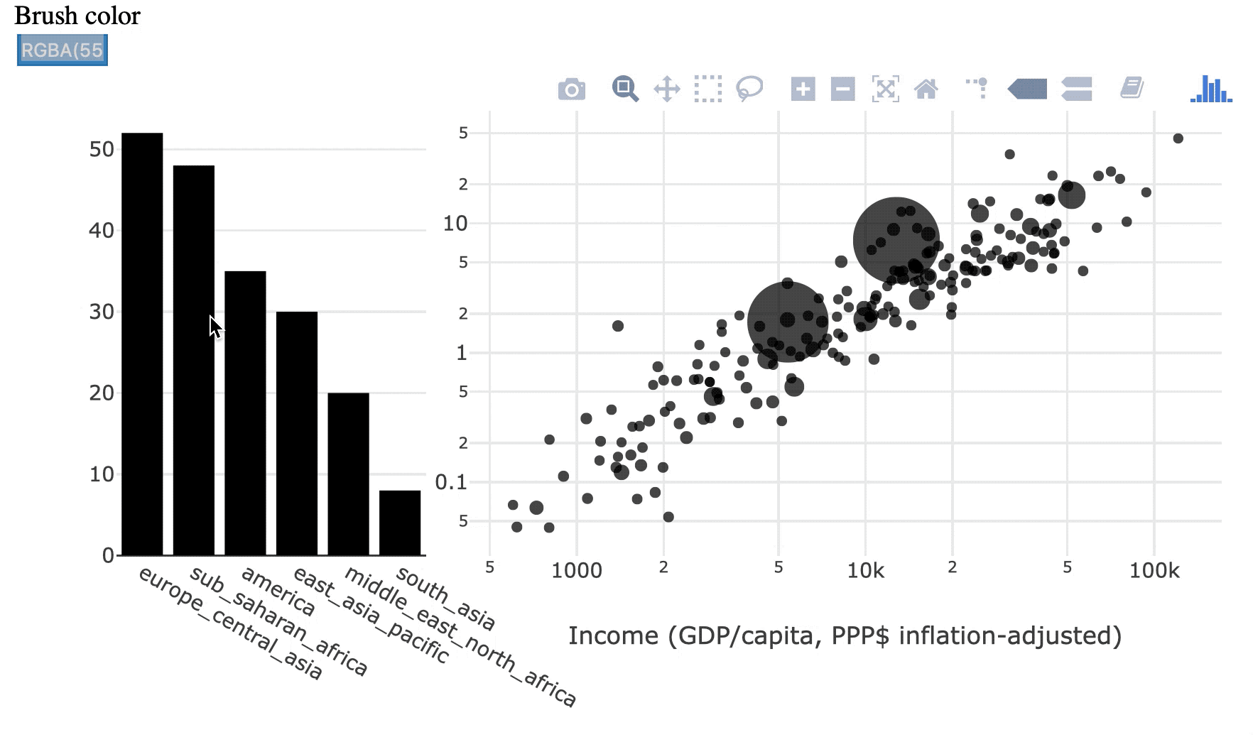
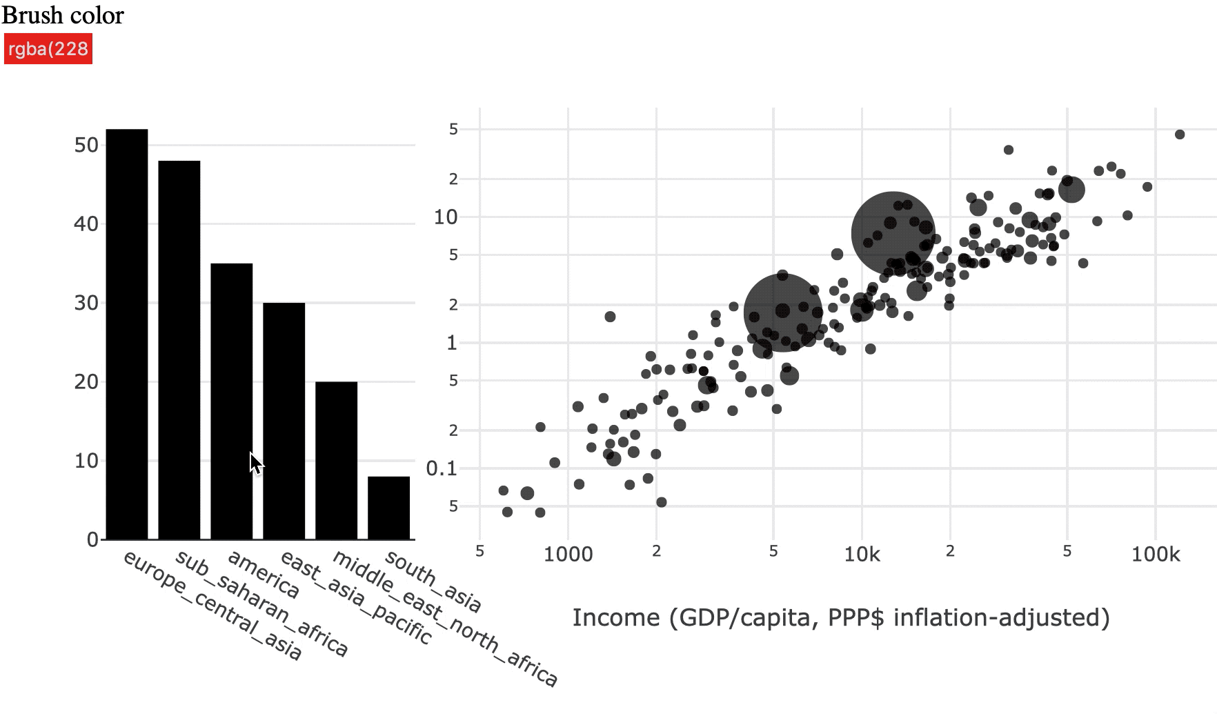
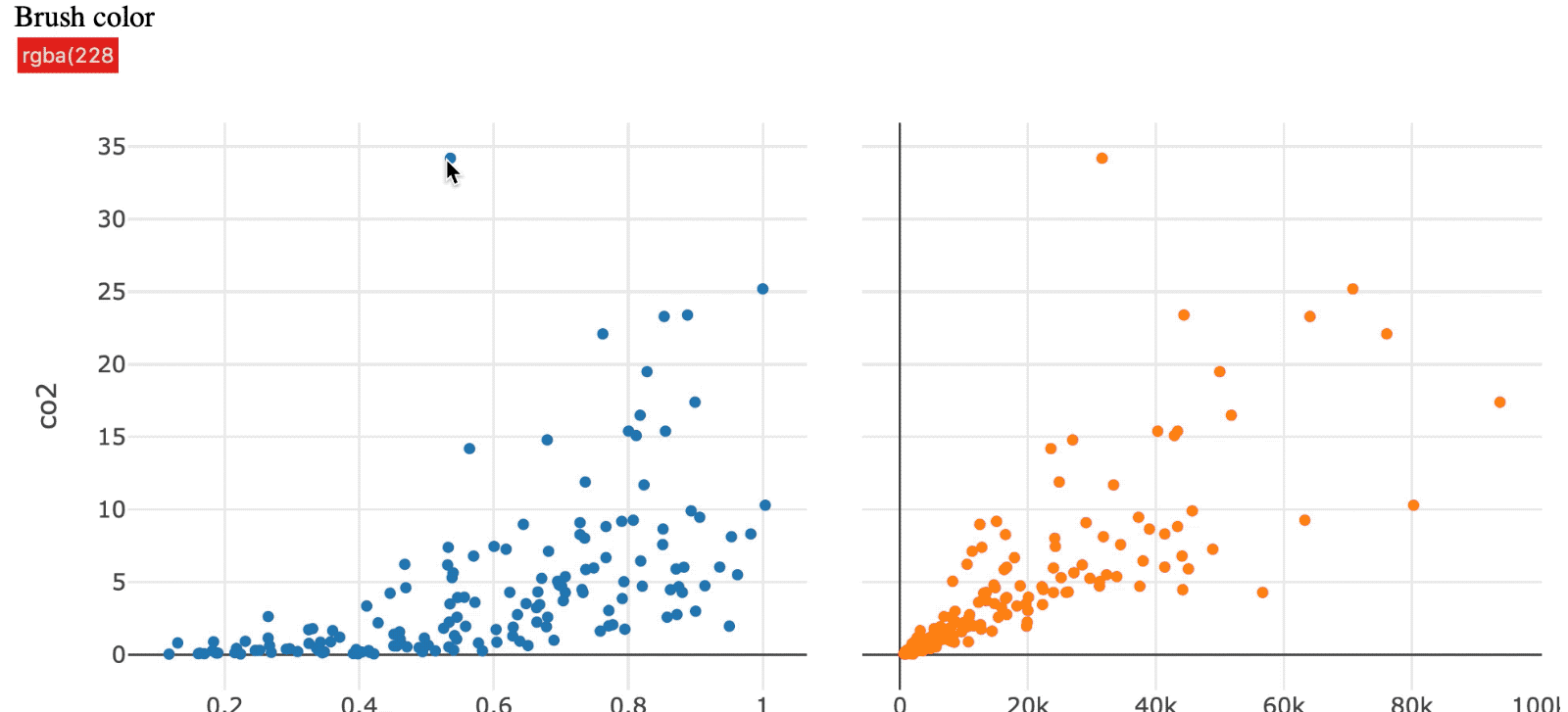
Sorot dengan warna
Dua jenis manipulasi