Beberapa plot dari DataFrame
Pengantar Visualisasi Data dengan Julia

Gustavo Vieira Suñe
Data Analyst
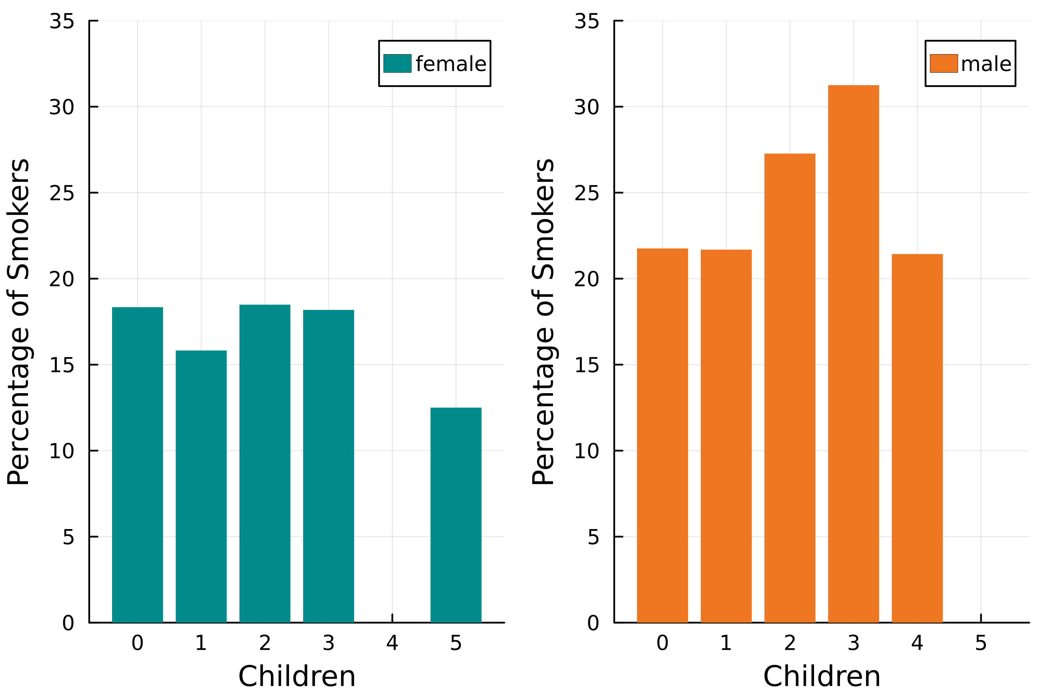
Beberapa variabel dalam satu plot
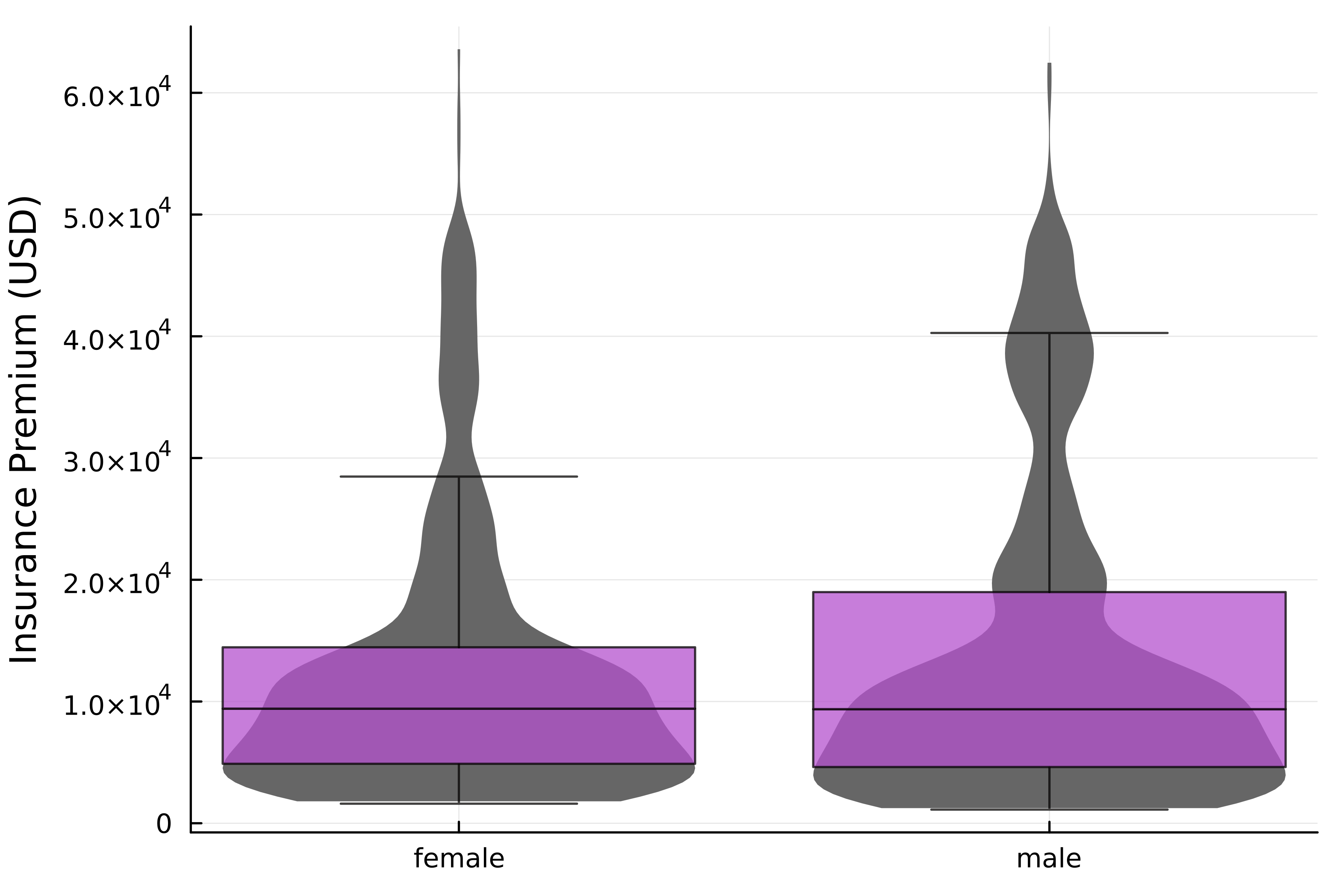
Tata letak dengan DataFrame
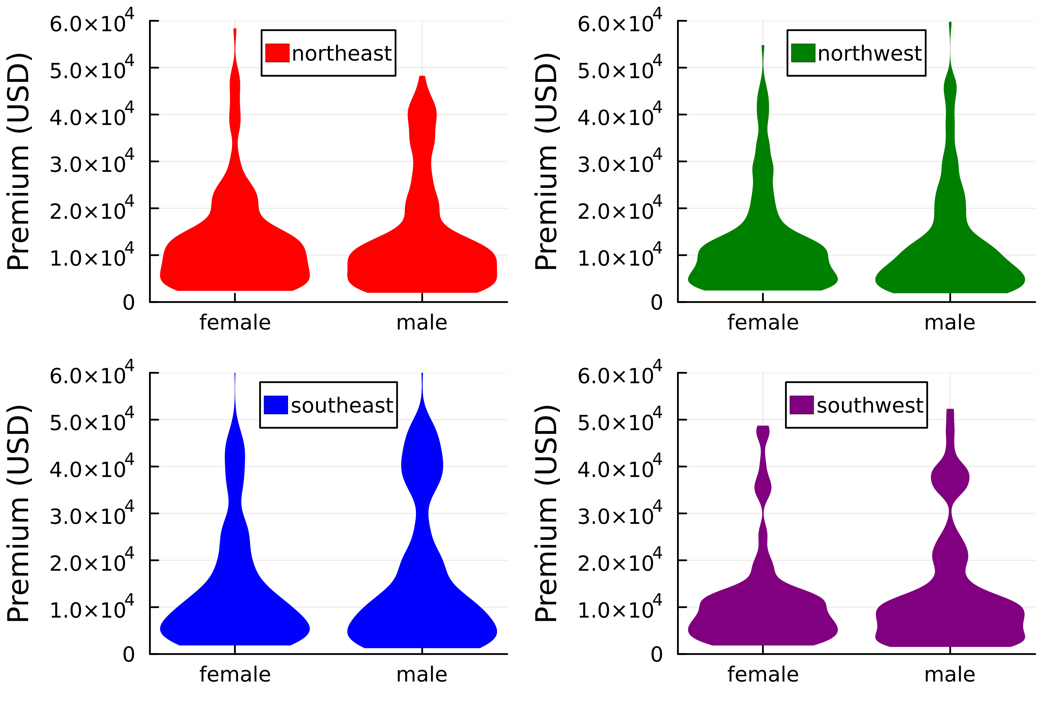
Menambahkan chain ke dalamnya
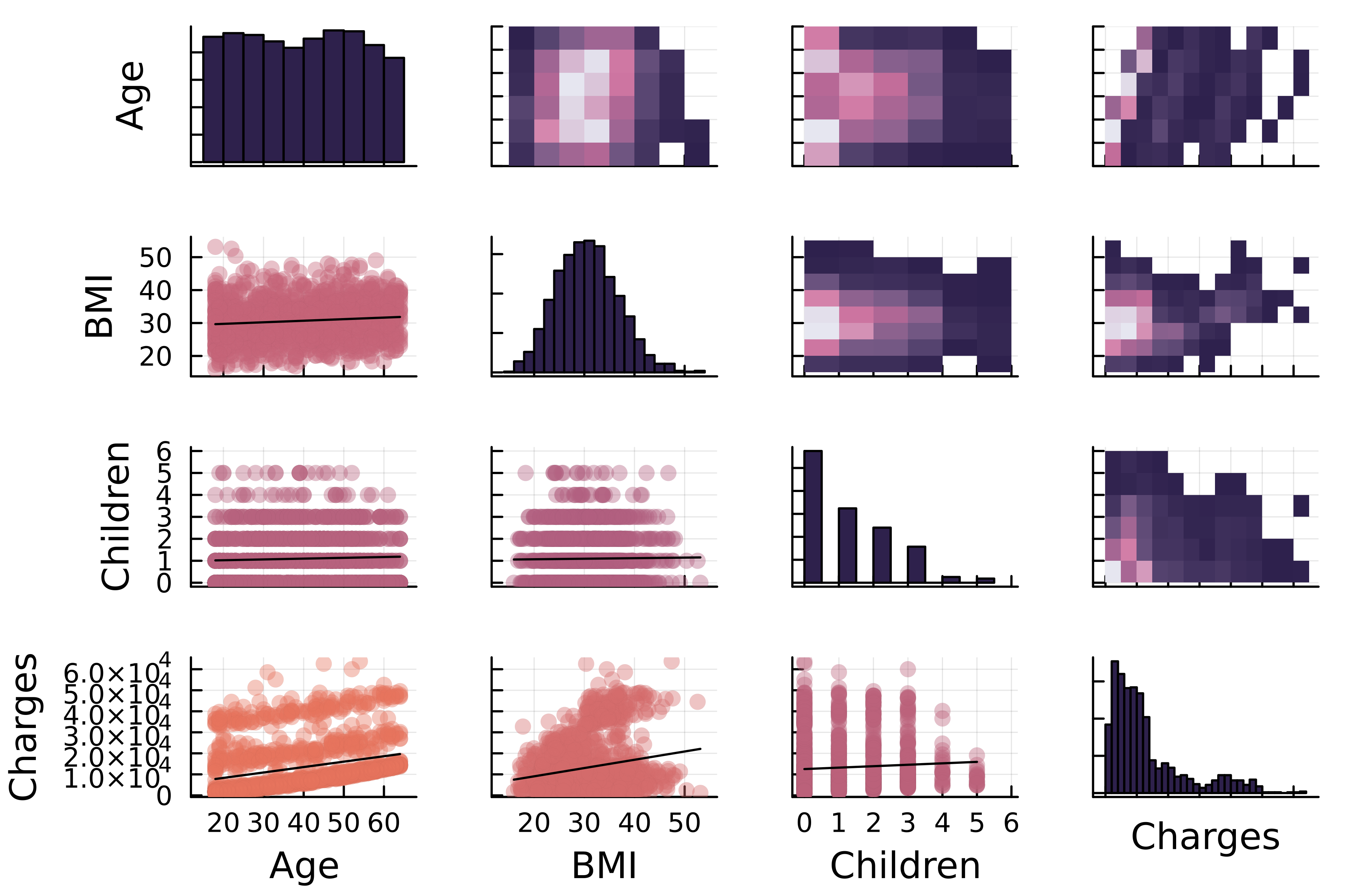
Plot matriks korelasi
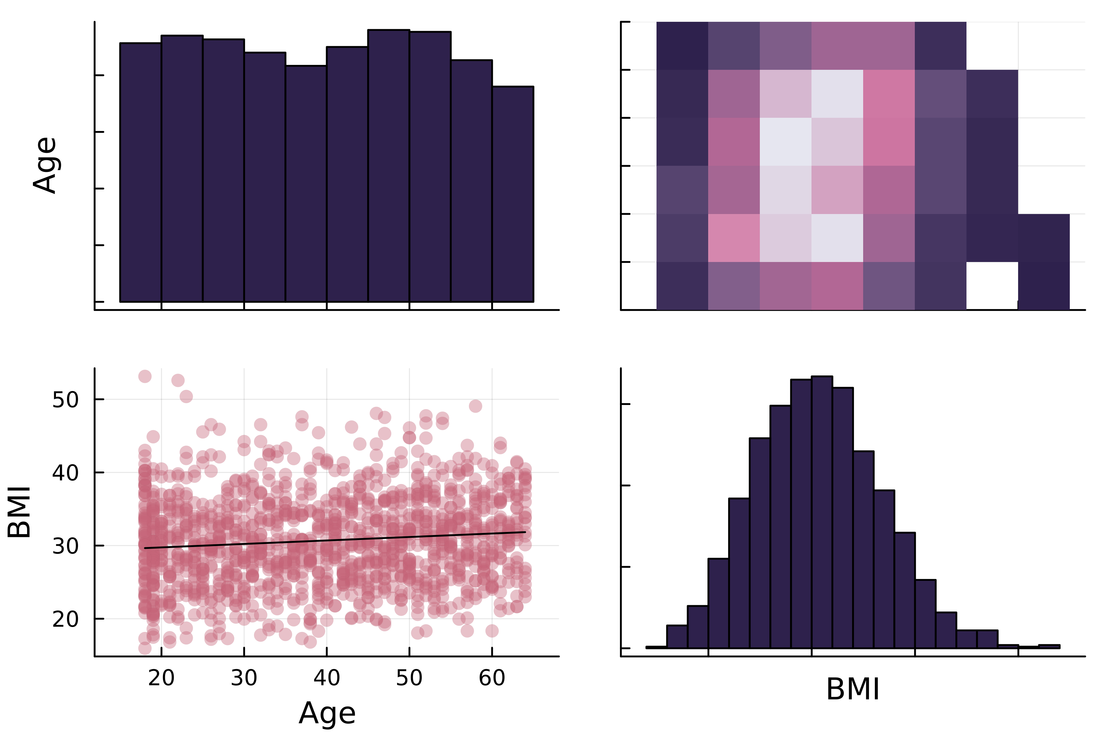
Plot matriks korelasi
Plot matriks korelasi di StatsPlots.jl
1 https://docs.juliaplots.org/latest/generated/colorschemes/
Plot matriks korelasi di StatsPlots.jl