Memplot beberapa variabel
Pengantar Visualisasi Data dengan Julia

Gustavo Vieira Suñe
Data Analyst
Kustomisasi scatter plot
Warna umum: :blue, :red, :green, :yellow, :black, :gray, :white
1 http://juliagraphics.github.io/Colors.jl/stable/namedcolors/
Notasi tanda seru
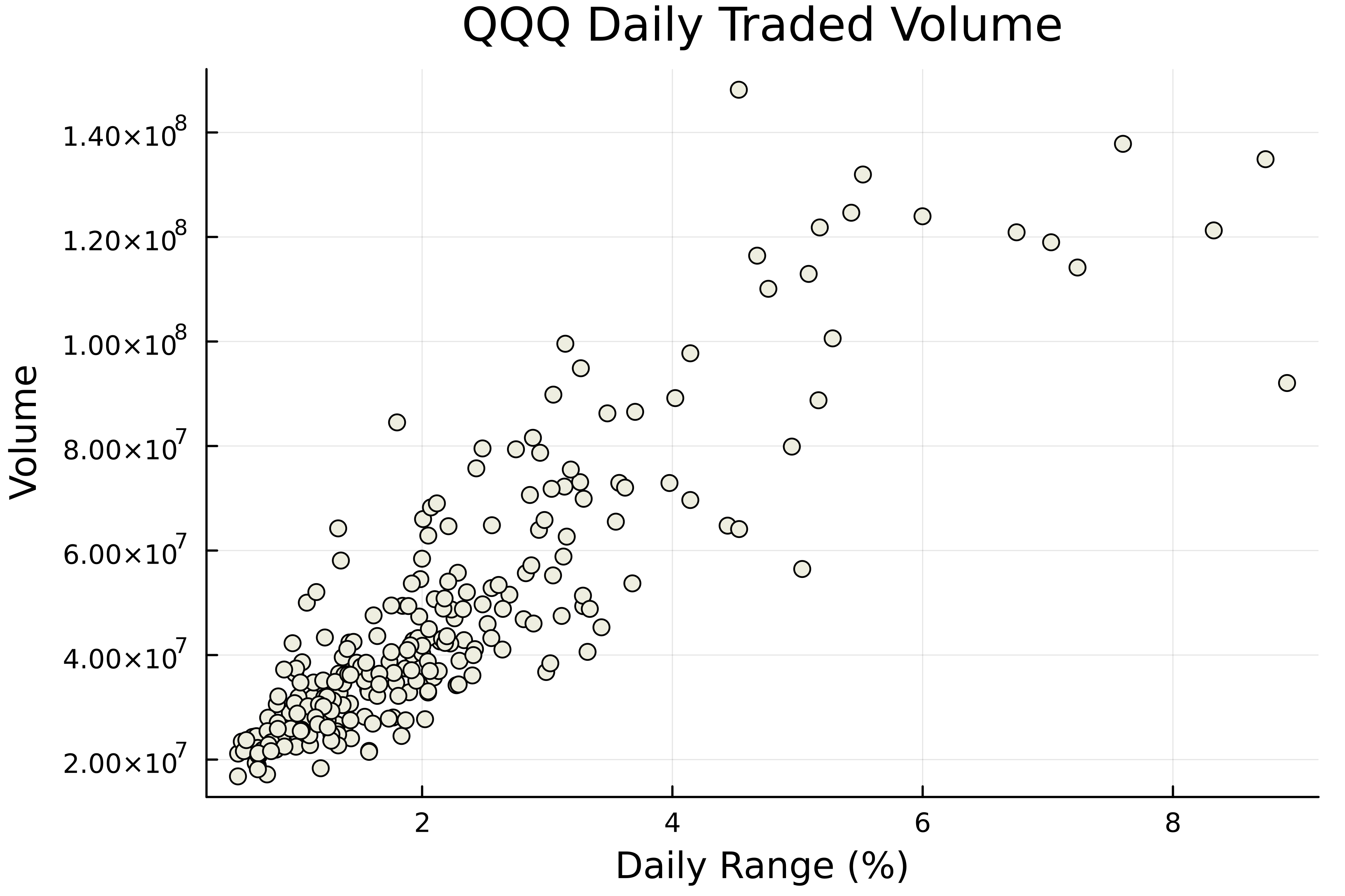
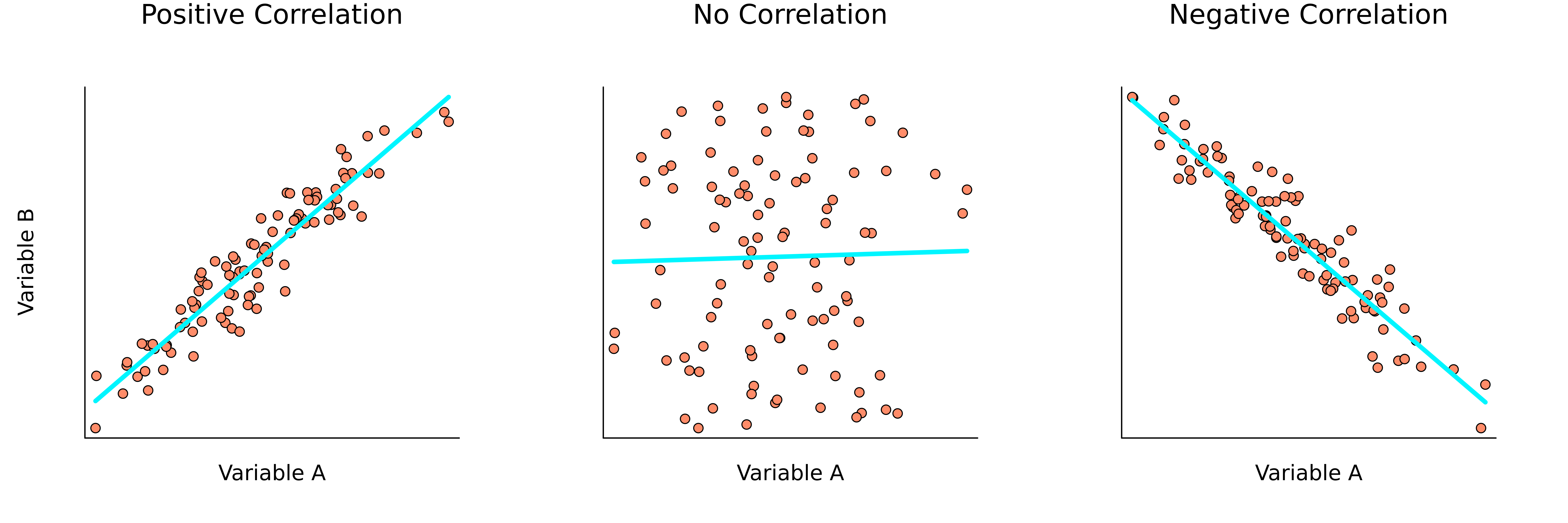
Korelasi
- Hubungan antar variabel
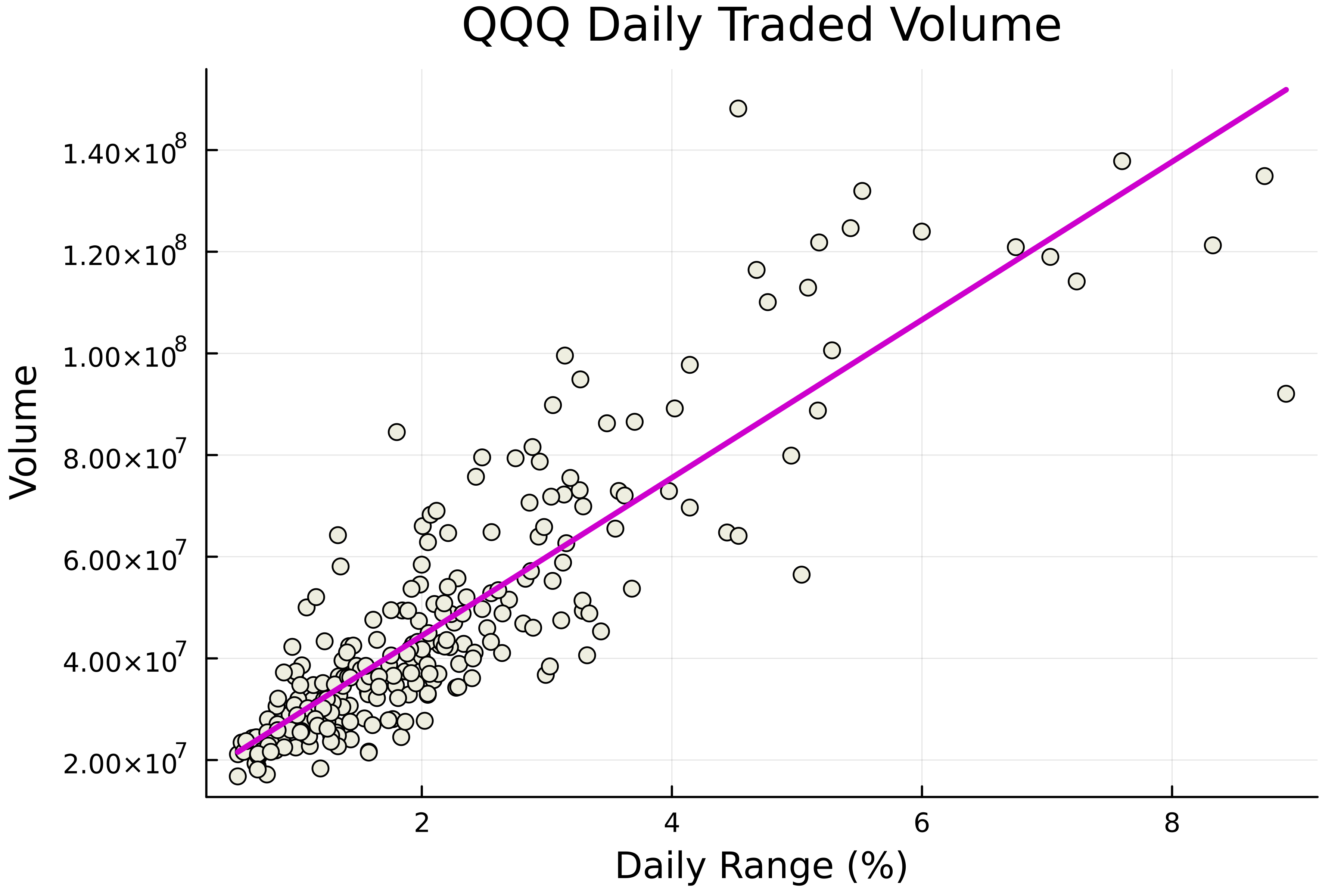
Menambahkan garis regresi
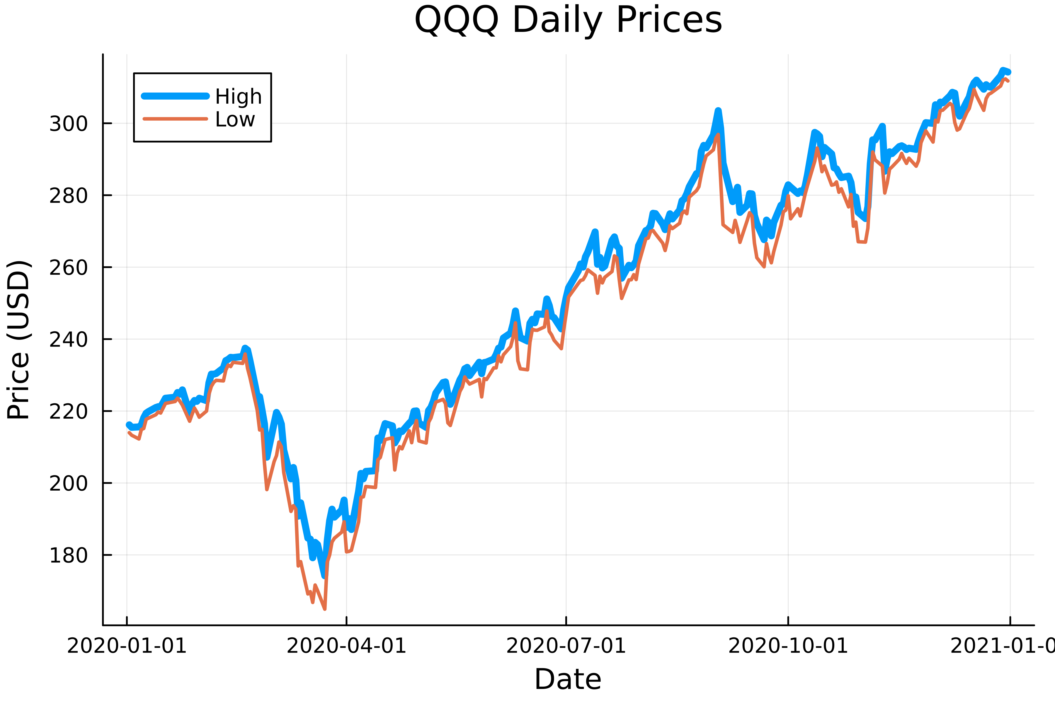
Beberapa plot garis
Cara lain untuk multi-plot

