Statistiche per categoria con seaborn

Importing and Managing Financial Data in Python

Stefan Jansen

Instructor

Grafici categorici con seaborn

  • Modi dedicati per combinare variabili categoriche e numeriche
  • Visualizza stime di statistiche riassuntive per categoria
  • Capisci come le categorie influenzano le variabili numeriche
  • Confronta con metriche chiave delle distribuzioni
  • Esempio: media della market cap per settore o anno di IPO, con dispersione
Importing and Managing Financial Data in Python

Le basi: countplot

sns.countplot(x='Sector', data=nasdaq)
plt.xticks(rotation=45)
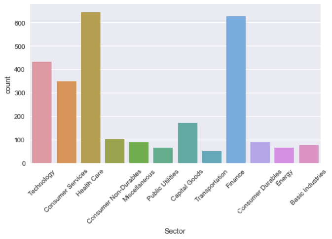
countplot.png

Importing and Managing Financial Data in Python

countplot, ordinato

sector_size = nasdaq.groupby('Sector').size()
order = sector_size.sort_values(ascending=False)
order.head()
Sector
Health Care          645
Finance              627
Technology           433
...
order = order.index.tolist()
['Health Care', 'Finance', ..., 'Energy', 'Transportation']
Importing and Managing Financial Data in Python

countplot, ordinato

sns.countplot(x='Sector', data=nasdaq, order=order)
plt.xticks(rotation=45)
plt.title('# osservazioni per settore’)
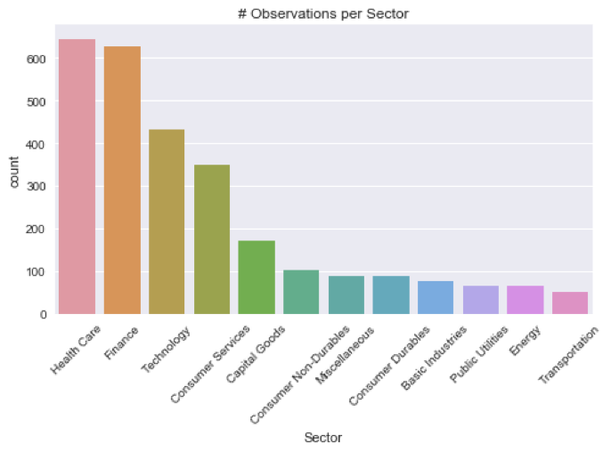
countplot_sorted.png

Importing and Managing Financial Data in Python

countplot, più categorie

recent_ipos = nasdaq[nasdaq['IPO Year'] > 2014]
recent_ipos['IPO Year'] = recent_ipos['IPO Year'].astype(int)
sns.countplot(x='Sector', hue='IPO Year', data=recent_ipos)
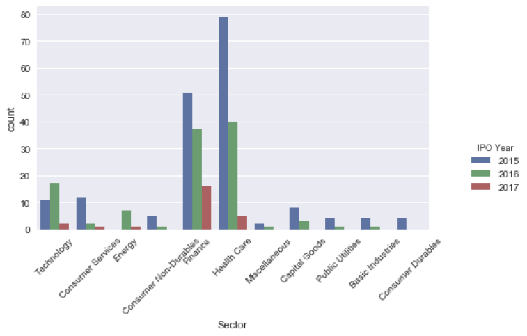
countplot_mc.png

Importing and Managing Financial Data in Python

Confronta statistiche con PointPlot

nasdaq['IPO'] = nasdaq['IPO Year'].apply(lambda x: 'After 2000' if x > 2000 else 'Before 2000')
sns.pointplot(x='Sector', y='market_cap_m', hue='IPO', data=nasdaq)
plt.xticks(rotation=45); plt.title('Mean Market Cap')
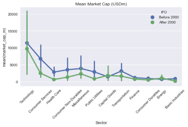
pointplot.png

Importing and Managing Financial Data in Python

Ayo berlatih!

Importing and Managing Financial Data in Python

Preparing Video For Download...