Visualizzare le prestazioni del modello
Modellazione con tidymodels in R

David Svancer
Data Scientist
Grafico della matrice di confusione
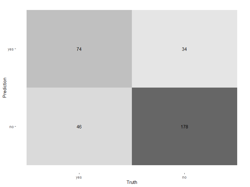
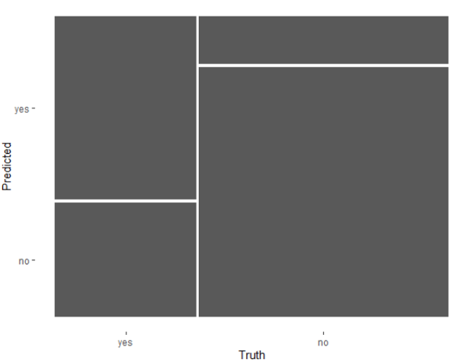
Grafico mosaico
Grafico mosaico
Visualizzare le prestazioni sulle soglie
Visualizzare le prestazioni sulle soglie
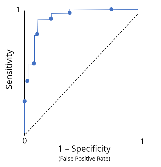
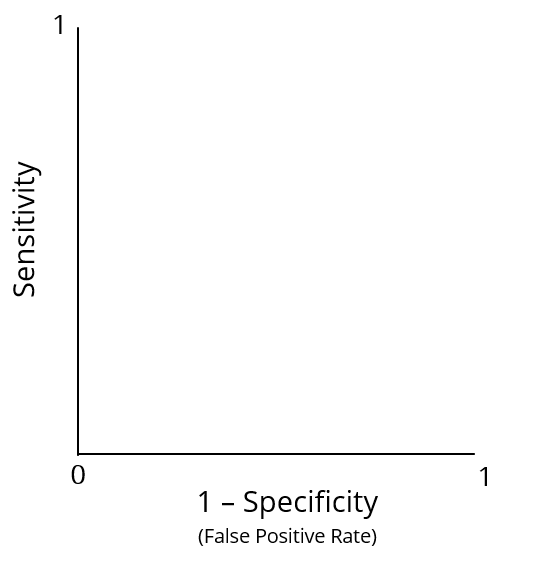
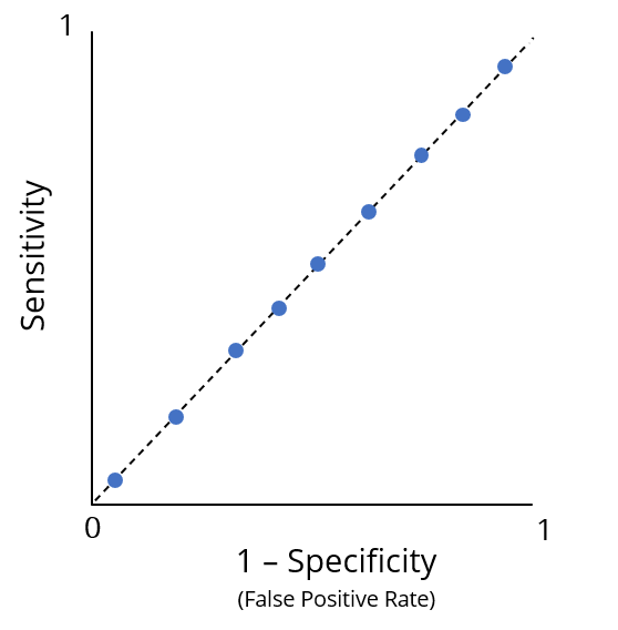
Curve ROC
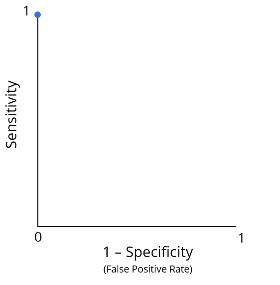
Curve ROC
Riassumere la curva ROC
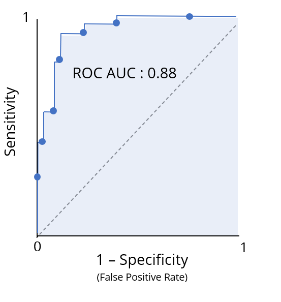
Tracciare la curva ROC


