Trực quan hóa tỷ số tài chính để so sánh
Phân tích báo cáo tài chính bằng Python

Rohan Chatterjee
Risk Modeler
Vẽ tỷ số của hai công ty
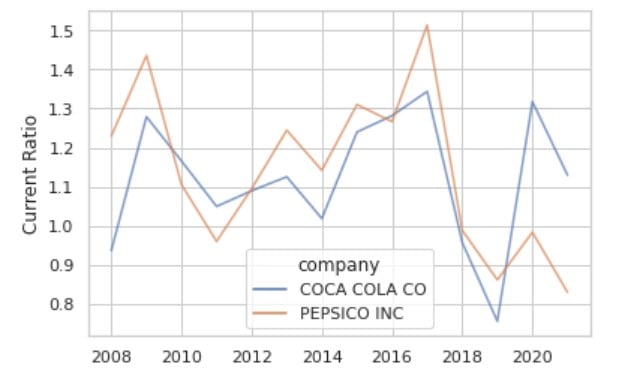
Quá tải khi dùng sns.lineplot()
Biểu đồ này chứa quá nhiều thông tin trong không gian hẹp, gây rối mắt
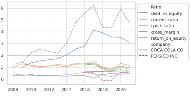
Giới thiệu sns.relplot()
Bước đầu là melt DataFrame để có dữ liệu theo thời gian.
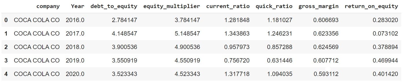
DataFrame "chưa melt":
plot_df.head()
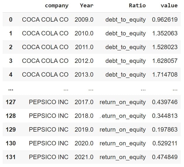
Bây giờ melt DataFrame
plot_df_melt = plot_df.melt(id_vars = ['company','Year'], var_name = "Ratio")
Vẽ tỷ số với sns.relplot()
ax = sns.relplot(data=df_melt, x="Year",
                 y="value", hue="Ratio",
                 alpha=0.7,
                 col='company',
                 kind='line')
ax.set_ylabels('')
ax.set_xlabels('')
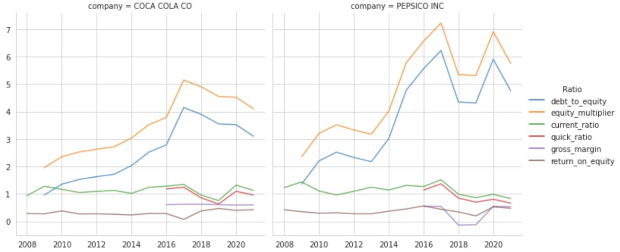
Xem kỹ biểu đồ

