When to use bars

Thực hành tốt nhất về trực quan hóa trong R

Nick Strayer

Instructor

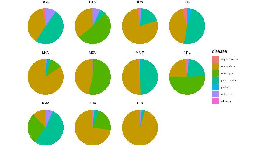
Why not use faceting?

  • Almost impossible to compare

Thực hành tốt nhất về trực quan hóa trong R

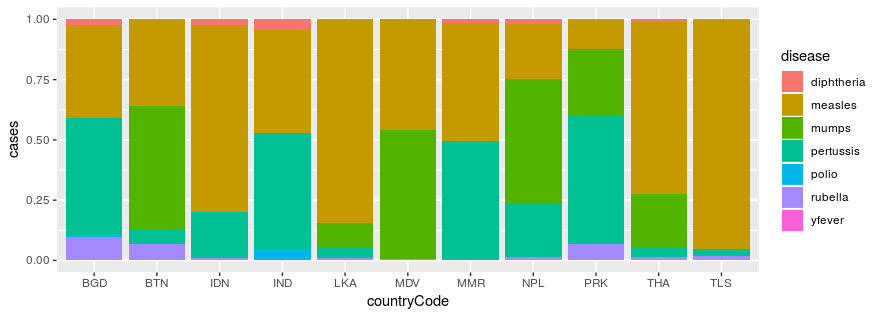
The stacked bar chart

  • Allow each population to share the same y-axis
  • Enables easier comparisons based on vertical position/size
who_disease %>% 
  filter(region == 'SEAR') %>% 
  ggplot(aes(x = countryCode, y = cases, fill = disease)) +
    geom_col(position = 'fill')

Thực hành tốt nhất về trực quan hóa trong R

Caveats

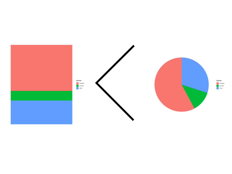
  • Worse in isolation than pie or waffle charts
  • Accuracy degrades rapidly after 3 classes
Thực hành tốt nhất về trực quan hóa trong R

Chapter recap

Proportions:

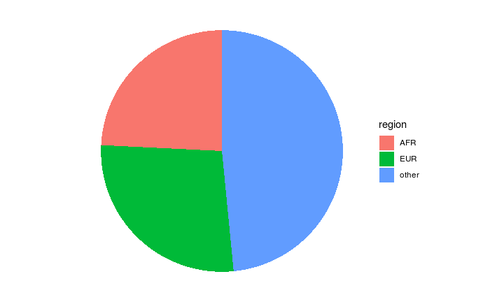
Pie charts:
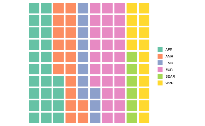
Waffle charts:
Stacked bars:

Thực hành tốt nhất về trực quan hóa trong R

Let's practice!

Thực hành tốt nhất về trực quan hóa trong R

Preparing Video For Download...