Plotting the predictor insight graph

Nhập môn Phân tích Dự đoán với Python

Nele Verbiest, Ph.D

Data Scientist @PythonPredictions

The predictor insight graph
Nhập môn Phân tích Dự đoán với Python

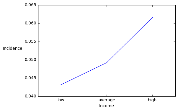
Plotting the target incidence

import matplotlib.pyplot as plt
import numpy as np

# Plot the graph pig_table["Incidence"].plot()
# Show the group names plt.xticks(np.arange(len(pig_table)), pig_table["income"])
# Center the groups names width = 0.5 plt.xlim([-width, len(pig_table)-width])
plt.ylabel("Incidence", rotation = 0, rotation_mode="anchor", ha = "right") plt.xlabel("Income") plt.show()

Nhập môn Phân tích Dự đoán với Python

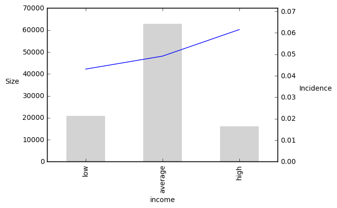
Plotting the sizes

import matplotlib.pyplot as plt
import numpy as np
# Plot the graph

plt.ylabel("Size", rotation = 0,rotation_mode="anchor", ha = "right" )
pig_table["Incidence"].plot(secondary_y = True)
pig_table["Size"].plot(kind='bar', width = 0.5, color = "lightgray", edgecolor = "none") ## Add bars
# Show the group names plt.xticks(np.arange(len(pig_table)), pig_table["income"]) # Center the groups names plt.xlim([-0.5, len(pt)-0.5]) plt.ylabel("Incidence", rotation = 0, rotation_mode="anchor", ha = "right" plt.xlabel("Income") plt.show()
Nhập môn Phân tích Dự đoán với Python

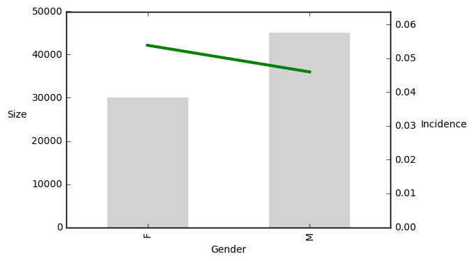
Plotting the sizes

Nhập môn Phân tích Dự đoán với Python

Let's practice!

Nhập môn Phân tích Dự đoán với Python

Preparing Video For Download...