Plot multiple time series

Trực quan hóa dữ liệu chuỗi thời gian trong Python

Thomas Vincent

Head of Data Science, Getty Images

Clarity is key

In this plot, the default matplotlib color scheme assigns the same color to the beef and turkey time series.
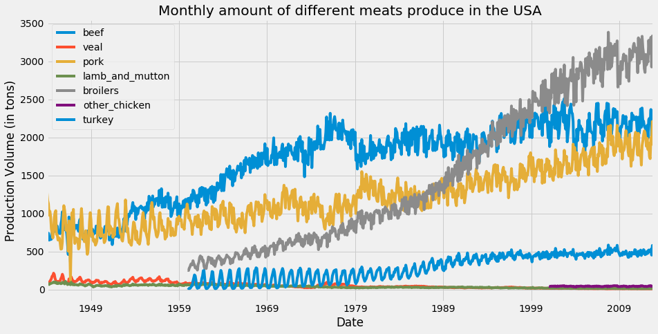
Color cycles in matplotlib

Trực quan hóa dữ liệu chuỗi thời gian trong Python

The colormap argument

ax = df.plot(colormap='Dark2', figsize=(14, 7))
ax.set_xlabel('Date')
ax.set_ylabel('Production Volume (in tons)')

plt.show()

For the full set of available colormaps, click here.

Trực quan hóa dữ liệu chuỗi thời gian trong Python

Changing line colors with the colormap argument
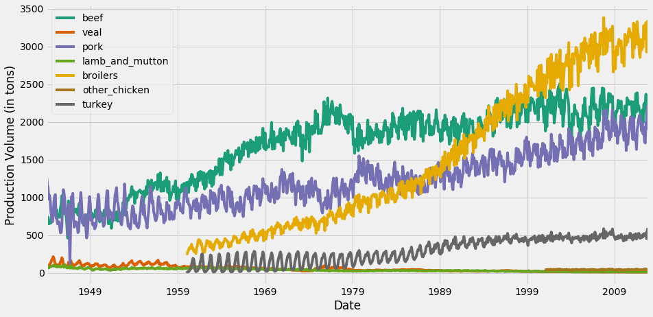
Changing color schemes for time series visualization

Trực quan hóa dữ liệu chuỗi thời gian trong Python

Enhancing your plot with information

ax = df.plot(colormap='Dark2', figsize=(14, 7))

df_summary = df.describe() # Specify values of cells in the table ax.table(cellText=df_summary.values, # Specify width of the table colWidths=[0.3]*len(df.columns), # Specify row labels rowLabels=df_summary.index, # Specify column labels colLabels=df_summary.columns, # Specify location of the table loc='top') plt.show()
Trực quan hóa dữ liệu chuỗi thời gian trong Python

Adding Statistical summaries to your plots
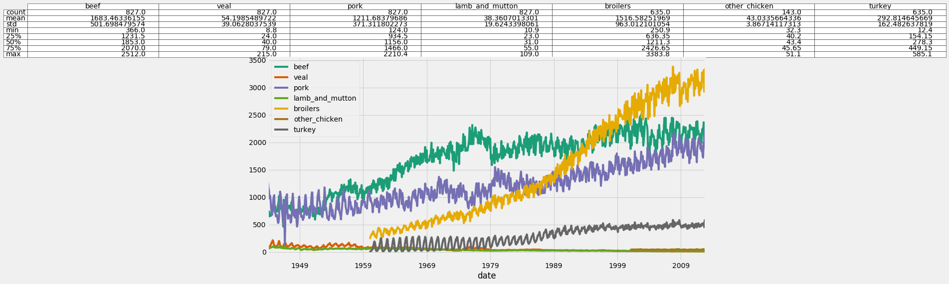
Adding Statistical summaries to your plots

Trực quan hóa dữ liệu chuỗi thời gian trong Python

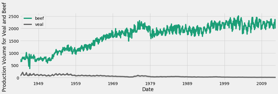
Dealing with different scales

Time series for beef and veal

Trực quan hóa dữ liệu chuỗi thời gian trong Python

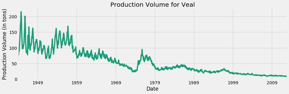
Only veal

Time series for veal only

Trực quan hóa dữ liệu chuỗi thời gian trong Python

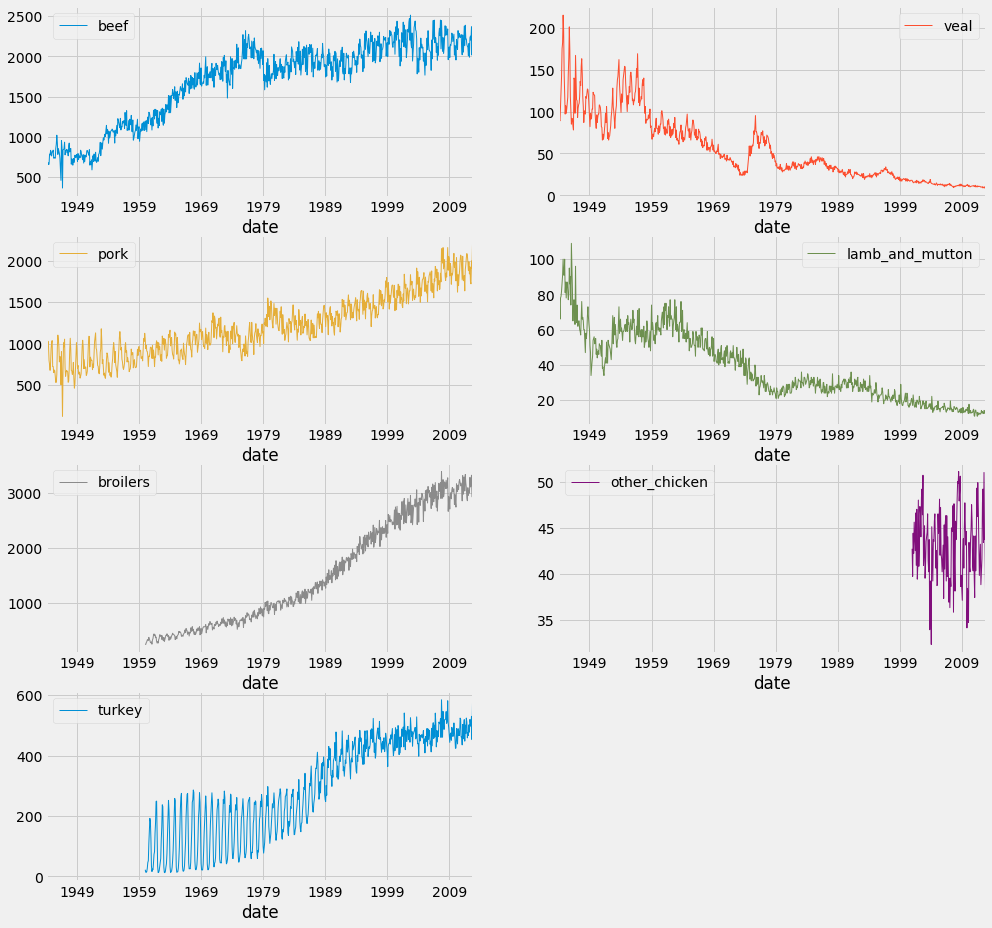
Facet plots

df.plot(subplots=True,
                linewidth=0.5,
                layout=(2, 4),
                figsize=(16, 10),
                sharex=False,
                sharey=False)

plt.show()
Trực quan hóa dữ liệu chuỗi thời gian trong Python

Facet plots

Trực quan hóa dữ liệu chuỗi thời gian trong Python

Time for some action!

Trực quan hóa dữ liệu chuỗi thời gian trong Python

Preparing Video For Download...