Nhập môn Trực quan hóa Dữ liệu với Plotly trong Python
Alex Scriven
Data Scientist
Cách tùy chỉnh biểu đồ:
color)update_layout()fig.update_layout({"title":{"text":"A New Title"}})
Tùy chỉnh màu giúp:

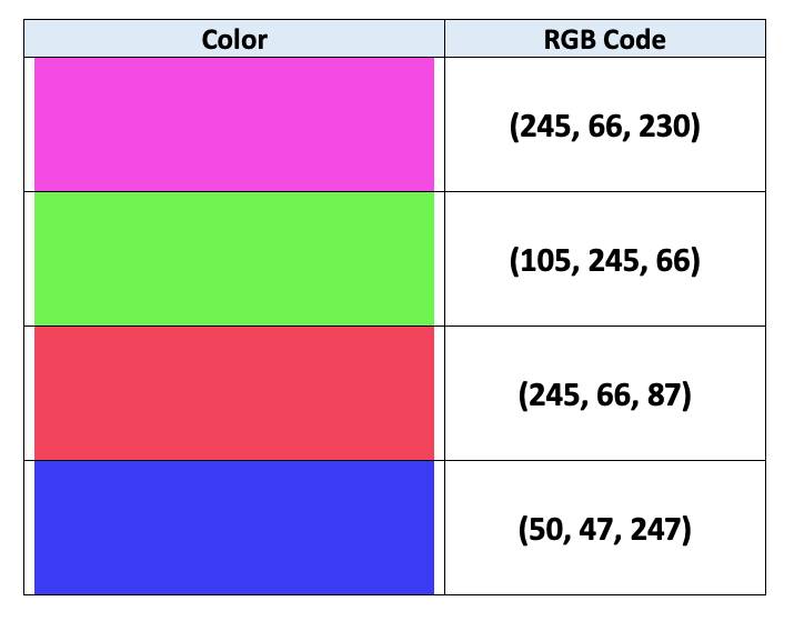
Máy tính dùng mã RGB để chỉ định màu:
$$
$$
Xem thêm trong bài viết

color (cột DataFrame)
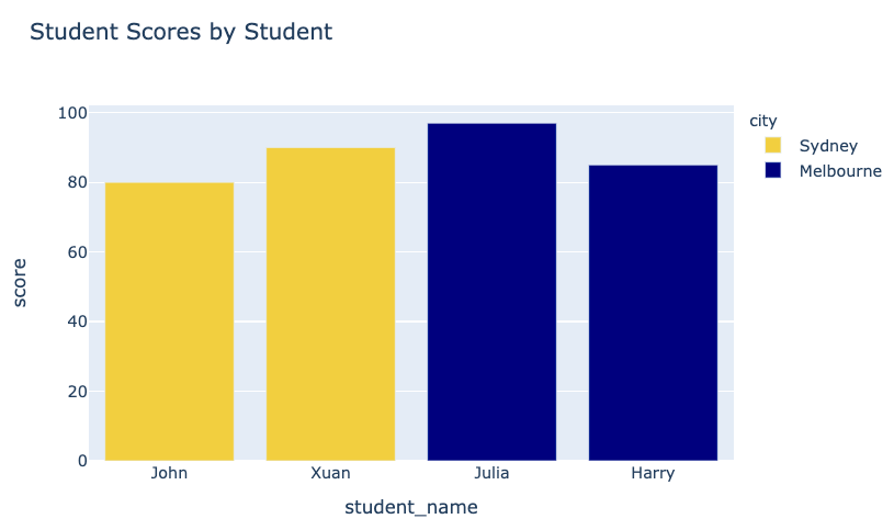
fig = px.bar(data_frame=student_scores,
x="student_name",
y="score",
title="Student Scores by Student"
color="city")
fig.show()
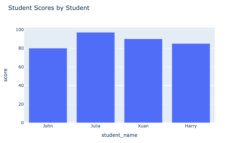
Biểu đồ trước:

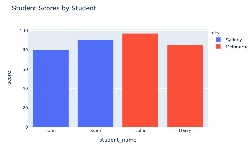
Biểu đồ sau:

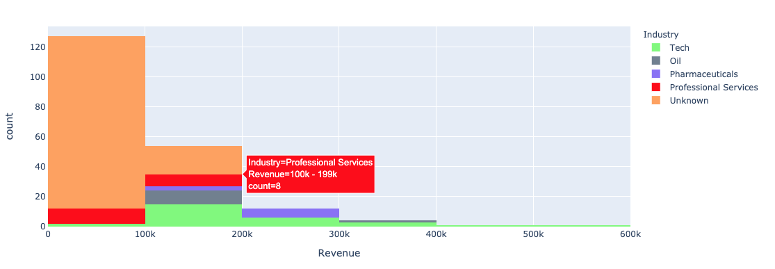
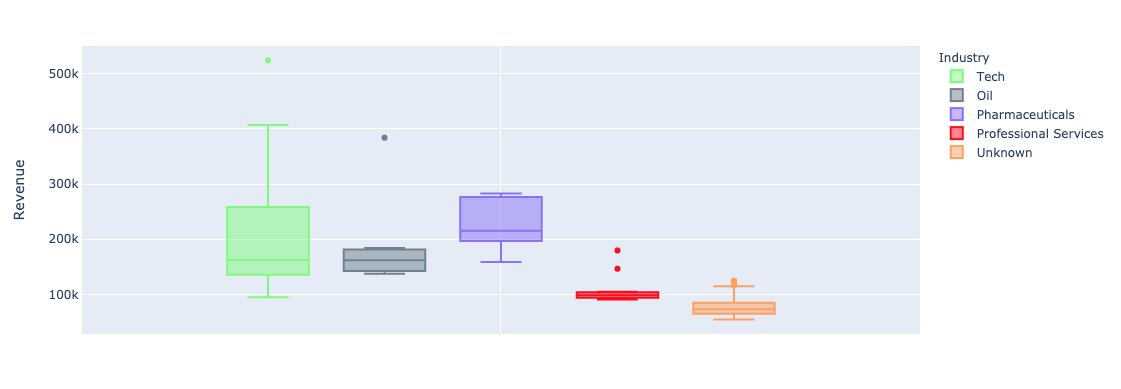
Dùng đối số color của plotly.express với biểu đồ đơn biến (cột, histogram):


color_discrete_map: Từ điển ánh xạ giá trị phân loại sang màu"red", "green"...$$
fig = px.bar( data_frame=student_scores, x="student_name", y="score", title="Student Scores by Student",color_discrete_map={ "Melbourne": "rgb(0,0,128)", "Sydney": "rgb(235, 207, 52)"},color="city")


$$
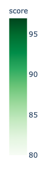
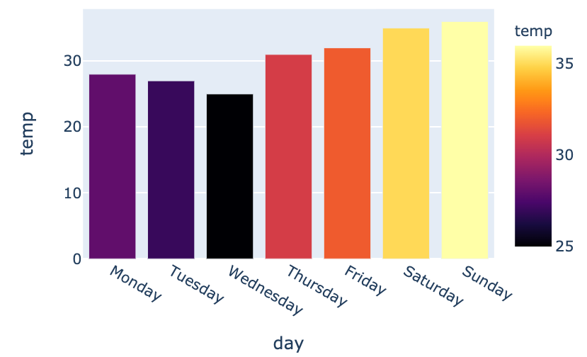
color_continuous_scale cho thang màu liên tục.
fig = px.bar(data_frame=weekly_temps,
x="day", y="temp",
color="temp",
color_continuous_scale="inferno")
fig.show()
$$

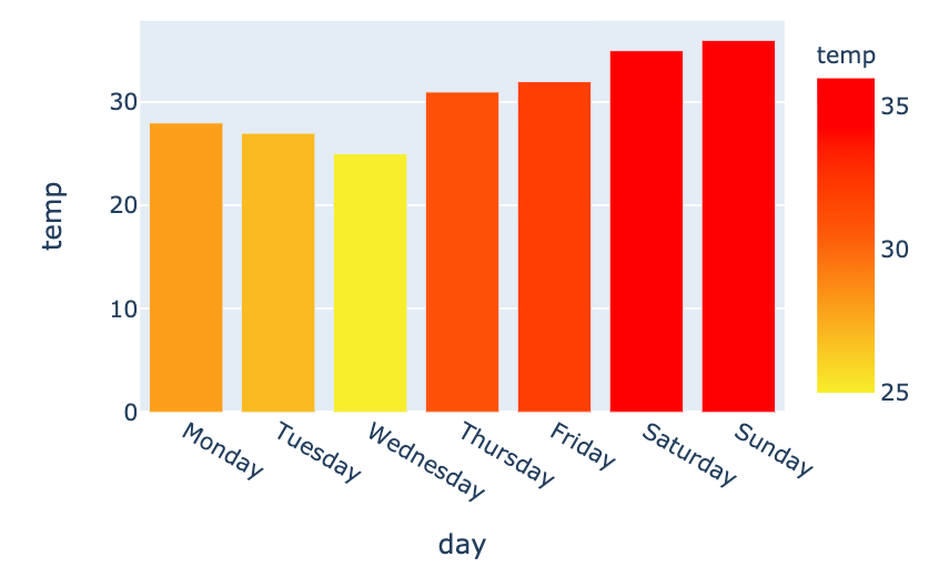
my_scale=[("rgb(242, 238, 10)"), ("rgb(242, 95, 10)"), ("rgb(255,0,0)")]fig = px.bar(data_frame=weekly_temps, x="day", y="temp",color_continuous_scale=my_scale, color="temp")

Nhập môn Trực quan hóa Dữ liệu với Plotly trong Python