Matrix Plots
Trực quan hóa dữ liệu nâng cao với Seaborn

Chris Moffitt
Instructor
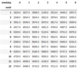
Getting data in the right format
- Seaborn's
heatmap()function requires data to be in a grid format - pandas
crosstab()is frequently used to manipulate the data
pd.crosstab(df["mnth"], df["weekday"],
values=df["total_rentals"],aggfunc="mean").round(0)
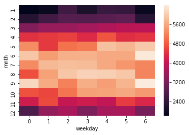
Build a heatmap
sns.heatmap(pd.crosstab(df["mnth"], df["weekday"],
            values=df["total_rentals"], aggfunc="mean")
)
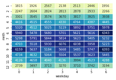
Customize a heatmap
sns.heatmap(df_crosstab, annot=True, fmt="d",
            cmap="YlGnBu", cbar=False, linewidths=.5)
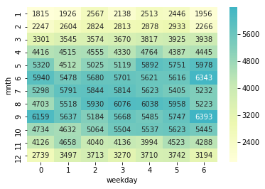
Centering a heatmap
- Seaborn support centering the heatmap colors on a specific value
sns.heatmap(df_crosstab, annot=True, fmt="d",
            cmap="YlGnBu", cbar=True,
            center=df_crosstab.loc[9, 6])
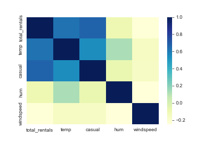
Plotting a correlation matrix
- Pandas
corrfunction calculates correlations between columns in a dataframe - The output can be converted to a heatmap with seaborn
cols = ['total_rentals', 'temp', 'casual', 'hum', 'windspeed']
sns.heatmap(df[cols].corr(), cmap='YlGnBu')