Customizing with matplotlib

Trực quan hóa dữ liệu nâng cao với Seaborn

Chris Moffitt

Instructor

Matplotlib Axes

  • Most customization available through matplotlib Axes objects
  • Axes can be passed to seaborn functions
fig, ax = plt.subplots()
sns.histplot(df['Tuition'], ax=ax)
ax.set(xlabel='Tuition 2013-14')
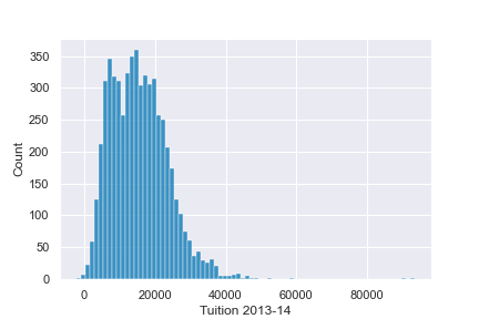
Example axes plot

Trực quan hóa dữ liệu nâng cao với Seaborn

Further Customizations

  • The axes object supports many common customizations
fig, ax = plt.subplots()
sns.histplot(df['Tuition'], ax=ax)
ax.set(xlabel="Tuition 2013-14",
       ylabel="Distribution", xlim=(0, 50000), 
title="2013-14 Tuition and Fees Distribution")
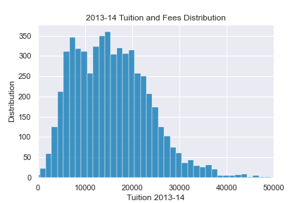
Additional axes example

Trực quan hóa dữ liệu nâng cao với Seaborn

Combining Plots

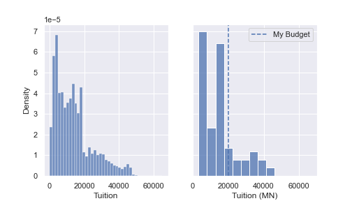
  • It is possible to combine and configure multiple plots
fig, (ax0, ax1) = plt.subplots(nrows=1, ncols=2, 
                               sharey=True, figsize=(7,4))

sns.histplot(df['Tuition'], stat='density', ax=ax0)
sns.histplot(df.query('State == "MN"')['Tuition'], stat='density', ax=ax1)

ax1.set(xlabel='Tuition (MN)', xlim=(0, 70000))
ax1.axvline(x=20000, label='My Budget', linestyle='--')
ax1.legend()
Trực quan hóa dữ liệu nâng cao với Seaborn

Combining Plots

Side by side plots

Trực quan hóa dữ liệu nâng cao với Seaborn

Let's practice!

Trực quan hóa dữ liệu nâng cao với Seaborn

Preparing Video For Download...