Making better plots

Dữ liệu phân loại trong Tidyverse

Emily Robinson

Data Scientist
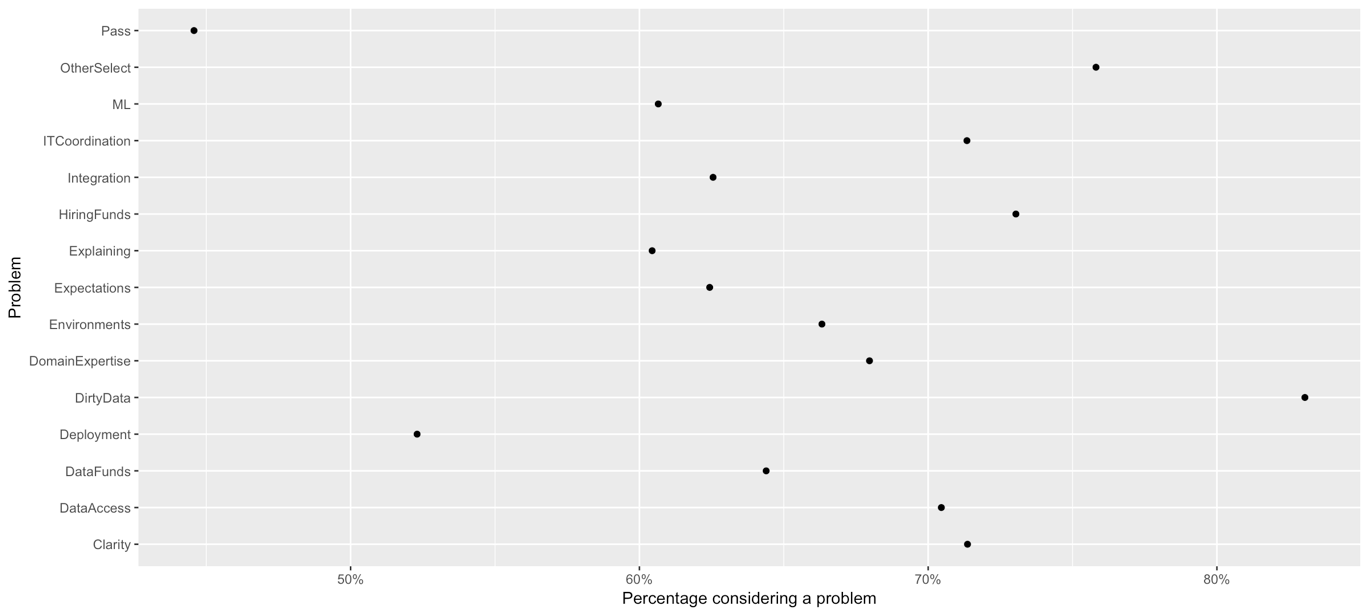
A scatterplot with "problem" on the y-axis and "percentage considering a problem" on the x-axis. Problems include Expectations, Dirty Data, and Domain Expertise. The plot is not ordered so the points are scattered around.

Dữ liệu phân loại trong Tidyverse

Reordering factors

ggplot(WorkChallenges, aes(x = fct_reorder(question, perc_problem),
                           y = perc_problem)) +
  geom_point() + 
  coord_flip()              
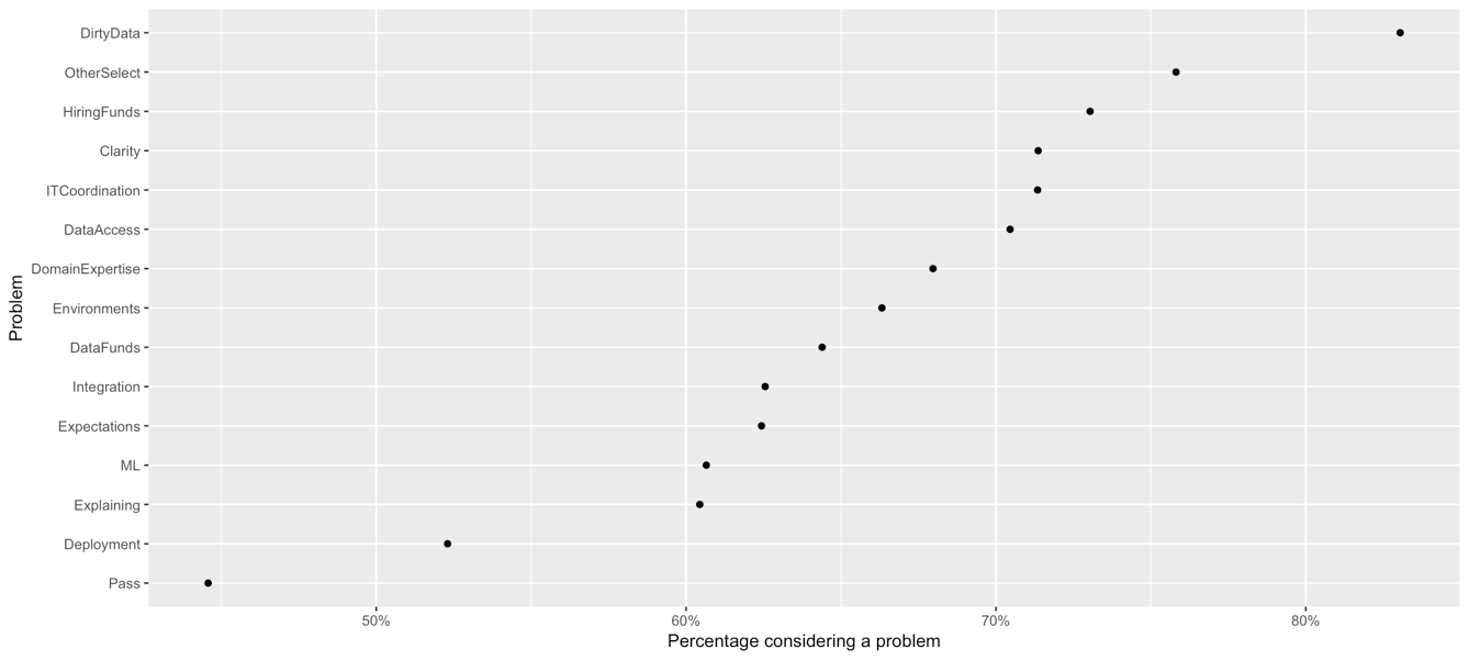
The same scatterplot as before but now ordered so from left to right it goes from the least percentage considering a problem to the most.

Dữ liệu phân loại trong Tidyverse

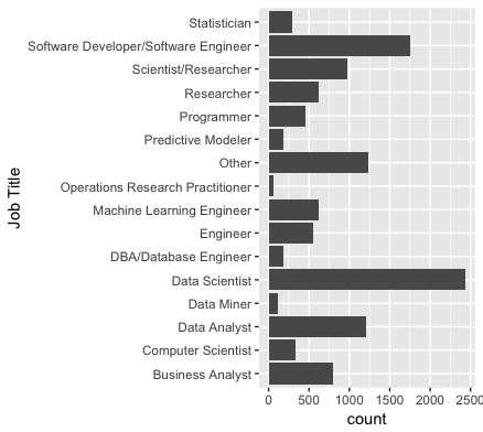
A bar graph with job title on the y-axis and count on the x-axis. The bar is not ordered by count.

Dữ liệu phân loại trong Tidyverse

Reordering bar chart

ggplot(multiple_choice_responses, aes(x = fct_infreq(CurrentJobTitleSelect)) +
   geom_bar() +
   coord_flip()              

The same bar chart as before but now ordered from top to bottom in increasing count.

Dữ liệu phân loại trong Tidyverse

Reversing factor levels

ggplot(multiple_choice_responses, aes(x = fct_rev(fct_infreq(CurrentJobTitleSelect)))) +
    geom_bar() + 
    coord_flip()
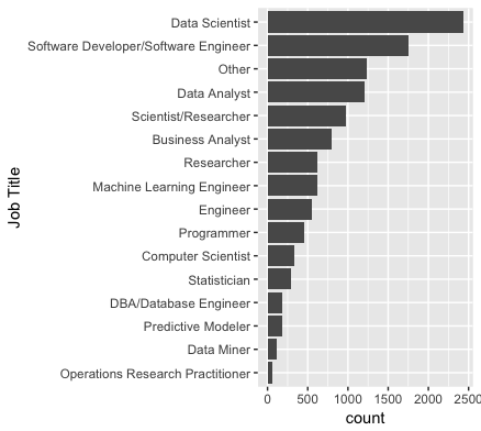
The same bar chart as before but now ordered from top to bottom in decreasing count.

Dữ liệu phân loại trong Tidyverse

Let's practice!

Dữ liệu phân loại trong Tidyverse

Preparing Video For Download...