Reordering factors

Dữ liệu phân loại trong Tidyverse

Emily Robinson

Data Scientist
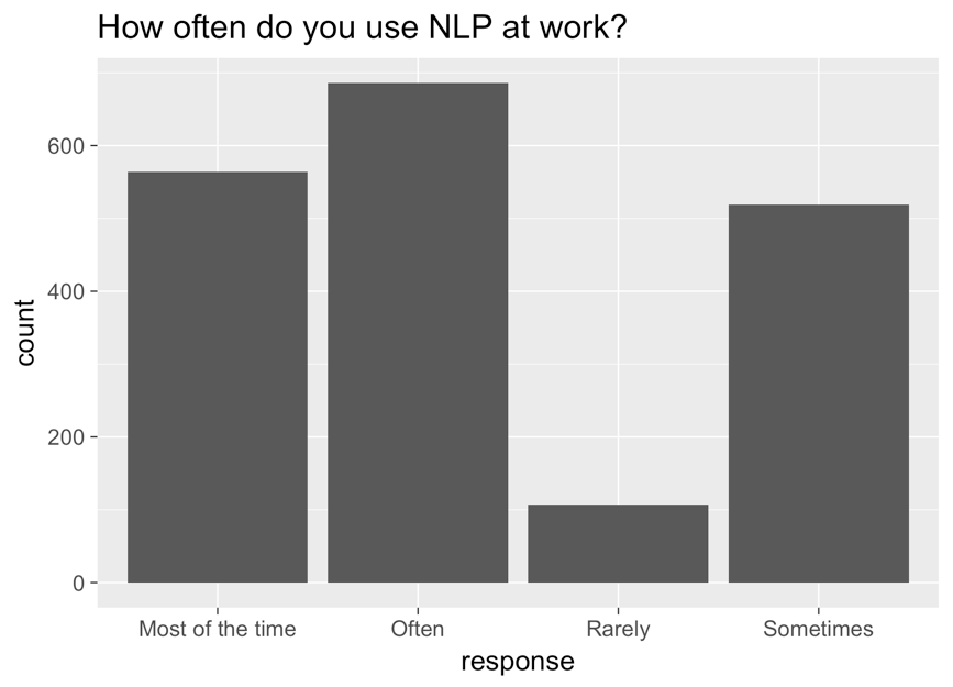
A bar chart with the response on the x-axis, count on the y-axis, and the title "how often do you use NLP at work?" The bars, from left to right, are most of the time, often, rarely, and sometimes.

Dữ liệu phân loại trong Tidyverse

Corrected graph

ggplot(aes(nlp_frequency, 
            x = fct_relevel(response, 
            "Rarely", "Sometimes", "Often", "Most of the time"))) + 
        geom_bar()
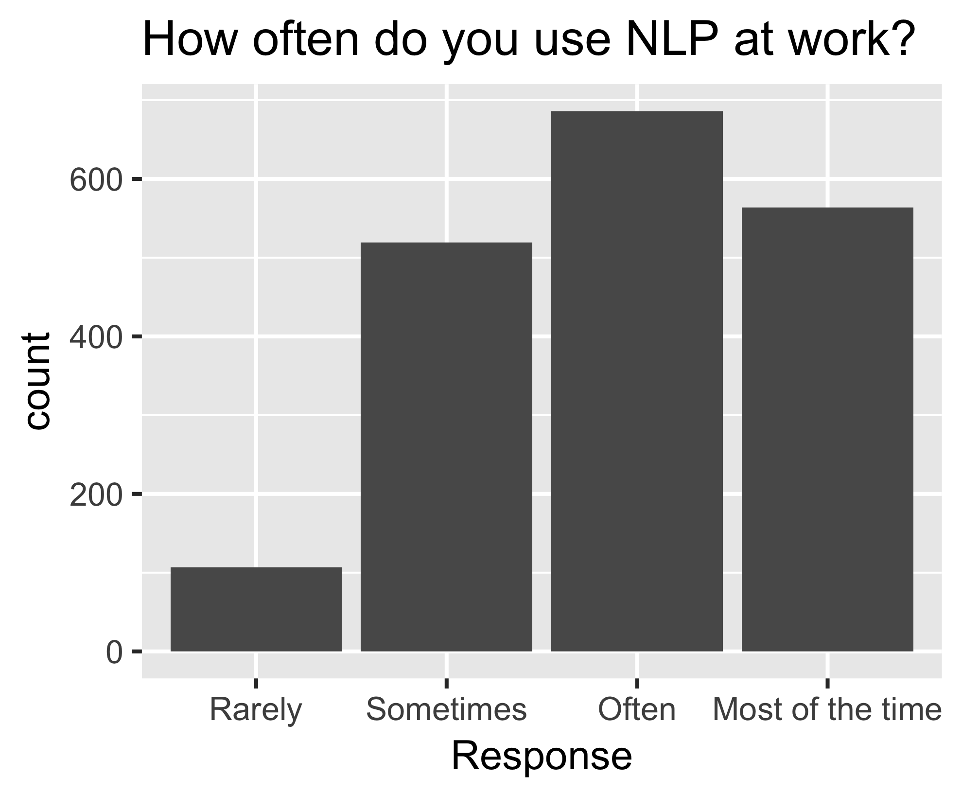
The same bar chart as before, now ordered, from left to right, rarely, sometimes, often, most of the time.

Dữ liệu phân loại trong Tidyverse

fct_reorder()

nlp_frequency %>%
    pull(response) %>%
    levels()
[1] "Most of the time" "Often" "Rarely" "Sometimes"       
nlp_frequency %>%
    mutate(response = fct_relevel(response, 
            "Often", "Most of the time")) %>%
    pull(response) %>%
    levels()
[1] "Often" "Most of the time" "Rarely" "Sometimes"
Dữ liệu phân loại trong Tidyverse

Additional arguments

nlp_frequency %>%
    mutate(response = fct_relevel(response, 
            "Often", "Most of the time", after = 2)) %>%
            pull(response) %>%
            levels()
nlp_frequency %>%
    mutate(response = fct_relevel(response, 
            "Often", "Most of the time", after = Inf) %>%
    pull(response) %>%
    levels()
[1] "Rarely" "Sometimes" "Often" "Most of the time"
Dữ liệu phân loại trong Tidyverse

Let's practice!

Dữ liệu phân loại trong Tidyverse

Preparing Video For Download...