복잡한 실험에서 인사이트 종합하기

Python으로 배우는 실험 설계

James Chapman

Curriculum Manager, DataCamp

제조 수율 데이터

manufacturing_yield
 BatchID  MaterialType  ProductionSpeed  TemperatureSetting  YieldStrength
      39       Polymer           Medium             Optimal          58.83
     195         Metal             High                High          51.29
     462       Polymer             High             Optimal          55.15
     696     Composite           Medium                 Low          50.27
     142     Composite             High                 Low          57.62
  • 다요인 설계: MaterialType, ProductionSpeed, TemperatureSetting
  • 반응 변수: YieldStrength
Python으로 배우는 실험 설계

제조 품질 데이터

manufacturing_quality
 BatchID ProductionSpeed  ProductQuality
     149             Low           93.87
     739            High           93.35
     617          Medium           90.45
     131            High           90.26
     684             Low           91.62
  • 설계: ProductionSpeed
  • 반응 변수: ProductQuality
Python으로 배우는 실험 설계

머지 전략

merged_manufacturing = pd.merge(manufacturing_yield,
                       manufacturing_quality, 
                       on=['BatchID', 'ProductionSpeed'])
print(merged_manufacturing)
 BatchID  MaterialType  ProductionSpeed  TemperatureSetting  YieldStrength  ProductQuality
       1         Metal              Low                High          57.32           91.19
       5     Composite           Medium             Optimal          51.82           90.20
       7       Polymer              Low                High          56.12           91.66
       8     Composite             High             Optimal          50.91           93.05
      11       Polymer              Low                High          50.13           92.31
Python으로 배우는 실험 설계

나란히 막대 그래프

import seaborn as sns
sns.catplot(x='MaterialType', y='YieldStrength', hue='ProductionSpeed', kind='bar', 
            data=merged_manufacturing)
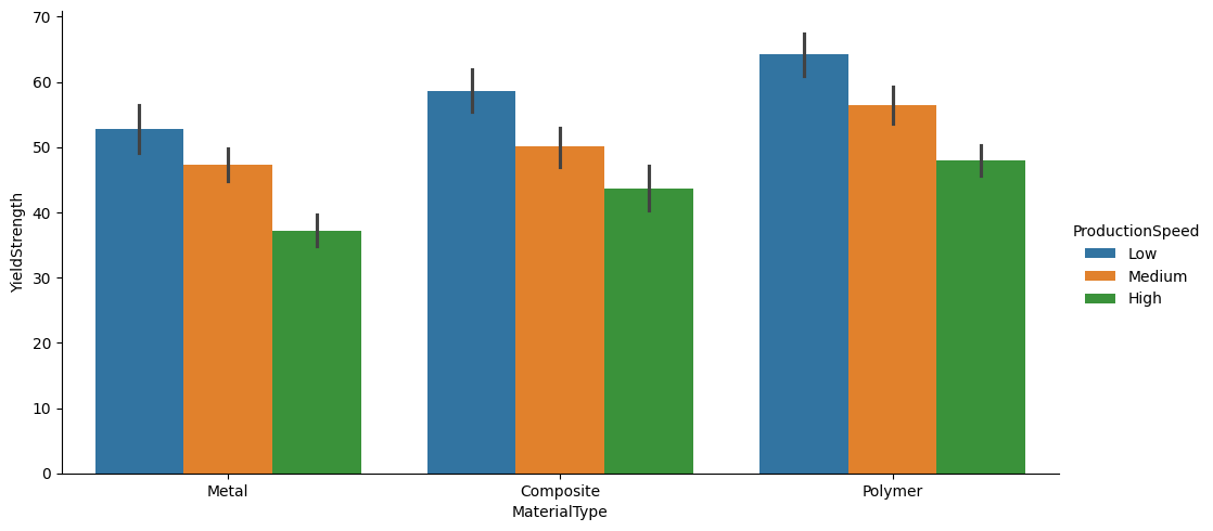
catplot.png

Python으로 배우는 실험 설계

세 변수 산점도

sns.relplot(x='YieldStrength', y='ProductQuality', hue='ProductionSpeed', 
            kind='scatter', data=merged_manufacturing)
plt.title('Yield Strength vs. Product Quality by Production Speed')
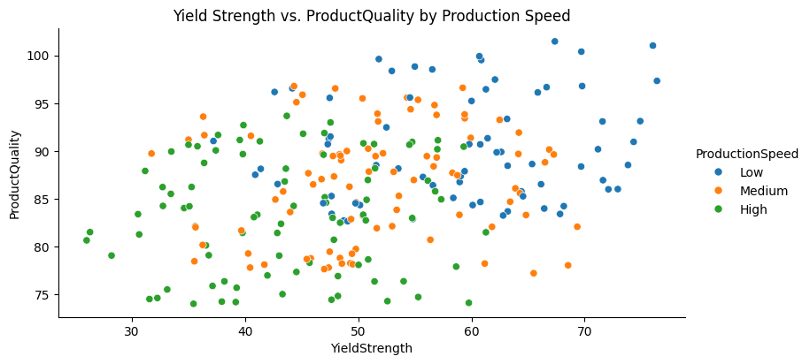
생산 속도별 인장강도 vs. 제품 품질

Python으로 배우는 실험 설계

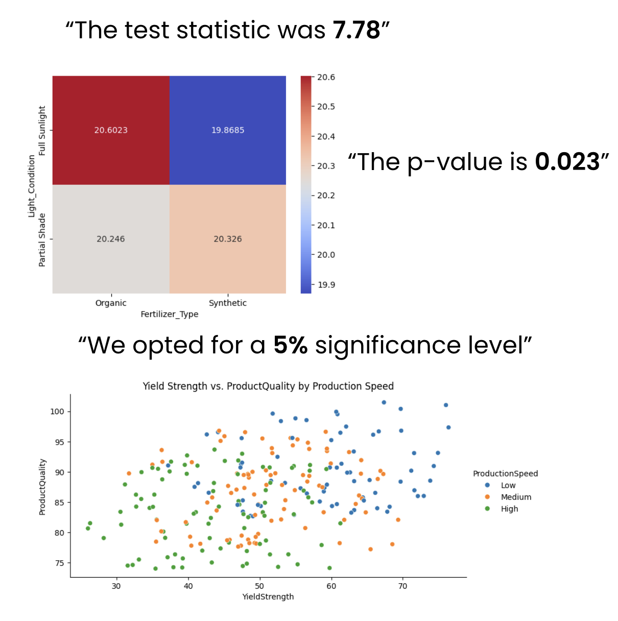
기술 청중에게 데이터 전달하기


  • 데이터 내러티브 구성
    • p-값
    • 검정 통계량
    • 유의수준
  • 복잡한 데이터 시각화
    • 히트맵
    • 다중 색의 산점도
    • 투영

기술 청중에게 발표하기

Python으로 배우는 실험 설계

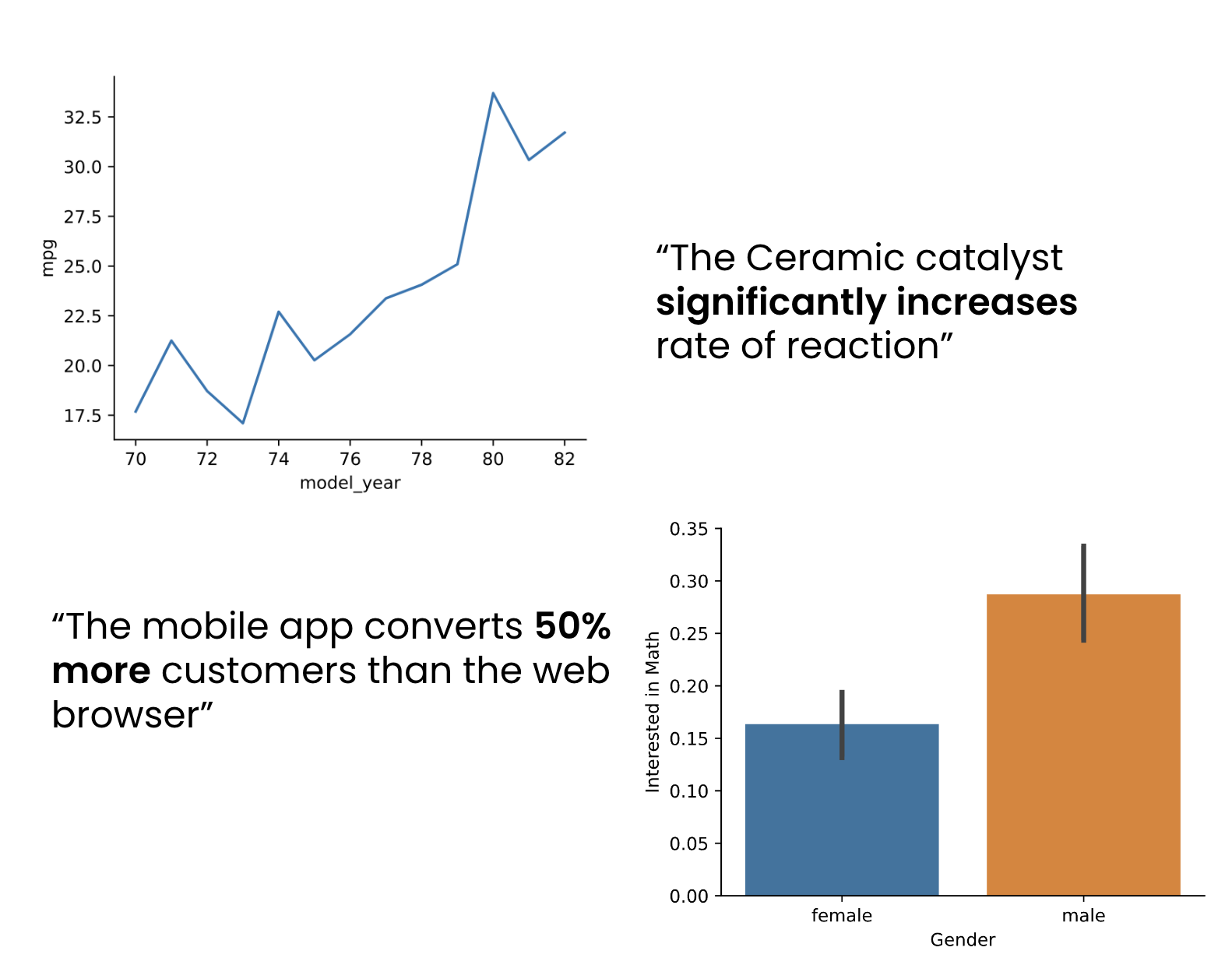
비기술 청중을 데이터로 참여시키기


  • 데이터 인사이트 단순화
    • 기본 시각화: 막대/선 그래프
  • 청중 중심 발표 준비
    • 왜 이 데이터가 중요한가?
    • 인사이트를 현실 적용과 연결

데이터 스토리텔링

Python으로 배우는 실험 설계

연습해 봅시다!

Python으로 배우는 실험 설계

Preparing Video For Download...