캠페인 결과 시각화 (I)

pandas로 마케팅 캠페인 분석하기

Jill Rosok

Data Scientist

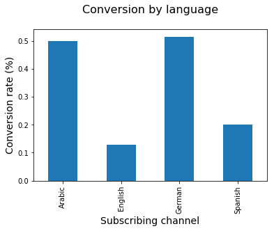
언어별 전환율 비교

import matplotlib.pyplot as plt

# Create a bar chart using channel retention DataFrame
language_conversion_rate.plot(kind = 'bar')

# Add a title and x and y-axis labels plt.title('Conversion rate by language\n', size = 16) plt.xlabel('Language', size = 14) plt.ylabel('Conversion rate (%)', size = 14)
# Display the plot plt.show()
pandas로 마케팅 캠페인 분석하기

언어별 전환율.png

pandas로 마케팅 캠페인 분석하기

가입자 품질 계산하기

# Group by date_subscribed and count unique users
subscribed = marketing.groupby(['date_subscribed'])['user_id']\
                     .nunique()

# Group by date_subscribed and sum conversions
retained = marketing[marketing['is_retained'] == True]\
                         .groupby(['date_subscribed'])\
                         ['user_id'].nunique()

# Calculate subscriber quality across dates
daily_retention_rate = retained/subscribed
pandas로 마케팅 캠페인 분석하기

시계열 플롯을 위한 데이터 준비

# Reset index to turn the Series into a DataFrame
daily_retention_rate = 
    pd.DataFrame(daily_retention_rate.reset_index())

# Rename columns
daily_retention_rate.columns = ['date_subscribed', 
                               'retention_rate']
pandas로 마케팅 캠페인 분석하기

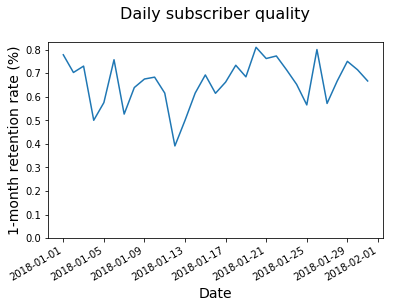
시간 경과에 따른 추세 시각화

# Create a line chart using the daily_retention DataFrame
daily_retention_rate.plot('date_subscribed', 
                          'retention_rate')

# Add a title and x and y-axis labels
plt.title('Daily subscriber quality\n', size = 16)
plt.ylabel('1-month retention rate (%)', size = 14)
plt.xlabel('Date', size = 14)

# Set the y-axis to begin at 0
plt.ylim(0)
# Display the plot
plt.show()
pandas로 마케팅 캠페인 분석하기

일별 가입자 품질 차트.png

pandas로 마케팅 캠페인 분석하기

실습해 봅시다!

pandas로 마케팅 캠페인 분석하기

Preparing Video For Download...