Dash와 Plotly로 대시보드 만들기
Alex Scriven
Data Scientist
HTML: 웹사이트 구조 언어


dash.html로 HTML과 Python을 연결$$
중요한 HTML 구조(‘태그’) 두 가지:
$$
style은 무시 - CSS는 나중에 다룸!
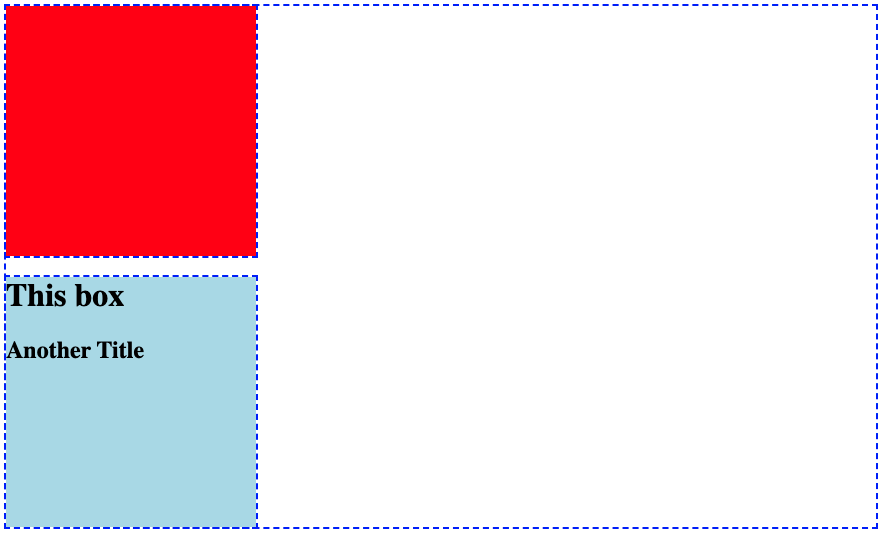
<div>
<div style="background-color: red;
width:250; height:250;">
</div>
<div style="background-color: lightblue;
width:250; height:250;">
<h1>This box</h1>
<h2>Another Title</h2>
</div>
</div>

주의:
from dash import Dash, html
app = Dash()
app.layout = [
html.Div(style={'height':250, 'width':250, 'background-color':'red'}),
html.Div(children=[
html.H1("This box"),
html.H2("Another Title")],
style={'background-color':'lightblue'})
]
html.()에 매핑됨html.Div() = <div>html.H1() = <h1>children 인수가 있음dcc.Graph()도 넣을 수 있음!
from dash import Dash, html
app.layout = [
html.Div(
style={'background-color':'red',
'height':250, 'width':250}),
html.Div(
children=[
html.H1("This box"),
html.H2("Another Title")]
,style={'background-color':'lightblue',
'height':250, 'width':250})
]
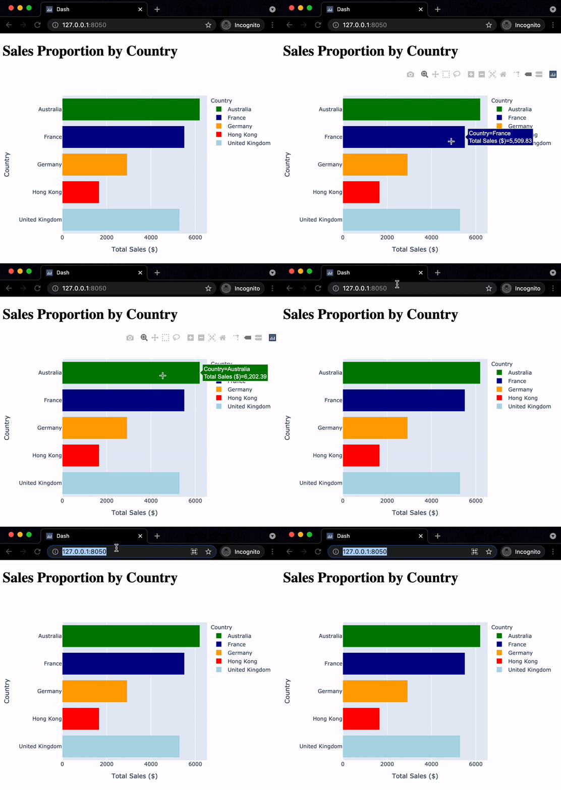
bar_fig_country = px.bar(ecom_sales, x='Total Sales ($)', y='Country', color='Country', color_discrete_map= {'United Kingdom':'lightblue', 'Germany':'orange', 'France':'darkblue', 'Australia':'green', 'Hong Kong':'red'}) app = Dash()app.layout = [ html.H1("Sales Proportion by Country"), dcc.Graph(id='bar_graph', figure=bar_fig_country) ]

$$
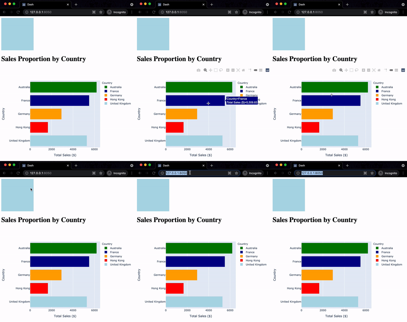
app.layout = [
html.Div(style={
'width':150,'height':150,
'background-color':'lightblue'}),
html.H1("Sales Proportion by Country"),
dcc.Graph(id='bar_graph',
figure=bar_fig_country)
]

$$

Dash와 Plotly로 대시보드 만들기