R로 배우는 시각화 베스트 프랙티스
Nick Strayer
Instructor
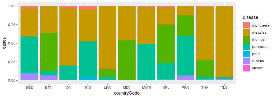
who_disease %>%
  filter(region == 'SEAR') %>%
  ggplot(aes(x = countryCode, y = cases, fill = disease)) +
    geom_col(position = 'fill')
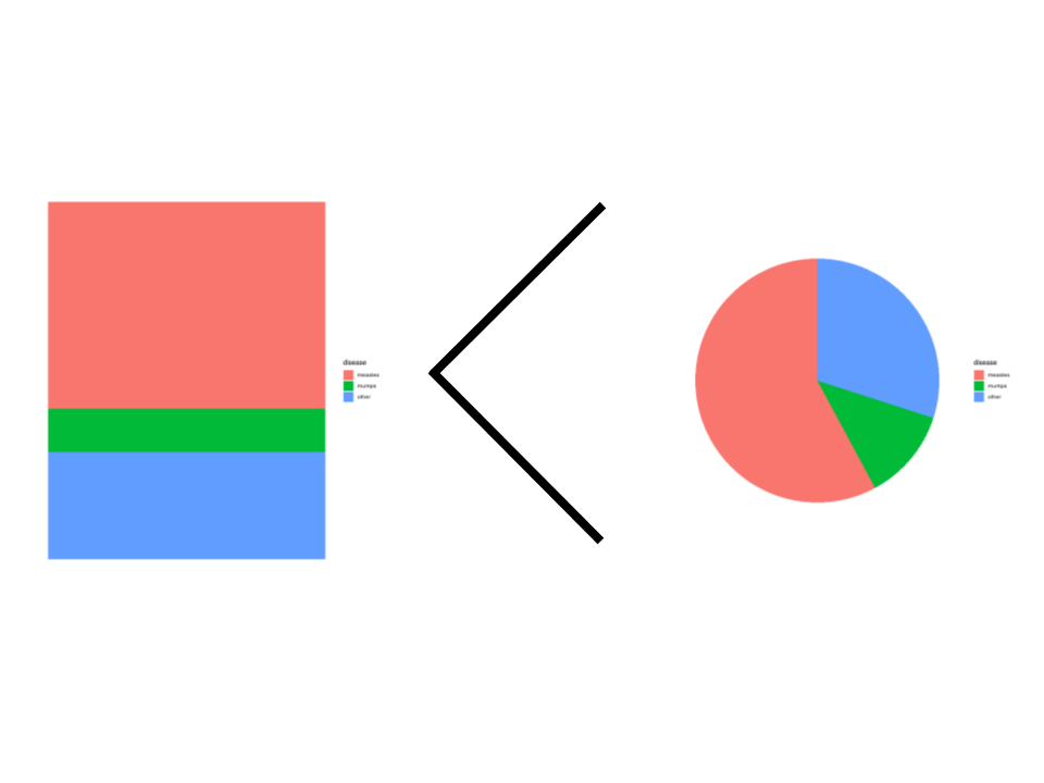
비율:
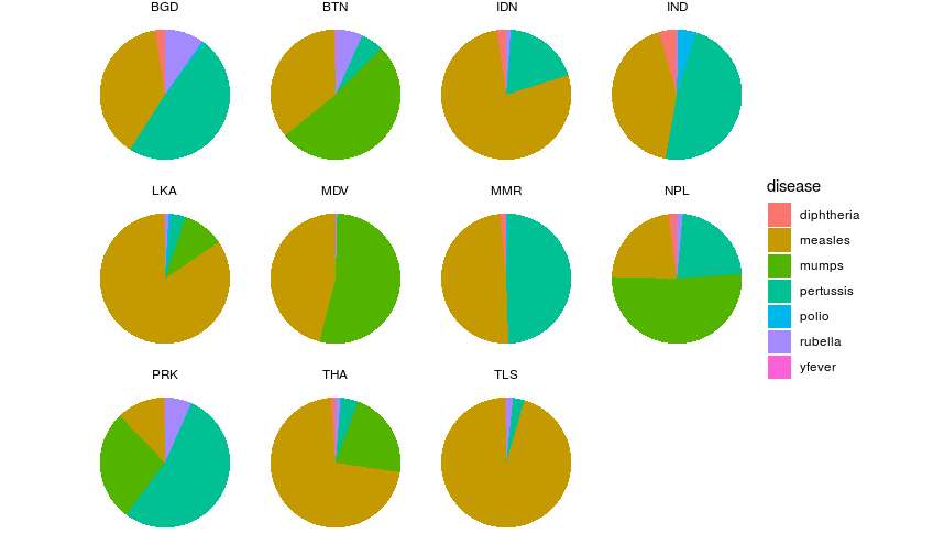
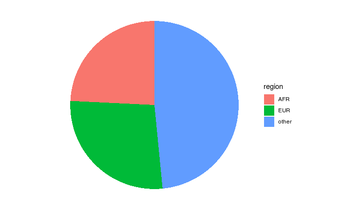
파이 차트:
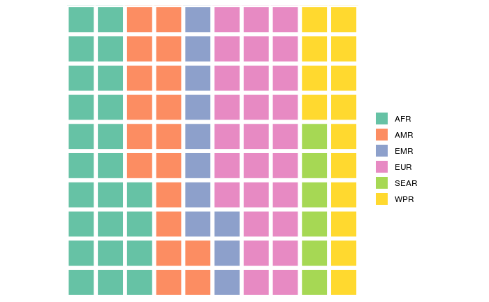
와플 차트:
누적 막대: