R로 배우는 시각화 베스트 프랙티스
Nick Strayer
Instructor
who_disease %>%
  filter(region == 'EMR', disease == 'measles', year == 2015) %>%
  ggplot(aes(x = country, y = cases)) +
    geom_col()
geom_bar()
geom_col()
busy_bars <- who_disease %>%
filter(region == 'EMR', disease == 'measles', year == 2015) %>%
ggplot(aes(x = country, y = cases)) +
geom_col()
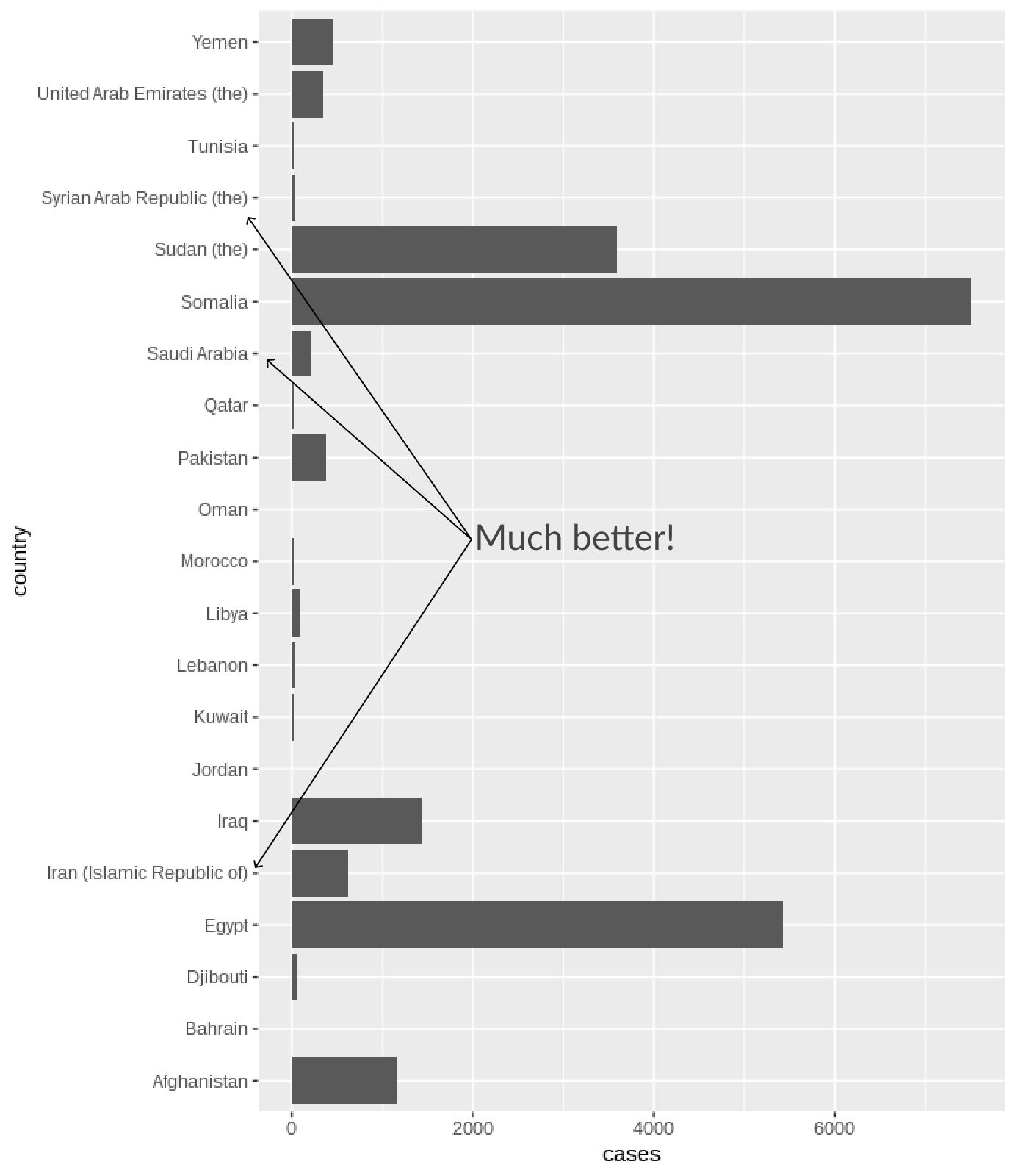
busy_bars + coord_flip() # x, y 축 교체!
plot <- who_disease %>%
  filter(country == "India", year == 1980) %>%
  ggplot(aes(x = disease, y = cases)) +
    geom_col()
# Remove vertical grid lines
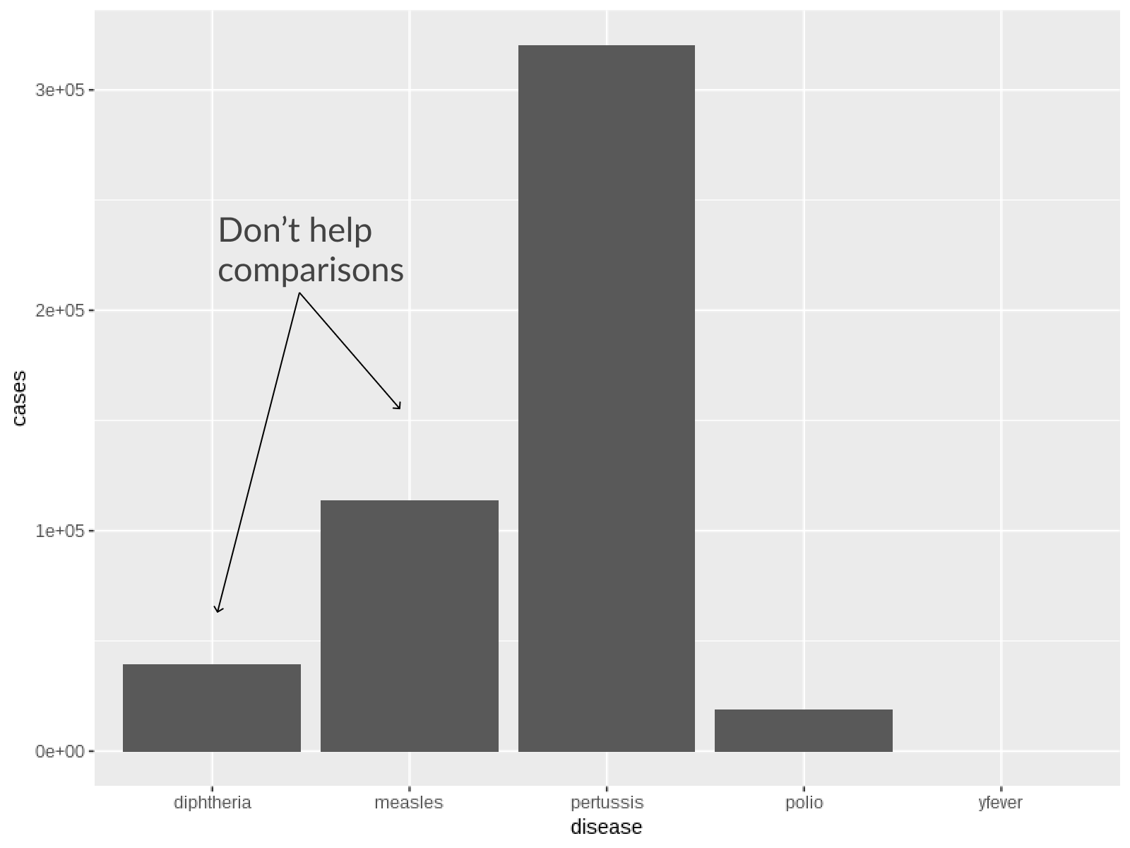
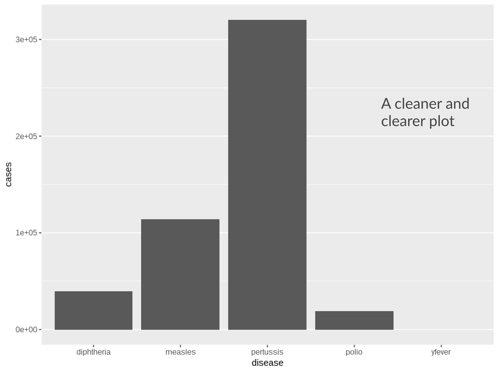
 plot + theme(
    panel.grid.major.x = element_blank()
  )
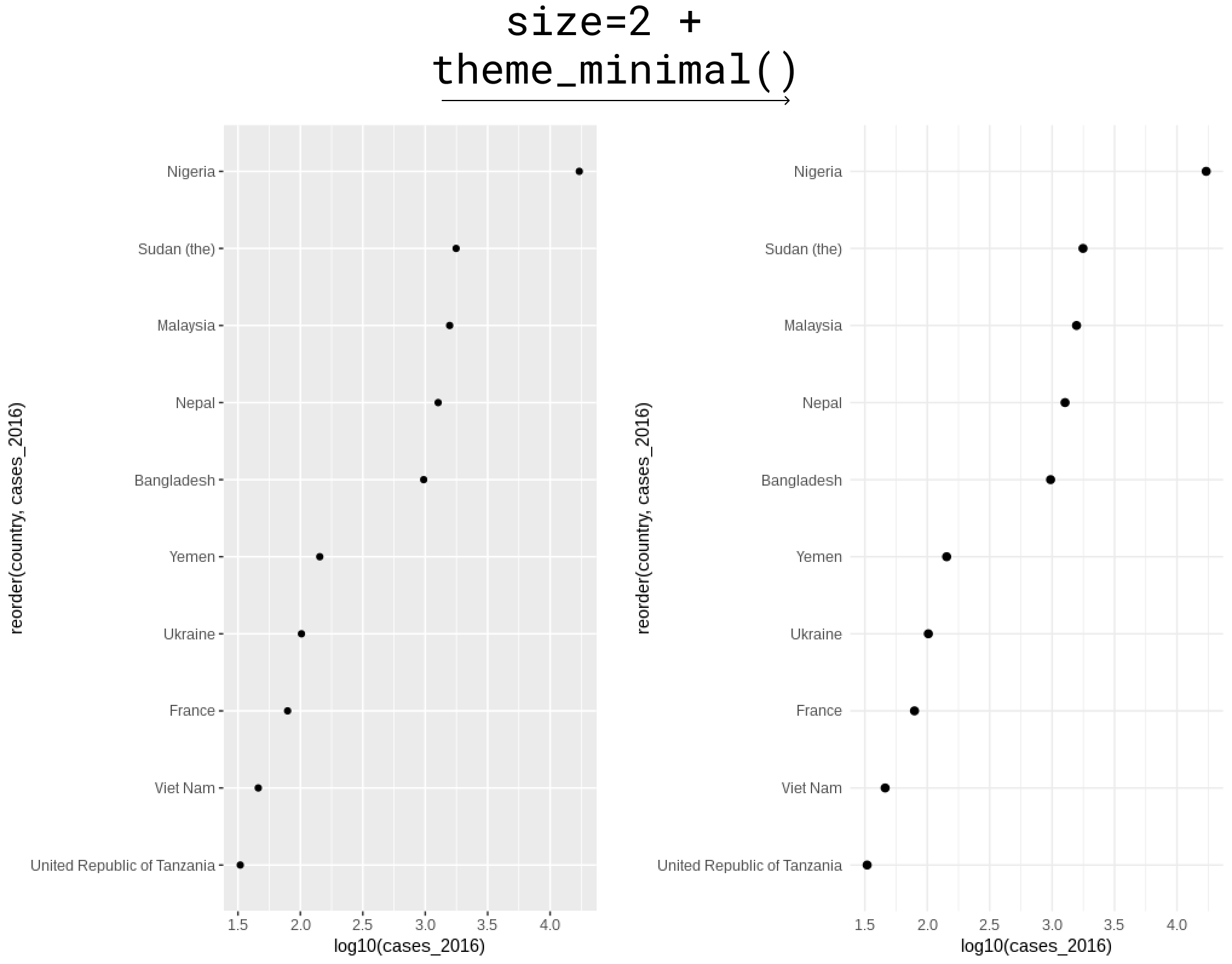
theme_minimal()
who_subset %>%
  ggplot(aes(y = reorder(country, cases_2016), x = log10(cases_2016))) +
  # Point size increased
  geom_point(size = 2) +
  # Theme minimal for light background
  theme_minimal()