시계열 플롯 커스터마이징

Python으로 시계열 데이터 시각화

Thomas Vincent

Head of Data Science, Getty Images

시계열 데이터 슬라이싱

discoveries['1960':'1970']
discoveries['1950-01':'1950-12']
discoveries['1960-01-01':'1960-01-15']
Python으로 시계열 데이터 시각화

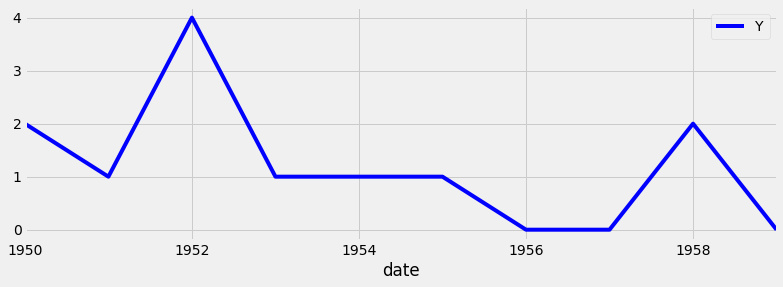
시계열 데이터 서브셋 플로팅

import matplotlib.pyplot as plt
plt.style.use('fivethirtyeight')
df_subset = discoveries['1960':'1970']
ax = df_subset.plot(color='blue', fontsize=14)
plt.show()

시계열 서브셋 예시

Python으로 시계열 데이터 시각화

마커 추가

ax.axvline(x='1969-01-01', 
           color='red', 
           linestyle='--')
ax.axhline(y=100, 
           color='green', 
           linestyle='--')
Python으로 시계열 데이터 시각화

마커 사용: 전체 코드

ax = discoveries.plot(color='blue')
ax.set_xlabel('Date')
ax.set_ylabel('Number of great discoveries')

ax.axvline('1969-01-01', color='red', linestyle='--') ax.axhline(4, color='green', linestyle='--')
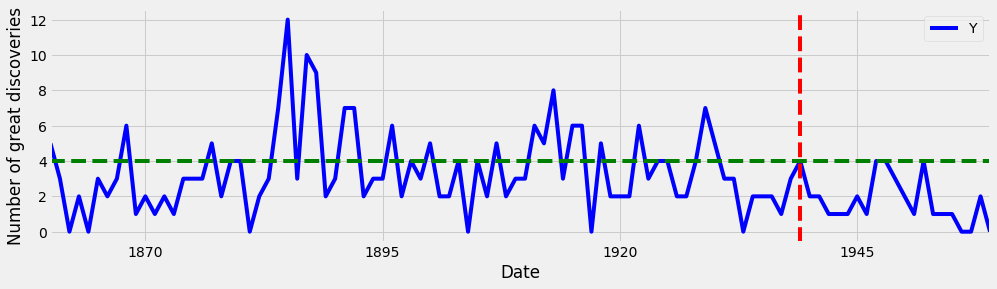
플롯에 마커 추가

Python으로 시계열 데이터 시각화

관심 영역 강조 표시

ax.axvspan('1964-01-01', '1968-01-01', 
           color='red', alpha=0.5)
ax.axhspan(8, 6, color='green',
           alpha=0.2)
Python으로 시계열 데이터 시각화

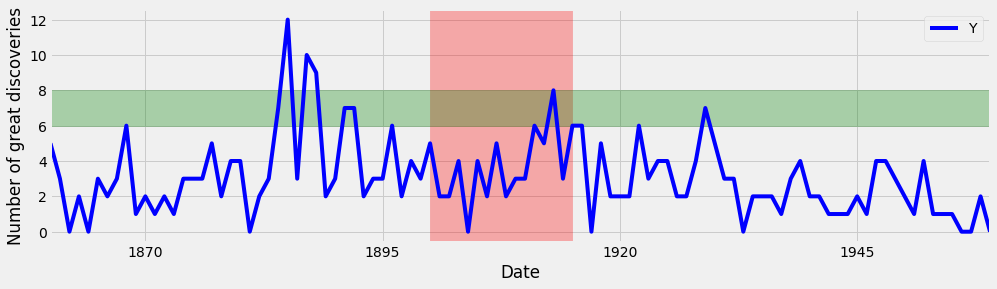
관심 영역 강조 표시: 전체 코드

ax = discoveries.plot(color='blue')
ax.set_xlabel('Date')
ax.set_ylabel('Number of great discoveries')
ax.axvspan('1964-01-01', '1968-01-01', color='red',
alpha=0.3)
ax.axhspan(8, 6, color='green', alpha=0.3)

플롯에 관심 영역 추가

Python으로 시계열 데이터 시각화

연습해 봅시다!

Python으로 시계열 데이터 시각화

Preparing Video For Download...