Python으로 배우는 Plotly 데이터 시각화 입문
Alex Scriven
Data Scientist
$$
add_annotation()
update_layout()
annotations
text
x
y
showarrow
True
False
🛑 절대 위치 배치는 주의하십시오. 데이터가 바뀌면 겹칠 수 있습니다
xref
yref
paper
x=0.5
y=0.5
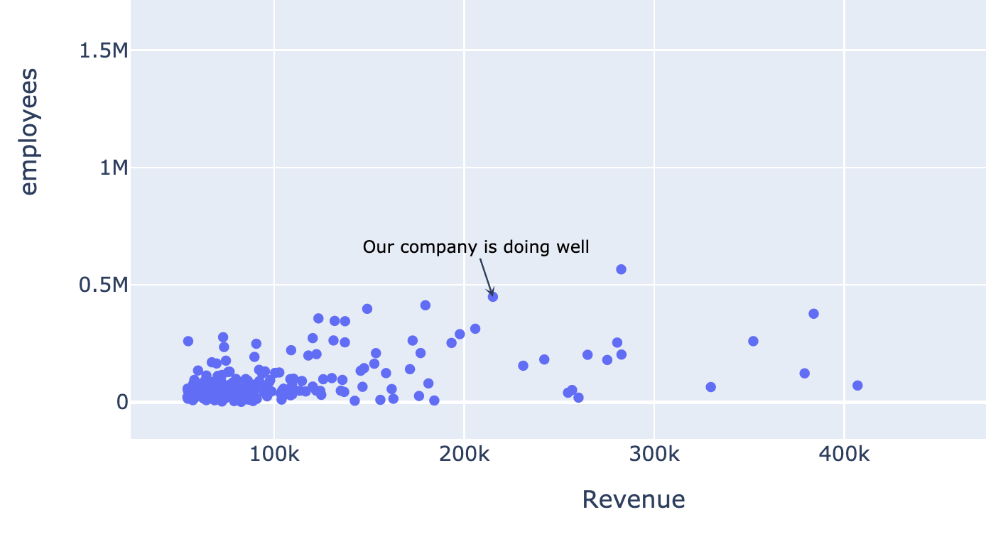
my_annotation = dict(
    x=215111, y=449000,

    showarrow=True, arrowhead=3,

    text="Our company is doing well",
    font=dict(size=10, color="black")
)

fig.update_layout(annotations=[my_annotation])
fig.show()
my_annotation = dict( x=215111, y=449000,
showarrow=True, arrowhead=3,
text="Our company is doing well", font=dict(size=10, color="black") )
fig.update_layout(annotations=[my_annotation]) fig.show()
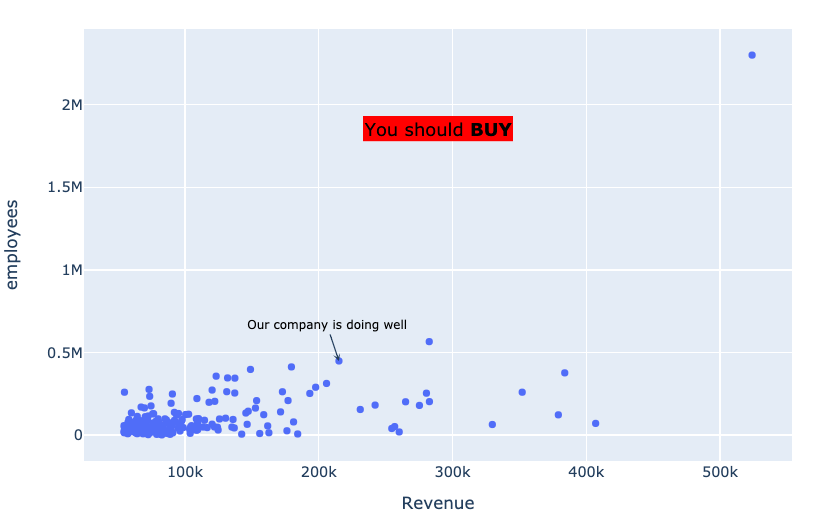
float_annotation = dict(
    xref="paper", yref="paper",

    x=0.5, y=0.8,

    showarrow=False,
    text="You should <b>BUY</b>",
    font=dict(size=15, color="black"),
    bgcolor="rgb(255,0,0)"
)
float_annotation = dict( xref="paper", yref="paper",
x=0.5, y=0.8,
showarrow=False, text="You should <b>BUY</b>", font=dict(size=15, color="black"), bgcolor="rgb(255,0,0)" )