Python으로 배우는 Plotly 데이터 시각화 입문
Alex Scriven
Data Scientist
플롯 커스터마이징 방법:
color)update_layout() 사용fig.update_layout({"title":{"text":"A New Title"}})
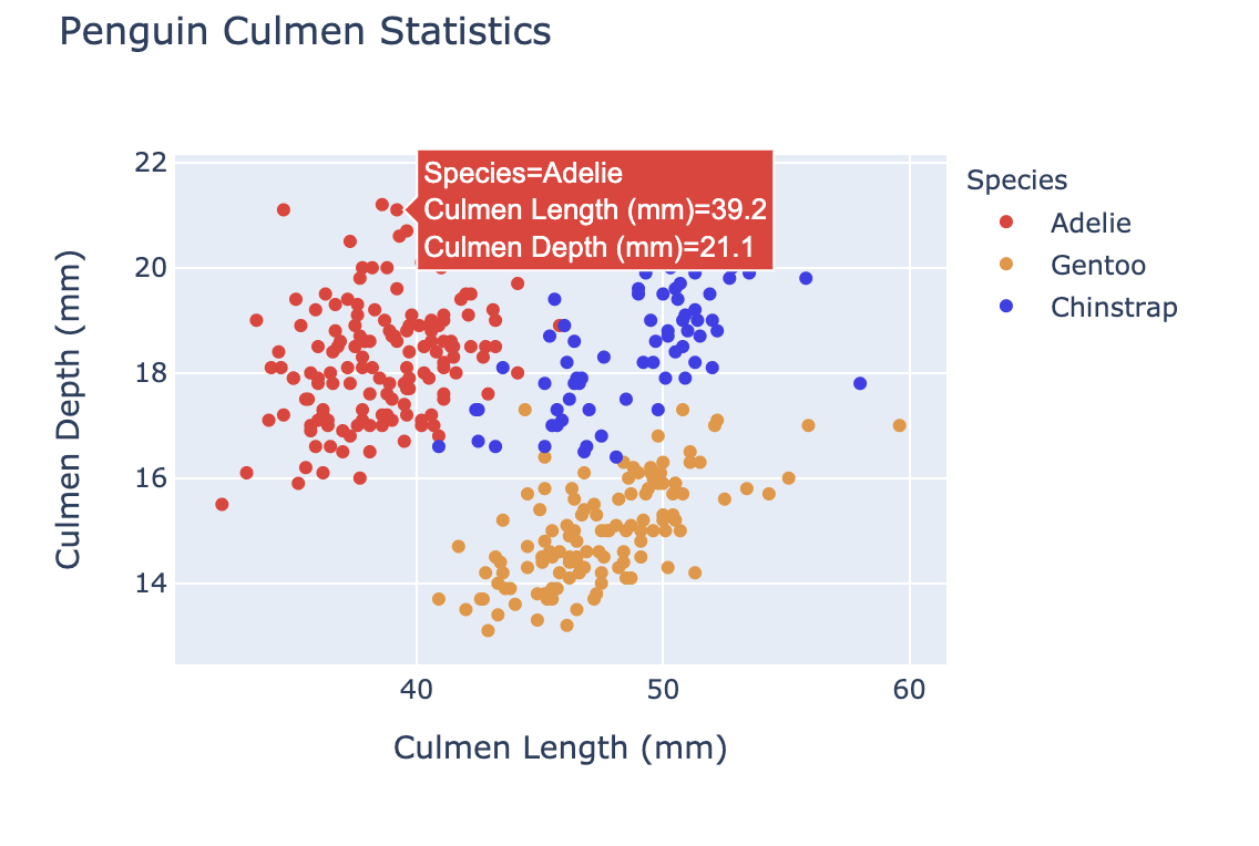
색상 커스터마이징은 다음에 유용합니다:

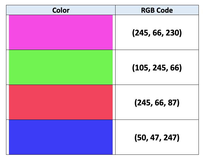
컴퓨터는 색을 지정할 때 RGB 인코딩을 사용합니다:
$$
$$
자세한 내용: 기사

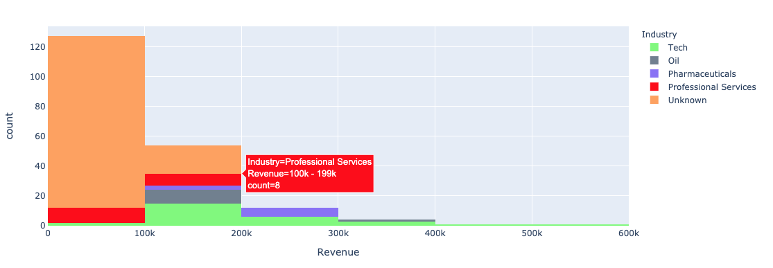
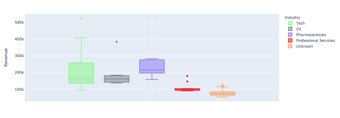
color 인자(DataFrame 열)
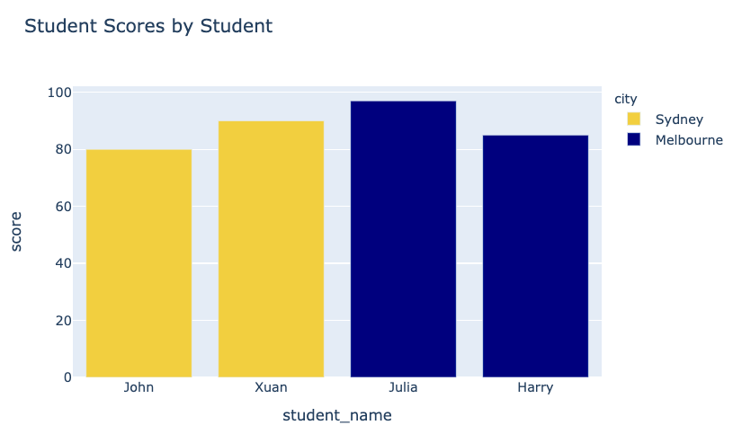
fig = px.bar(data_frame=student_scores,
x="student_name",
y="score",
title="Student Scores by Student"
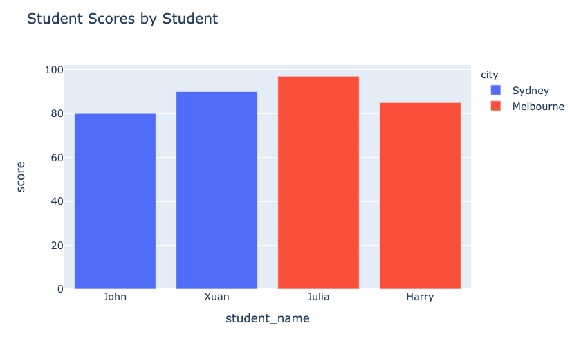
color="city")
fig.show()
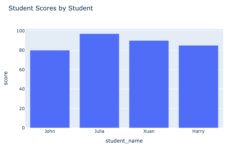
이전 그래프:

변경 후 그래프:

plotly.express의 color 인자를 단변량(막대, 히스토그램) 플롯에 사용:


color_discrete_map: 범주 값을 색에 매핑하는 딕셔너리"red", "green" 등 문자열로도 지정 가능$$
fig = px.bar( data_frame=student_scores, x="student_name", y="score", title="Student Scores by Student",color_discrete_map={ "Melbourne": "rgb(0,0,128)", "Sydney": "rgb(235, 207, 52)"},color="city")


$$
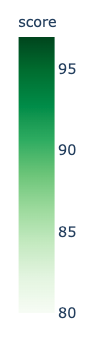
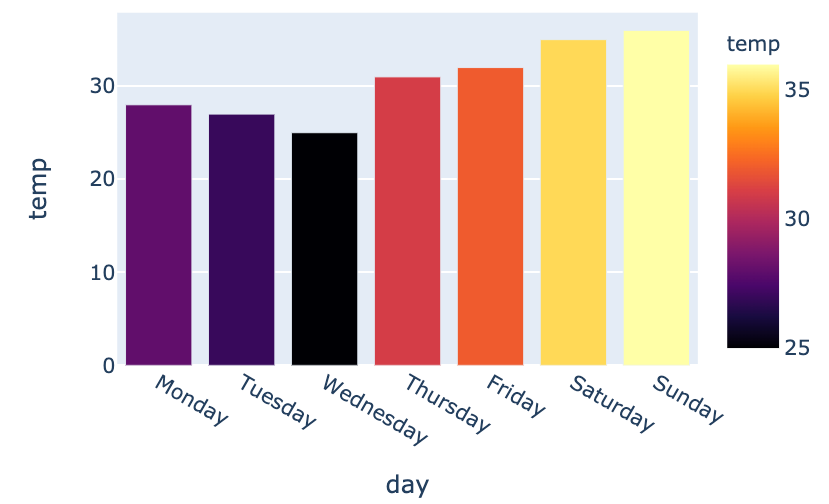
color_continuous_scale
fig = px.bar(data_frame=weekly_temps,
x="day", y="temp",
color="temp",
color_continuous_scale="inferno")
fig.show()
$$

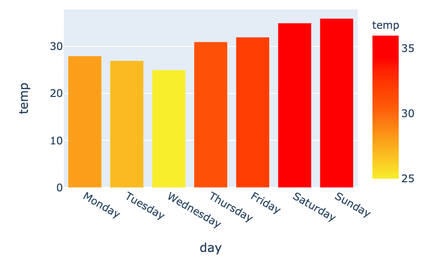
my_scale=[("rgb(242, 238, 10)"), ("rgb(242, 95, 10)"), ("rgb(255,0,0)")]fig = px.bar(data_frame=weekly_temps, x="day", y="temp",color_continuous_scale=my_scale, color="temp")

Python으로 배우는 Plotly 데이터 시각화 입문