Python으로 배우는 Plotly 데이터 시각화 입문
Alex Scriven
Data Scientist

Plotly의 장점:
plotly.express로 저코드/저노력 옵션
Plotly Figure 생성 방법:
plotly.express(px)plotly.graph_objects(go)$$
📈 대부분 px를 사용합니다
기본 Plotly Figure:
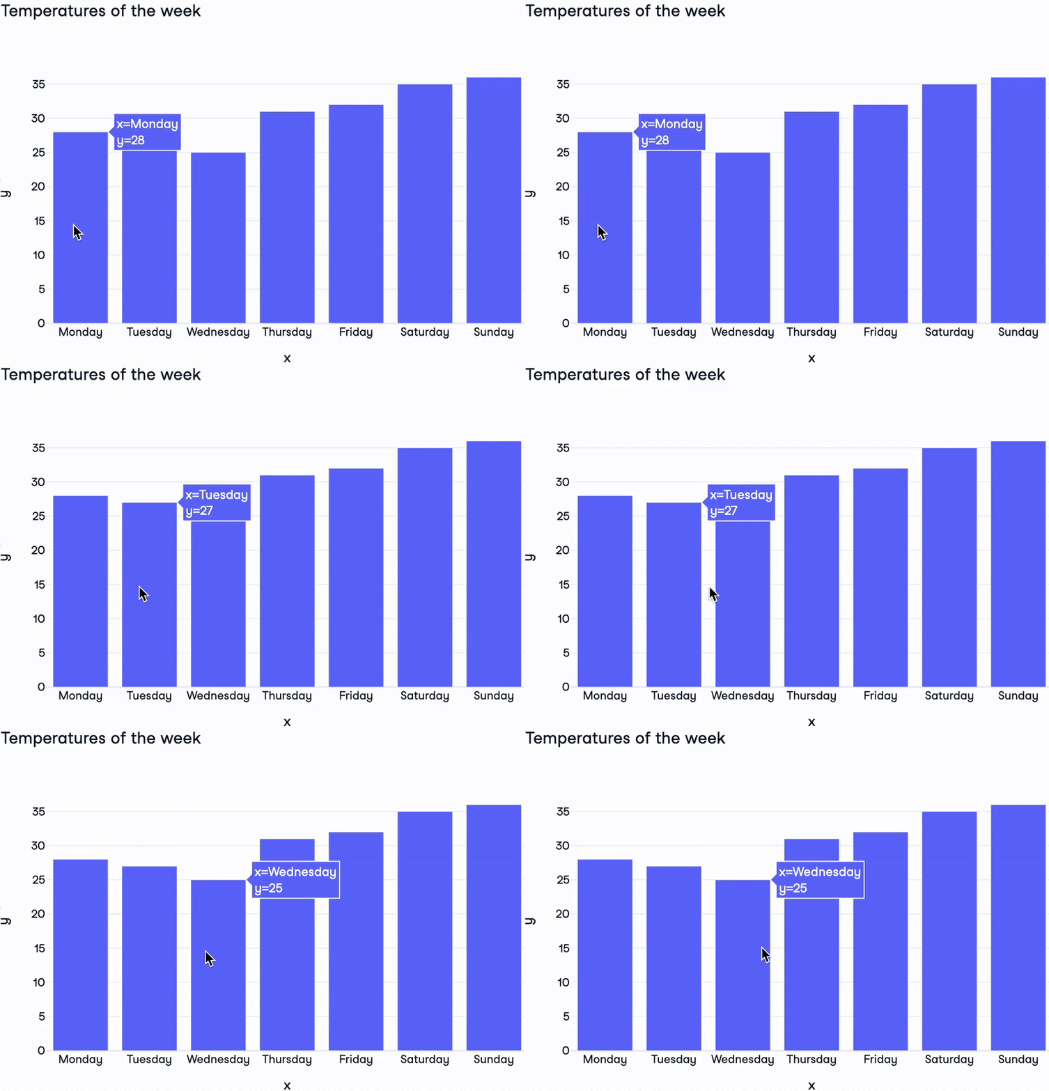
import plotly.express as pxdays = ["Monday", "Tuesday", "Wednesday", "Thursday", "Friday", "Saturday", "Sunday"] temperatures = [28, 27, 25, 31, 32, 35, 36]fig = px.bar( x=days, y=temperatures, title="Temperatures of the week")fig.show()

Plotly Figure 구성 요소:
layout: Figure 스타일을 제어하는 딕셔너리layout는 하나data: 그래프 유형과 데이터 설정 딕셔너리의 리스트trace (40종 이상)frames: 애니메이션용(이 강의 범위 밖)
print(fig)
Figure({'data': [{'type': 'bar',
'x': array(['Monday', 'Tuesday', 'Wednesday', 'Thursday', 'Friday'
, 'Saturday','Sunday'], dtype=object),
'y': {'bdata': 'HBsZHyAjJA==....'}],
'layout': {'title': {'text': 'Temperatures of the week'}}})
$$

Python으로 배우는 Plotly 데이터 시각화 입문