Python으로 배우는 Plotly 데이터 시각화 입문
Alex Scriven
Data Scientist
$$
Plotly 그림은 traces 목록을 가집니다: 데이터와 유형
traces
fig.data[0], fig.data[1]로 접근
fig.data[0]
fig.data[1]
.add_trace()
px_fig = px.scatter(df...)
print(px_fig)
Figure({'data': [trace1], 'layout': {...}})
import plotly.express as px
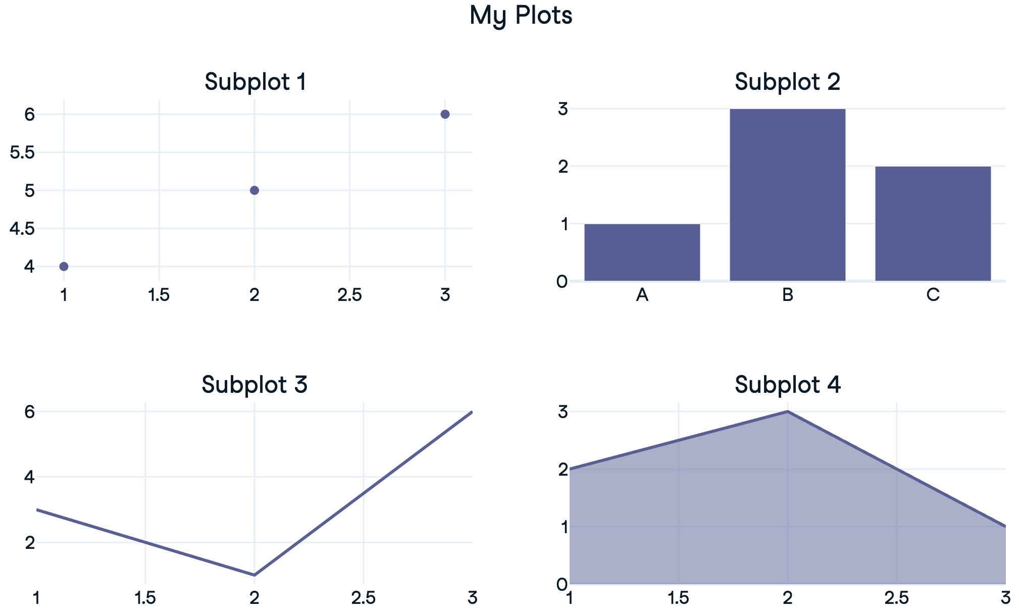
from plotly.subplots import make_subplots

# Create a subplot grid
fig = make_subplots(rows=2, cols=1)

# Create plotly express figures
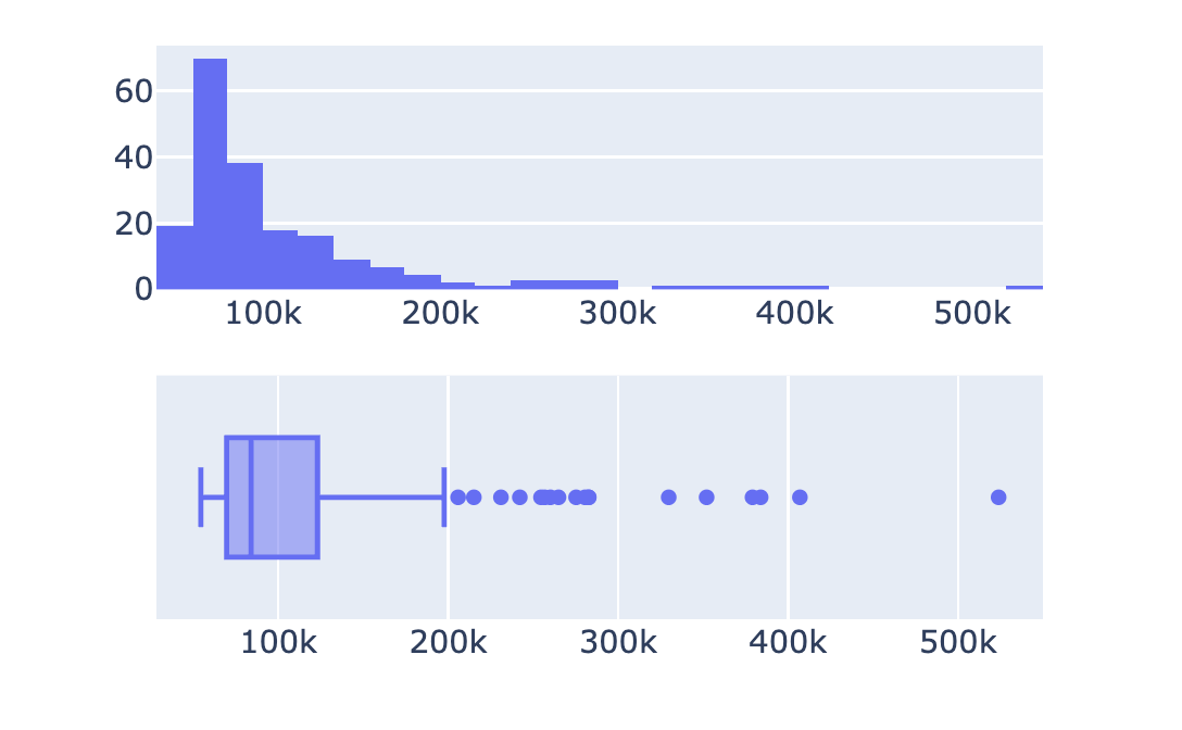
hist = px.histogram(revenues, x='Revenue')
box = px.box(revenues, x='Revenue')

# Extract traces and add to subplots
fig.add_trace(hist.data[0], row=1, col=1)
fig.add_trace(box.data[0], row=2, col=1)

fig.show()
import plotly.express as px from plotly.subplots import make_subplots # Create a subplot grid fig = make_subplots(rows=2, cols=1)
# Create plotly express figures hist = px.histogram(revenues, x='Revenue') box = px.box(revenues, x='Revenue')
# Extract traces and add to subplots fig.add_trace(hist.data[0], row=1, col=1) fig.add_trace(box.data[0], row=2, col=1) fig.show()
from plotly.subplots import make_subplots

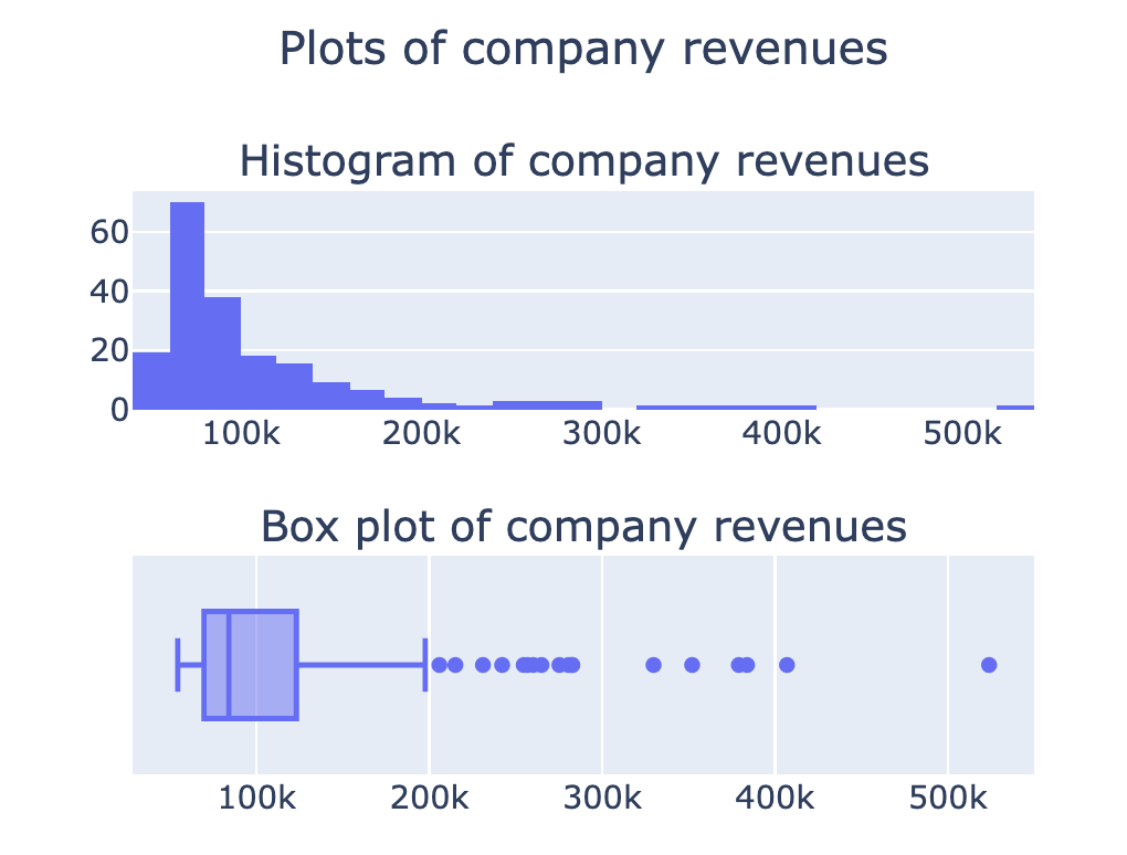
fig = make_subplots(rows=2, cols=1,
    subplot_titles=[
    '회사 매출의 히스토그램',
    '회사 매출의 박스 플롯'])

## Add in traces (fig.add_trace())

fig.update_layout({'title': {'text':
    '회사 매출 플롯',
    'x': 0.5, 'y': 0.9}})

fig.show()
from plotly.subplots import make_subplots fig = make_subplots(rows=2, cols=1, subplot_titles=[ '회사 매출의 히스토그램', '회사 매출의 박스 플롯'])
## Add in traces (fig.add_trace())
fig.update_layout({'title': {'text': '회사 매출 플롯', 'x': 0.5, 'y': 0.9}}) fig.show()
자세한 옵션은 문서에서 확인하십시오
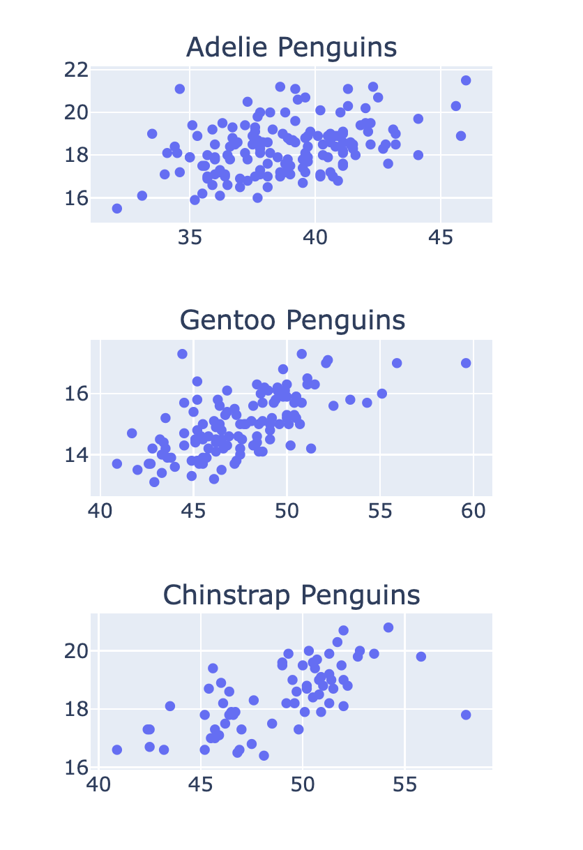
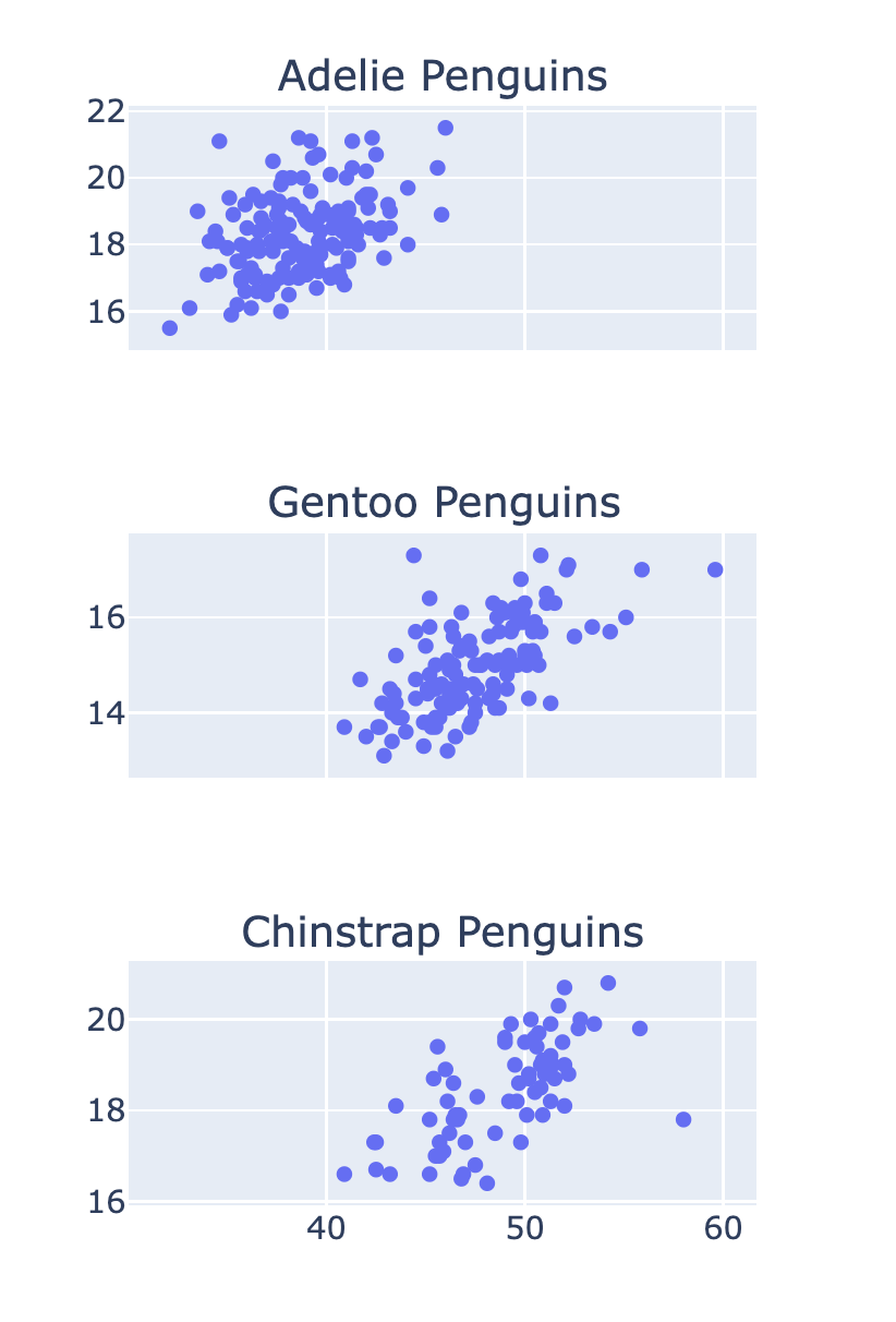
fig = make_subplots(rows=3, cols=1,
  subplot_titles=['Adelie Penguins'
  , 'Gentoo Penguins', 'Chinstrap Penguins'])

row_num = 1
for species in ['Adelie', 'Gentoo', 'Chinstrap']:
  # Filter data for this species
  df = penguins[penguins['Species'] == species]

  scatter = px.scatter(df, x='Culmen Length (mm)'
  , y='Culmen Depth (mm)')
  # Add the trace to the subplot
  fig.add_trace(scatter.data[0]
  , row=row_num, col=1)
  row_num +=1
fig = make_subplots(rows=3, cols=1, subplot_titles=['Adelie Penguins' , 'Gentoo Penguins', 'Chinstrap Penguins'])
row_num = 1 for species in ['Adelie', 'Gentoo', 'Chinstrap']: # Filter data for this species df = penguins[penguins['Species'] == species]
scatter = px.scatter(df, x='Culmen Length (mm)' , y='Culmen Depth (mm)') # Add the trace to the subplot fig.add_trace(scatter.data[0] , row=row_num, col=1) row_num +=1
fig = make_subplots(
    rows=3, cols=1
    , shared_xaxes=True)