Python으로 배우는 Plotly 데이터 시각화 입문
Alex Scriven
Data Scientist
사용자 지정 버튼은 다음을 수행할 수 있습니다:
그래프의 데이터 또는 레이아웃 요소 업데이트
update_layout() 설정을 버튼으로 묶을 수 있습니다!애니메이션 보조(이 강의 범위 밖)
updatemenus 인수로 추가하며, 주요 인수는 다음과 같습니다:
type: buttons 또는 dropdowndirection: 버튼 배치 방향left) 또는 위아래로(down) 배치 가능x/y: 버튼 위치를 정하는 부동소수점 값showactive: True/False로 active(선택된 버튼 인덱스) 표시 여부 설정buttons: button 객체의 리스트$$
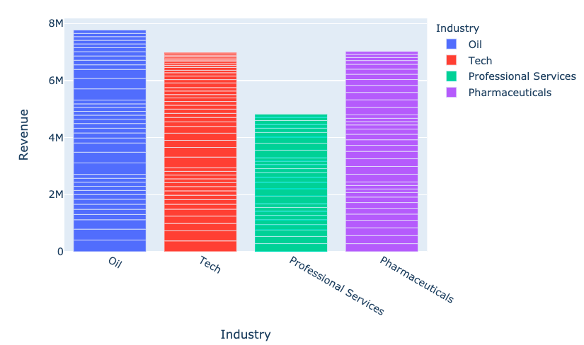
fig = px.bar(
data_frame=revenues,
x='Industry', y='Revenue',
color='Industry')
fig.show()

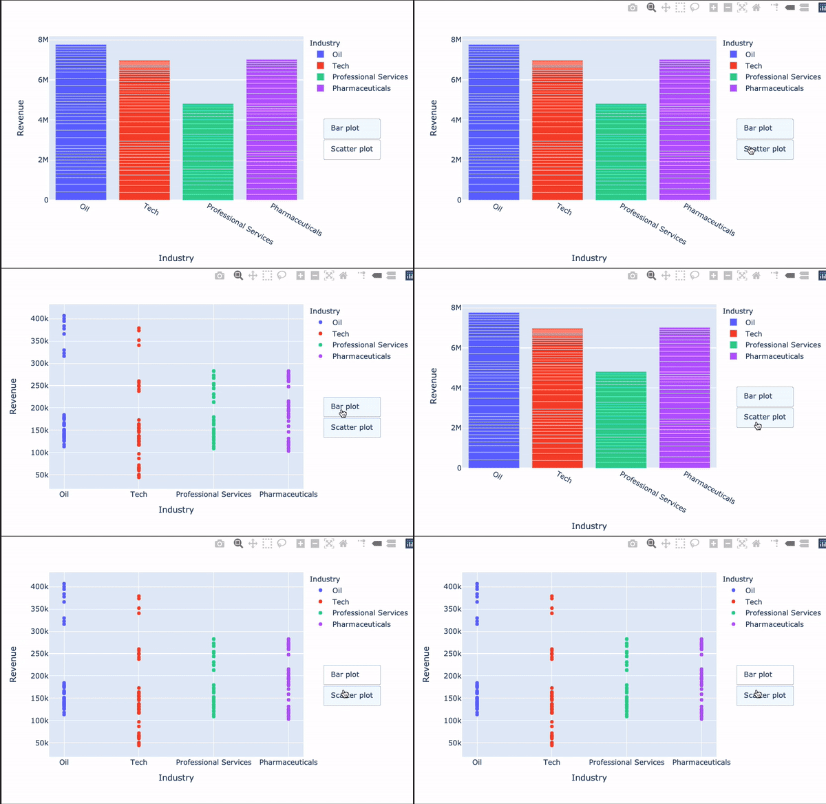
my_buttons = [{'label': "Bar plot",'method': "update",'args': [{"type": "bar"}]},{'label': "scatterplot",'method': "update",'args': [{"type": "scatter", 'mode': 'markers'}]}]
Plotly에서 가장 헷갈리는 부분 중 하나!
[{dictionary to send to data}, {dictionary to send to layout}]

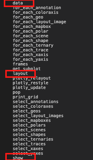
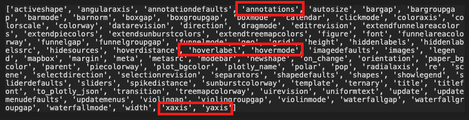
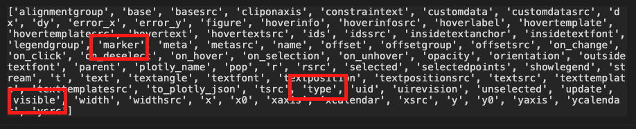
dir(fig.layout)

'args'로 어떤 인수든 업데이트 가능dir(fig.data[0])

$$
fig.update_layout({ 'updatemenus': [{'type': "buttons",'direction': 'down', 'x': 1.3, 'y': 0.5,'showactive': True, 'active': 0,'buttons': my_buttons}] }) fig.show()
$$

Python으로 배우는 Plotly 데이터 시각화 입문