seaborn으로 범주별 요약 통계

Python으로 금융 데이터 가져오기와 관리

Stefan Jansen

Instructor

seaborn의 범주형 플롯

  • 범주형·수치형 변수 조합을 그리는 전용 방법
  • 범주별 요약 통계 추정치 시각화
  • 범주가 수치 변수에 미치는 영향 이해
  • 분포 특성의 핵심 지표로 비교
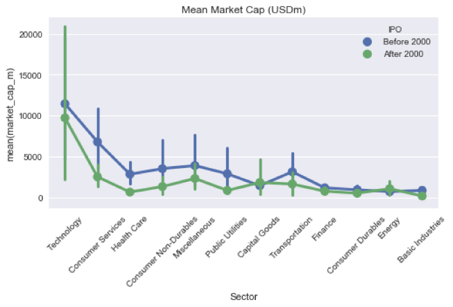
  • 예: 부문·IPO 연도별 평균 시가총액과 분산 표시
Python으로 금융 데이터 가져오기와 관리

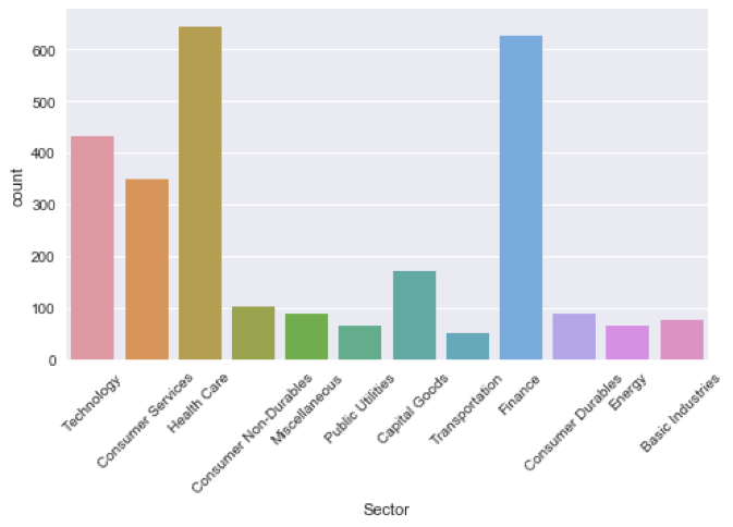
기본: countplot

sns.countplot(x='Sector', data=nasdaq)
plt.xticks(rotation=45)
countplot.png

Python으로 금융 데이터 가져오기와 관리

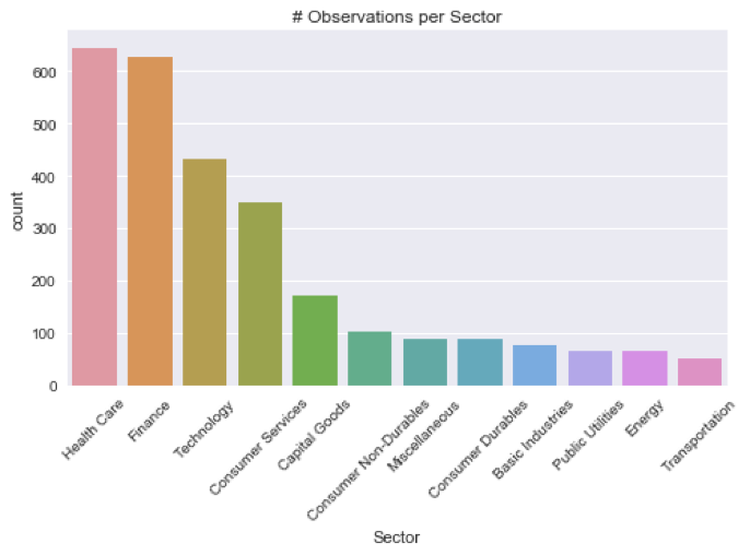
countplot, 정렬

sector_size = nasdaq.groupby('Sector').size()
order = sector_size.sort_values(ascending=False)
order.head()
Sector
Health Care          645
Finance              627
Technology           433
...
order = order.index.tolist()
['Health Care', 'Finance', ..., 'Energy', 'Transportation']
Python으로 금융 데이터 가져오기와 관리

countplot, 정렬

sns.countplot(x='Sector', data=nasdaq, order=order)
plt.xticks(rotation=45)
plt.title('# Observations per Sector’)
countplot_sorted.png

Python으로 금융 데이터 가져오기와 관리

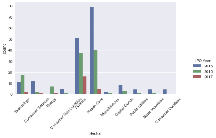
countplot, 다중 범주

recent_ipos = nasdaq[nasdaq['IPO Year'] > 2014]
recent_ipos['IPO Year'] = recent_ipos['IPO Year'].astype(int)
sns.countplot(x='Sector', hue='IPO Year', data=recent_ipos)
countplot_mc.png

Python으로 금융 데이터 가져오기와 관리

PointPlot으로 통계 비교

nasdaq['IPO'] = nasdaq['IPO Year'].apply(lambda x: 'After 2000' if x > 2000 else 'Before 2000')
sns.pointplot(x='Sector', y='market_cap_m', hue='IPO', data=nasdaq)
plt.xticks(rotation=45); plt.title('Mean Market Cap')
pointplot.png

Python으로 금융 데이터 가져오기와 관리

연습해 봅시다!

Python으로 금융 데이터 가져오기와 관리

Preparing Video For Download...