범주별 분포 시각화(seaborn)

Python으로 금융 데이터 가져오기와 관리

Stefan Jansen

Instructor

범주별 분포

  • 이전: 요약 통계
  • 관측치 수, 범주별 평균
  • 이제: 범주형 변수 수준별로 변수 분포를 시각화하여 비교 용이
  • 예: 섹터별 또는 IPO 연도별 시가총액 분포
  • 요약 통계보다 더 자세함
Python으로 금융 데이터 가져오기와 관리

데이터 정제: 이상치 제거

nasdaq = pd.read_excel('listings.xlsx', sheet_name='nasdaq', 
                        na_values='n/a')
nasdaq['market_cap_m'] = nasdaq['Market Capitalization'].div(1e6)

nasdaq = nasdaq[nasdaq.market_cap_m > 0] # Active companies only
outliers = nasdaq.market_cap_m.quantile(.9) # Outlier threshold
nasdaq = nasdaq[nasdaq.market_cap_m < outliers] # Remove outliers
Python으로 금융 데이터 가져오기와 관리

박스플롯: 사분위수와 이상치

import seaborn as sns
sns.boxplot(x='Sector', y='market_cap_m', data=nasdaq)
plt.xticks(rotation=75);
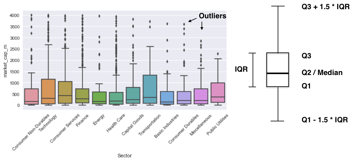
사분위수 도식

Python으로 금융 데이터 가져오기와 관리

변형: 스웜플롯

sns.swarmplot(x='Sector', y='market_cap_m', data=nasdaq)
plt.xticks(rotation=75)
plt.show()
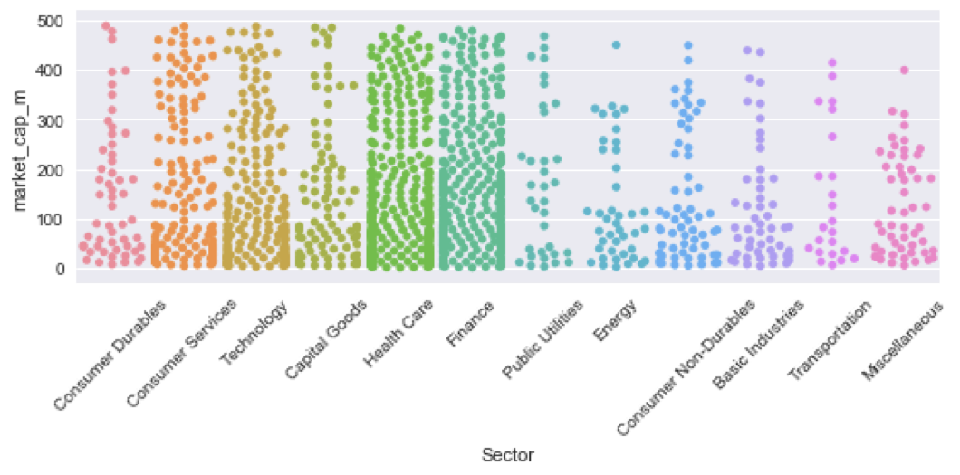
스웜플롯

Python으로 금융 데이터 가져오기와 관리

연습해 봅시다!

Python으로 금융 데이터 가져오기와 관리

Preparing Video For Download...