요인 재정렬

Tidyverse로 배우는 범주형 데이터

Emily Robinson

Data Scientist
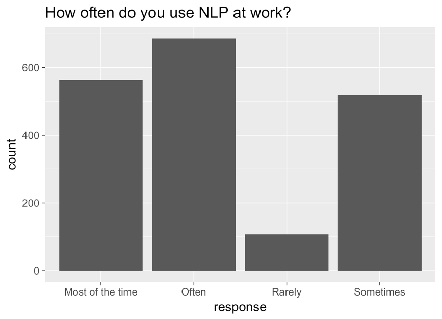
x축은 응답, y축은 빈도, 제목은 "NLP를 업무에 얼마나 자주 사용합니까?"인 막대 그래프. 막대는 왼쪽부터 most of the time, often, rarely, sometimes 순서입니다.

Tidyverse로 배우는 범주형 데이터

수정된 그래프

ggplot(aes(nlp_frequency, 
            x = fct_relevel(response, 
            "Rarely", "Sometimes", "Often", "Most of the time"))) + 
        geom_bar()
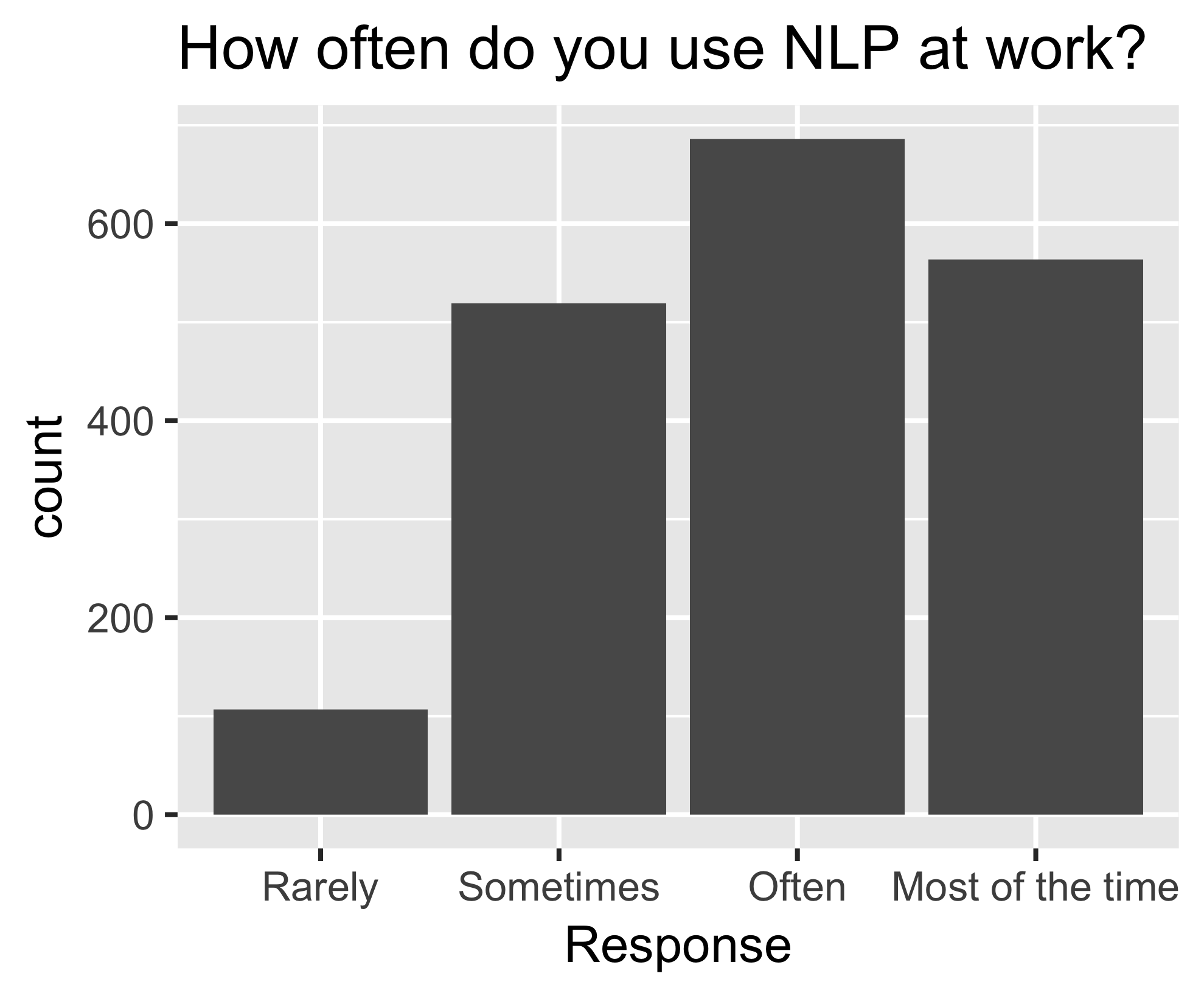
동일한 막대 그래프로, 왼쪽부터 rarely, sometimes, often, most of the time 순서로 정렬되어 있습니다.

Tidyverse로 배우는 범주형 데이터

fct_reorder()

nlp_frequency %>%
    pull(response) %>%
    levels()
[1] "Most of the time" "Often" "Rarely" "Sometimes"       
nlp_frequency %>%
    mutate(response = fct_relevel(response, 
            "Often", "Most of the time")) %>%
    pull(response) %>%
    levels()
[1] "Often" "Most of the time" "Rarely" "Sometimes"
Tidyverse로 배우는 범주형 데이터

추가 인수

nlp_frequency %>%
    mutate(response = fct_relevel(response, 
            "Often", "Most of the time", after = 2)) %>%
            pull(response) %>%
            levels()
nlp_frequency %>%
    mutate(response = fct_relevel(response, 
            "Often", "Most of the time", after = Inf) %>%
    pull(response) %>%
    levels()
[1] "Rarely" "Sometimes" "Often" "Most of the time"
Tidyverse로 배우는 범주형 데이터

연습해 봅시다!

Tidyverse로 배우는 범주형 데이터

Preparing Video For Download...